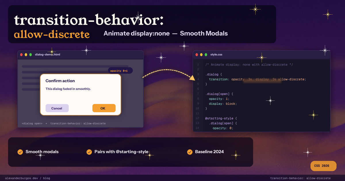
If you have ever tried to fade a modal in and out, you know the pain. You set opacity: 0, you set opacity: 1, you watch it work on the way in, and then you set display: none on close and the whole thing snaps out of existence with all the grace of a slammed door. So you reach for JavaScript. You write a tiny state machine. You set a class, wait for transitionend, then set display: none. You add a requestAnimationFrame on the way in to force a reflow. You probably write a hook for it. And then you do the same dance for the next modal, and the dialog, and the popover, and the toast.
Every front-end developer I know has written this code at least three times. It is not hard, exactly. It is just deeply tedious, and it lives in JavaScript when it really should live in CSS.
The good news is that the platform finally caught up. A while back I wrote about CSS @starting-style and how it stops you needing JavaScript for entry animations. That post covers half of the puzzle. This post is the companion piece, the other half. The two of them together let you animate display: none properly, in pure CSS, on real production sites today. The second half is a property called transition-behavior: allow-discrete.
Let me walk you through what it does, the four-part recipe you actually need, and the five gotchas that will eat half your afternoon if nobody warns you about them.
What is transition-behavior?
transition-behavior is a CSS property defined in the CSS Transitions Module Level 2 spec. It takes one of two keyword values: normal (the default) or allow-discrete. That is it. The whole property is one switch.
What it actually controls is which kinds of properties the transition engine is allowed to touch. By default, CSS transitions only fire for properties that can be smoothly interpolated. Numbers, lengths, colours, transforms, that sort of thing. A property like display has no in-between state, so the engine has historically just shrugged and ignored it. Setting transition-behavior: allow-discrete tells the engine, in effect: "I know this property cannot interpolate. Transition it anyway. I will tell you what to do at the boundaries".
What "discrete" properties are
A discrete property is one whose values cannot be smoothly interpolated. Think of it as a switch rather than a slider. The browser cannot give you a value that is half none and half block -- there is no such thing. The properties most of us care about here are:
- display -- the headline use case (e.g. none -> block)
- content-visibility -- mostly used for off-screen rendering optimisations
- overlay -- the top-layer property used by [popover] and modal <dialog>
- visibility, mix-blend-mode, and custom properties of an unrecognised type
By default, those are silently ignored if you stick them in transition-property. With allow-discrete, the spec defines a default behaviour: a discrete value flips from the start value to the end value at the 50% mark of the transition duration. That is fine for mix-blend-mode, but it would be terrible for display, because half your animation would happen on an invisible element.
So the spec makes a special case. For display, content-visibility and overlay: when going from none to a visible value, the value flips at 0% -- the element becomes visible immediately and the rest of the transition plays. When going from visible to none, the value flips at 100% -- the element stays visible for the whole exit animation and only disappears once everything else has finished. That is exactly the JavaScript dance we have all been writing manually, except the browser does it for you, on the compositor.
Worth flagging: the 0%/100% rule only kicks in when one of the two values is none. A display: flex -> display: block transition still flips at the 50% mark, like any other discrete property. We will come back to this in the gotchas.
The 4-part recipe
Animating in and out of display: none takes four ingredients, every single time. If you skip any one of them, the result is silently broken. The four ingredients are: (1) @starting-style for the entry "from" state, (2) transition-behavior: allow-discrete to opt display into the transition system, (3) display listed explicitly in your transition-property, and (4) a continuous companion property like opacity or transform so the user actually sees something happen during the animation.
Here is the smallest possible toast that uses all four:
.toast {
  display: none;
  opacity: 0;
  transition: opacity 0.3s, display 0.3s allow-discrete;
}

.toast.is-open {
  display: block;
  opacity: 1;

  @starting-style {
    opacity: 0;
  }
}
Toggle .is-open and the toast fades in and fades out, no setTimeout, no transitionend listener, no animation library. The display sits in the transition list, allow-discrete is right there inside the shorthand, @starting-style defines the "before-open" opacity, and opacity is the continuous companion that gives the user something to watch. Drop any one of those and you get a snap, not a fade.
Animating popovers smoothly
The Popover API was designed around display: none, which means it is the perfect target for this technique. A [popover] element is hidden by default, gets rendered into the top layer when opened, and is matched by the :popover-open pseudo-class while visible. Here is a smooth fade-and-scale on both open and close:
[popover] {
  opacity: 0;
  transform: scale(0.9);
  transition:
    opacity 0.25s ease,
    transform 0.25s ease,
    display 0.25s allow-discrete,
    overlay 0.25s allow-discrete;
}

[popover]:popover-open {
  opacity: 1;
  transform: scale(1);
}

@starting-style {
  [popover]:popover-open {
    opacity: 0;
    transform: scale(0.9);
  }
}
Look carefully at the transition list. There are four properties in there: opacity, transform, display and overlay. The first two are the visible animation. The third keeps the element in the DOM for the duration of the exit animation. The fourth is the one that bites everyone the first time, and it is what the next section is about.
Animating dialogs and the overlay property
Both [popover] and a modal <dialog> render into the browser's top layer -- a special rendering layer that sits above everything else on the page, controlled by the user agent. The top layer is what stops a modal disappearing behind a high z-index footer. As an author, you cannot put things into the top layer manually -- only the browser can, via showModal() or the popover invoker -- and you cannot read or write the overlay property directly either. The browser flips it between auto (in the top layer) and none (not in the top layer).
What you can do is opt overlay into your transition list. That tells the engine: "do not yank this element out of the top layer until my transition has finished". Without it, the browser removes the element from the top layer the instant you close it, your beautiful exit animation plays underneath whatever was previously above it on the page, and you get a one-frame flicker that is hideous and almost impossible to debug if you do not know what you are looking for.
Here is a complete <dialog> with a slide-down entry, an animated ::backdrop, and the overlay transition wired up properly:
dialog {
  opacity: 0;
  translate: 0 30%;
  transition:
    opacity 0.4s,
    translate 0.4s,
    display 0.4s allow-discrete,
    overlay 0.4s allow-discrete;
}

dialog[open] {
  opacity: 1;
  translate: 0 0;
}

@starting-style {
  dialog[open] {
    opacity: 0;
    translate: 0 -30%;
  }
}

dialog::backdrop {
  background: rgb(0 0 0 / 0);
  transition:
    background 0.4s,
    display 0.4s allow-discrete,
    overlay 0.4s allow-discrete;
}

dialog[open]::backdrop {
  background: rgb(0 0 0 / 0.6);
}

@starting-style {
  dialog[open]::backdrop {
    background: rgb(0 0 0 / 0);
  }
}
That gives you a slide-down dialog with a fading backdrop, both in and out, with no JavaScript beyond dialog.showModal(). The Chrome team's own write-up on entry and exit animations recommends exactly this pattern, and it is the same one MDN uses in their overlay docs.
Browser support today
Support is genuinely solid as of 2026. Here is the shipping timeline for transition-behavior:
- Chrome 117 -- September 2023 (shipped together with @starting-style and overlay)
- Edge 117 -- September 2023 (same engine as Chrome)
- Safari 17.4 -- March 2024 (including iOS Safari)
- Firefox 129 -- August 2024 (last engine to ship; this is what tipped Baseline)
transition-behavior together with @starting-style became Baseline Newly available on 6 August 2024 when Firefox 129 landed. Global usage as of early 2026 sits around 91% per caniuse. The overlay property tracks roughly the same window. There is one historical wart -- some early Firefox builds did not actually transition display even with allow-discrete -- but the modern Firefox releases handle it correctly.
My take: ship it. The fallback is graceful. In any browser old enough to lack support, your popover will simply pop in and out with no transition -- which is how popovers worked for the previous decade anyway. Treat it as a progressive enhancement and stop blocking on it.
5 gotchas everyone hits
If you build something with this and it does not work, the cause is almost always one of these five. I have hit every one of them at least once, and a couple of them more times than I would like to admit.
- The transition shorthand resets transition-behavior. If you set transition-behavior: allow-discrete and then write a transition: opacity 0.3s, display 0.3s shorthand after it, the shorthand silently resets the longhand to normal and your exit animation is dead. Either put allow-discrete inside the shorthand per-property (e.g. transition: opacity 0.3s, display 0.3s allow-discrete) or declare transition-behavior after the shorthand. MDN actually recommends declaring transition twice for cross-browser fallback safety -- once without and once with allow-discrete.
- Forgetting @starting-style. allow-discrete handles the exit animation. @starting-style handles the entry animation. They are not the same feature. A popover with only transition-behavior: allow-discrete will fade out smoothly and then pop in instantly, which is the worst of both worlds. You need both. See my @starting-style post for the full rundown of the entry side.
- Forgetting overlay for top-layer elements. If your element is a [popover] or a modal <dialog>, overlay is what keeps it visible in the top layer for the duration of the exit animation. Skip it and you get a one-frame flicker on close that is genuinely impossible to debug if you have not seen it before.
- @starting-style cascade order. Per the spec, @starting-style rules must come after the regular open-state rule, otherwise the regular rule's specificity wins and the starting style is silently ignored. Most people learn this by losing 30 minutes of their life squinting at devtools. Nested @starting-style avoids this, which is one reason I prefer it.
- display's 0%/100% trick is only for transitions to/from none. A display: flex -> display: block transition still flips at 50%, just like any other discrete property. The "hold the visible value for the full duration" rule is specific to none swapping with not-none. If you are trying to animate between two visible display values, this property is probably not what you want.
A note on accessibility
One thing that comes for free when you move animations from JavaScript to CSS is that prefers-reduced-motion just works. The user's operating system tells the browser they want less motion, the browser sets the media query, your CSS responds. No extra matchMedia code in JavaScript, no manual gating, nothing to forget.
But you still have to write the rule. Here is what I add to every component that uses this technique:
@media (prefers-reduced-motion: reduce) {
  [popover],
  dialog,
  dialog::backdrop {
    transition: none;
  }

  @starting-style {
    [popover]:popover-open,
    dialog[open],
    dialog[open]::backdrop {
      /* No starting-style overrides -- the element appears in its final state */
    }
  }
}
That kills the transitions but keeps the functionality. Users who asked for less motion get an instant pop-in, which is exactly what the rest of the platform's native UI does for them. Do not skip this. People who set the preference are usually doing so because motion makes them physically unwell, and a fancy modal that they cannot turn off is genuinely a problem.
Looking at the bigger picture for a moment: transition-behavior: allow-discrete, paired with @starting-style, is part of a much bigger shift. Visual state stays in CSS. Behavioural state stays in HTML attributes (open, popover). JavaScript stops being the glue between them. That is the same direction :has(), the popover API and the dialog element are all pushing in -- the platform absorbing what frameworks used to do. Less code in your bundle, more code on the compositor thread, and the user gets smoother animations on their cheap phone. Hard to argue with.
If you only take one thing away from this post: the recipe is four ingredients, in this order. @starting-style. transition-behavior: allow-discrete. display in the transition list. A continuous companion property. Miss one and it silently breaks. Get all four and you never write a JavaScript animation state machine again.
If you want to go deeper and learn how to build real, production-ready CSS design systems step by step, check out my full course here: CSS Design Systems Course
If you found this helpful, I'd love to connect! Follow me on Twitter/X @alexandersstudi or LinkedIn for more CSS and design system tips.
Happy coding!