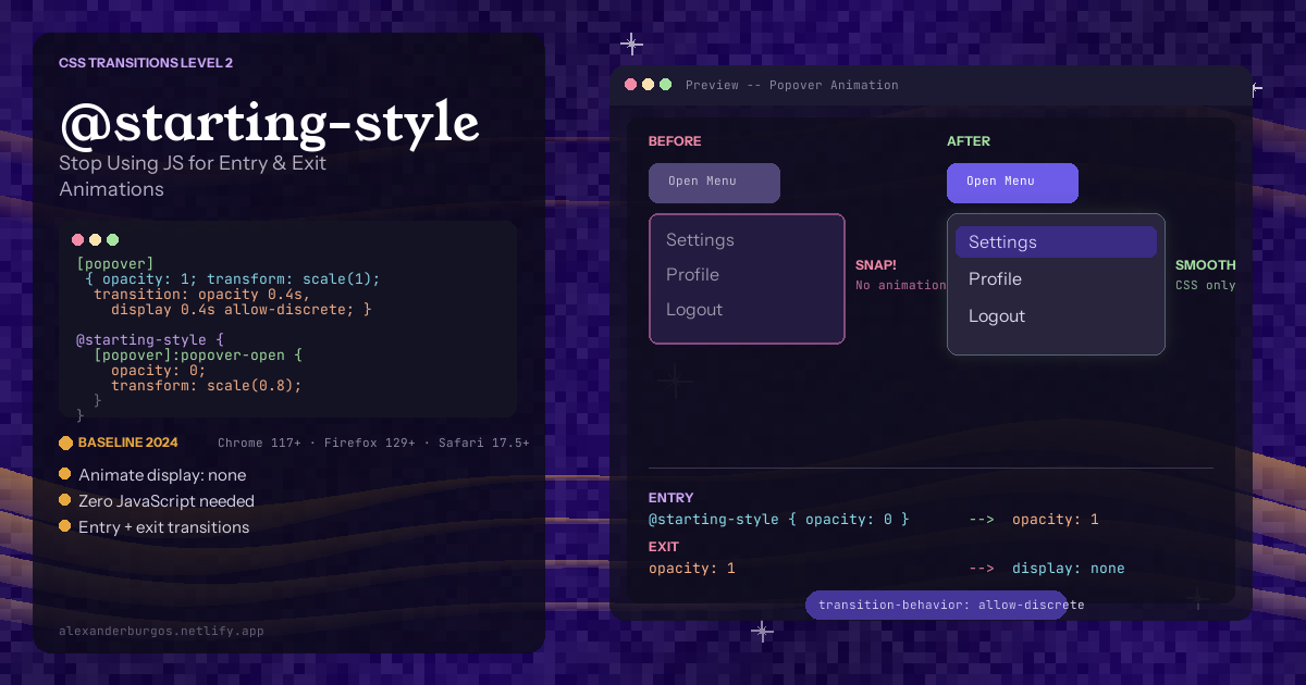
Let's be honest -- animating elements that go from display: none to display: block has always been one of the most annoying things in CSS. You want a smooth fade-in for a modal. Simple, right? Except CSS transitions completely ignore display changes. The element just pops into existence like it doesn't care about your feelings.
Sound familiar?
So what do we do? We reach for JavaScript. We add requestAnimationFrame hacks to force a reflow before applying the animation class. We listen for transitionend events to set display: none after the exit animation finishes. We pull in Framer Motion or GSAP just to fade in a tooltip. It works, but it's a ridiculous amount of complexity for something that should be trivial.
The good news is CSS finally has a proper solution. Two new features -- @starting-style and transition-behavior: allow-discrete -- let you animate entry and exit transitions entirely in CSS. No JavaScript. No libraries. No hacks.
Let me walk you through everything you need to know.
The Problem: Why CSS Couldn't Animate display Changes
To understand why these new features matter, you need to understand the core issue. The display property is what CSS calls a discrete property. Unlike opacity or transform, which can smoothly interpolate between values (0.5 opacity is a real thing), display has no in-between states. An element is either display: block or display: none. There's no display: half-none.
Because of this, CSS transitions have always ignored display changes entirely. When you toggle an element from display: none to display: block, the browser doesn't run any transition -- it just flips the switch instantly. And the reverse is even worse: setting display: none removes the element from the rendering tree immediately, killing any exit animation you had planned.
This is why developers have been writing workarounds for over a decade. But now, CSS has addressed both sides of this problem.
What Is @starting-style?
@starting-style is a new CSS at-rule that lets you define the initial styles an element should have when it first appears in the DOM (or transitions from display: none to a visible state). The browser uses these as the "from" values for the entry transition.
Here's the thing -- before @starting-style, the browser had no concept of "before the element was visible." It only knew the current computed styles. So there was no starting point to transition from. This at-rule gives the browser that missing piece.
The three-state mental model:
Think of it as three distinct states your element goes through:
- State 1 -- @starting-style (before visible): The styles the element starts with when it first enters. This is your "from" state for the entry animation.
- State 2 -- Normal styles (visible): The element's regular CSS styles. This is what it transitions to on entry, and transitions from on exit.
- State 3 -- Hidden/removed: The styles when the element is hidden again (e.g.
display: none,opacity: 0). This is your "to" state for the exit animation.
The entry animation goes: State 1 to State 2. The exit animation goes: State 2 to State 3. Simple.
@starting-style Syntax
You can write @starting-style in two ways -- standalone or nested.
Standalone syntax:
.tooltip {
  opacity: 1;
  transform: translateY(0);
  transition: opacity 0.3s, transform 0.3s;
}

@starting-style {
  .tooltip {
    opacity: 0;
    transform: translateY(8px);
  }
}
Nested syntax (cleaner, my preference):
.tooltip {
  opacity: 1;
  transform: translateY(0);
  transition: opacity 0.3s, transform 0.3s;

  @starting-style {
    opacity: 0;
    transform: translateY(8px);
  }
}
Both produce the exact same result. The nested syntax keeps everything together which I find much easier to maintain. When you have 20 components, you don't want to hunt for their starting styles in a separate block.
What Does transition-behavior: allow-discrete Do?
@starting-style solves the entry animation problem, but we still need one more piece. Remember how display is a discrete property that CSS transitions normally ignore? The transition-behavior property changes that.
Setting transition-behavior: allow-discrete tells the browser: "Yes, I know display is discrete. Transition it anyway." This enables the browser to keep the element visible long enough for exit animations to play out before it finally sets display: none.
How discrete transitions actually work:
- On entry: The
displayvalue flips to the new value at 0% of the transition. The element becomes visible immediately, then other properties (opacity, transform) transition smoothly. - On exit: The
displayvalue flips tononeat 100% of the transition. Other properties transition smoothly first, and only after they finish does the element actually disappear.
This is exactly what we've been doing manually with JavaScript -- keeping the element in the DOM until the animation completes, then removing it. Now the browser handles it natively.
The Syntax
Longhand:
.modal {
  transition-property: opacity, display;
  transition-duration: 0.3s;
  transition-behavior: allow-discrete;
}
Shorthand (my recommendation):
.modal {
  transition: opacity 0.3s, display 0.3s allow-discrete;
}
The shorthand is cleaner. Notice that allow-discrete goes at the end of the individual transition declaration for the discrete property.
Practical Examples
Enough theory. Let's build real things. Here are four practical examples you can use in production today.
1. Popover Animation
The Popover API (popover attribute) is perfect for this because popovers use display: none by default and render in the top layer. Here's a smooth fade and scale animation:
[popover] {
  /* Final visible state */
  opacity: 1;
  transform: scale(1);

  /* Transition everything including display */
  transition:
    opacity 0.3s ease,
    transform 0.3s ease,
    overlay 0.3s allow-discrete,
    display 0.3s allow-discrete;

  /* Entry animation starts from these values */
  @starting-style {
    opacity: 0;
    transform: scale(0.95);
  }
}

/* Exit animation goes to these values */
[popover]:not(:popover-open) {
  opacity: 0;
  transform: scale(0.95);
}
Notice the overlay property in the transition list. This keeps the element in the top layer during the exit animation. Without it, the popover drops out of the top layer immediately and might render behind other content during the fade-out. I'll cover this in more detail in the gotchas section.
2. Dialog Slide-Up
Dialogs are another perfect use case. When opened with showModal(), they render in the top layer just like popovers. Here's a slide-up effect with a backdrop fade:
dialog[open] {
  opacity: 1;
  transform: translateY(0);

  transition:
    opacity 0.4s ease,
    transform 0.4s ease,
    overlay 0.4s allow-discrete,
    display 0.4s allow-discrete;

  @starting-style {
    opacity: 0;
    transform: translateY(30px);
  }
}

/* Exit state */
dialog:not([open]) {
  opacity: 0;
  transform: translateY(30px);
}

/* Animate the backdrop too */
dialog::backdrop {
  background-color: rgba(0, 0, 0, 0.5);
  transition:
    background-color 0.4s ease,
    overlay 0.4s allow-discrete,
    display 0.4s allow-discrete;

  @starting-style {
    background-color: rgba(0, 0, 0, 0);
  }
}

dialog:not([open])::backdrop {
  background-color: rgba(0, 0, 0, 0);
}
This is the kind of animation that used to require a full animation library. Now it's pure CSS. The backdrop fades in, the dialog slides up, and both reverse smoothly on close. Beautiful.
3. Tooltip Fade-In
Tooltips typically toggle display on hover or focus. Here's a clean fade with a slight upward movement:
.tooltip {
  display: none;
  opacity: 0;
  transform: translateY(4px);
  transition:
    opacity 0.2s ease,
    transform 0.2s ease,
    display 0.2s allow-discrete;
}

.trigger:hover .tooltip,
.trigger:focus-visible .tooltip {
  display: block;
  opacity: 1;
  transform: translateY(0);

  @starting-style {
    opacity: 0;
    transform: translateY(4px);
  }
}
Notice the structure here. The base .tooltip class defines the hidden state (display: none, opacity: 0) and the transitions. The hover/focus state sets the visible styles and includes @starting-style for the entry animation. The exit animation transitions back to the base styles.
4. Notification Toast
Toast notifications that slide in from the right and slide out on dismissal -- a classic pattern that almost always involves JavaScript animation libraries:
.toast {
  position: fixed;
  top: 1rem;
  right: 1rem;
  display: none;
  opacity: 0;
  transform: translateX(100%);
  transition:
    opacity 0.4s ease,
    transform 0.4s ease,
    display 0.4s allow-discrete;
}

.toast.visible {
  display: flex;
  opacity: 1;
  transform: translateX(0);

  @starting-style {
    opacity: 0;
    transform: translateX(100%);
  }
}
All you need in JavaScript now is toggling the .visible class. No requestAnimationFrame. No transitionend listeners. No animation library. Just toggle a class and CSS handles the rest.
The overlay Property for Top-Layer Elements
You might have noticed the overlay property in the popover and dialog examples. This deserves a quick explanation.
When an element is in the top layer (popovers, dialogs opened with showModal(), fullscreen elements), the browser normally removes it from the top layer the moment it starts closing. This means your exit animation would play behind other content or not be visible at all.
The overlay property, when transitioned with allow-discrete, tells the browser to keep the element in the top layer for the duration of the exit transition. It's a small detail but absolutely essential for smooth exit animations on popovers and dialogs.
/* Always include overlay for top-layer elements */
transition:
  opacity 0.3s ease,
  transform 0.3s ease,
  overlay 0.3s allow-discrete,
  display 0.3s allow-discrete;
Browser Support
As of early 2026, support is solid across all major browsers:
- Chrome: 117+ (September 2023)
- Edge: 117+ (September 2023)
- Firefox: 129+ (July 2024)
- Safari: 17.5+ (June 2024)
That's a baseline coverage of roughly 92-95% of global users. The fallback behaviour is graceful too -- browsers that don't support these features will simply show the element without animation. No broken layouts, no errors. The UI still works, it just doesn't animate. That's a perfectly acceptable progressive enhancement.
One caveat: the overlay property has slightly more limited support. Firefox added it in version 132 (October 2024). If you need to support older Firefox versions, top-layer exit animations might not render perfectly, but the element will still hide correctly.
Gotchas and Things to Watch Out For
These features aren't complicated, but there are a few traps that will catch you out if you're not careful.
1. Specificity ordering matters
The @starting-style rules need to have equal or higher specificity than the normal styles they override. If your starting styles aren't being applied, check your specificity. The nested syntax helps avoid this issue because the starting styles inherit the parent selector's specificity.
2. Inline styles override everything
If you're setting styles via JavaScript inline styles (e.g. element.style.opacity = '0'), @starting-style won't override them. Inline styles have higher specificity. Use CSS classes instead of inline styles for anything you want to animate with this approach.
3. This only works with transitions, not @keyframes
Here's a common misconception. @starting-style and transition-behavior are transition features. They don't work with @keyframes animations. If you need multi-step animations or more complex sequences, you'll still need keyframes or a JavaScript library. But for the vast majority of show/hide animations, transitions are all you need.
4. The overlay property isn't universal
As mentioned, overlay only applies to top-layer elements. Don't bother including it for regular DOM elements like tooltips or toasts -- it won't do anything. Only use it for popovers, modal dialogs, and fullscreen elements.
5. Both entry and exit need explicit handling
A common mistake is defining @starting-style for the entry but forgetting the exit state. Without explicit exit styles that match your starting styles, the element will just disappear instantly on close. You need all three states: starting, visible, and hidden.
What JavaScript Libraries Does This Replace?
Let's talk about what this means for your dependency list.
If you're using Framer Motion, GSAP, React Transition Group, or Vue's <Transition> component primarily for simple show/hide animations -- fading in modals, sliding in sidebars, animating tooltips -- you can now replace all of that with pure CSS.
I'm not saying throw away these libraries entirely. They're still brilliant for complex orchestrated animations, spring physics, gesture-based interactions, and layout animations. But let's be honest -- how often are you importing a 30KB+ animation library just to fade in a dropdown? In my experience, that's the majority of animation use cases in most web apps.
Here's what you can confidently move to pure CSS:
- Modal/dialog open and close animations
- Popover and dropdown transitions
- Tooltip show/hide effects
- Toast notification enter/exit
- Sidebar slide-in/slide-out
- Accordion content reveal
- Any simple opacity/transform show/hide pattern
That's a significant chunk of what animation libraries handle in a typical project.
Performance Benefits
Moving animations from JavaScript to CSS isn't just about cleaner code -- there are real performance wins.
No JavaScript execution overhead. CSS transitions run on the compositor thread, separate from the main thread. Your JavaScript-heavy animations were competing with event handlers, state updates, and rendering logic on the main thread. CSS transitions don't have that problem.
Smaller bundle size. Framer Motion adds roughly 30-40KB (gzipped) to your bundle. GSAP is around 25KB. React Transition Group is smaller but still adds weight. If you only needed these for basic show/hide animations, that's wasted bandwidth. Native CSS features add zero bytes to your bundle.
No forced reflows. The classic JavaScript pattern of setting display: block, forcing a reflow with offsetHeight or getComputedStyle(), then applying animation classes -- that forced reflow is expensive. It can cause layout thrashing if multiple elements animate simultaneously. @starting-style eliminates this entirely because the browser handles the state change internally.
Better frame rates on low-end devices. Since the browser's compositor handles the animation directly, you get smoother 60fps animations even on budget phones where JavaScript animation libraries would struggle.
My Honest Take
As someone who's spent years building design systems and component libraries, I'm genuinely excited about @starting-style and transition-behavior: allow-discrete. They solve a problem that has bothered me since I started writing CSS.
The web platform is getting seriously good at handling things that used to require third-party libraries. Popovers, dialogs, container queries, cascade layers, and now proper entry/exit animations -- CSS is covering more ground than ever.
My recommendation? Start using these features today for new components. The browser support is there, the fallback is graceful, and the developer experience is miles better than the JavaScript alternatives. Keep your animation libraries for the complex stuff -- spring physics, orchestrated sequences, gesture-driven animations. But for every simple show/hide pattern, go native.
Your users get faster load times and smoother animations. Your codebase gets simpler. Your bundle gets smaller. Everyone wins.
Happy coding!
If you want to go deeper and learn how to build real, production-ready CSS design systems step by step, check out my full course here: CSS Design Systems Course
If you found this helpful, I'd love to connect! Follow me on Twitter/X @alexandersstudi or LinkedIn for more CSS and design system tips.