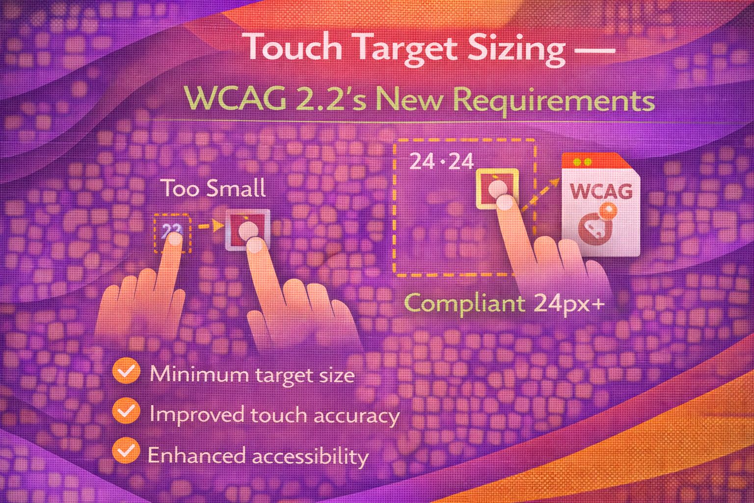
Ever wondered why some mobile apps feel effortless to use while others make you feel like you've got 'sausage fingers'? Let's be honest - tiny hit areas are broken, and WCAG 2.2 is finally doing something about it with the new 2.5.8 Target Size (Minimum) criterion.
The 24px Rule: More Than Just Width
The core requirement is that targets must be at least 24x24 CSS pixels, unless they have enough spacing around them. Here is the simplest way to ensure a button meets the minimum size directly.
/* CSS: Ensuring a minimum hit area directly */
.icon-button {
  min-width: 24px;
  min-height: 24px;
  display: inline-flex;
  align-items: center;
  justify-content: center;
  /* Visual icon might be smaller, but hit area is compliant */
  padding: 8px;
  border: none;
  background: transparent;
  cursor: pointer;
}
If you are working with raw HTML elements, you can apply these styles inline to guarantee the 24px threshold is met.
<!-- HTML: Inline compliance example -->
<button style="width: 24px; height: 24px; font-size: 24px;">
×
</button>The Spacing Exception: The 'Spacing Circle' Logic
Here's the cool bit: if your target is smaller than 24px, it can still pass if you provide enough spacing so that a 24px diameter circle centred on the target doesn't overlap any other target.
/* CSS: Using margins to create a compliant spacing buffer */
.small-target {
  width: 16px;
  height: 16px;
  /* Adding margin to prevent overlap with adjacent interactives */
  margin: 4px;
  /* 16px + 4px (left) + 4px (right) = 24px total footprint */
}
When targets are placed side-by-side, you'll need to ensure the total distance between them satisfies the spacing requirement.
<!-- HTML: Adjacent buttons with sufficient spacing -->
<button style="margin-right: 10px;">+</button>
<button>Adjacent Action</button>
Handling Icons and Ghost Buttons
I often see designers wanting 16px icons; the trick is to use padding to expand the hit area without changing the visual size of the icon itself.
/* CSS: Expanding the hit area of a small icon */
.toolbar-item {
  appearance: none;
  background: none;
  border: none;
  /* Icon is 16px, but padding makes the button 32px total */
  padding: 8px;
  width: 32px;
  height: 32px;
}

.toolbar-item svg {
  width: 16px;
  height: 16px;
  display: block;
}
Using pseudo-elements is another pro move to increase the hit area without affecting the layout flow of surrounding elements.
/* CSS: Invisible hit area expansion via pseudo-element */
.close-btn {
  position: relative;
  width: 12px;
  height: 12px;
}

.close-btn::before {
  content: '';
  position: absolute;
  top: 50%;
  left: 50%;
  width: 24px;
  height: 24px;
  transform: translate(-50%, -50%);
  /* This makes the clickable area 24x24 even if the button looks tiny */
}
Common Mistakes: Overlapping Hit Areas
The struggle is real when negative margins come into play, as they can cause hit areas to overlap, which is a direct violation of the spacing rule.
/* CSS: BAD PRACTICE - Negative margins causing overlap */
.bad-target {
  width: 20px;
  height: 20px;
  margin-left: -10px; /* This will likely fail WCAG 2.5.8 */
}
Instead, ensure that your layout logic accounts for the minimum 24px footprint for all interactive elements.
/* CSS: GOOD PRACTICE - Flexbox gap for consistent spacing */
.button-group {
  display: flex;
  gap: 8px; /* Ensures clear separation */
}

.small-action {
  width: 20px;
  height: 20px;
  /* Spacing + width exceeds the 24px circle requirement */
}
Browser Support & Implementation
There is no 'support' to track here because this isn't a new CSS property like Grid or Flexbox. It is an authoring requirement that applies to all browsers today.
- Applicable since WCAG 2.2 release (October 2023).
- No browser-specific APIs required.
- Works across all pointer inputs (touch, mouse, pen).
Wrapping Up
Implementing the 24px rule isn't just about following guidelines; it's about making our interfaces usable for everyone, especially those with motor impairments. Here's what to remember:
- Aim for a minimum target size of 24x24 CSS pixels wherever possible.
- If a target must be smaller, ensure it has enough spacing so that a 24px circle doesn't hit another target.
- Use padding and pseudo-elements to expand hit areas without ruining your design's aesthetic.
Give these techniques a try in your next design system update. It’s a small change that makes a massive difference for accessibility!
If you want to go deeper and learn how to build real, production-ready CSS design systems step by step, check out my full course here: CSS Design Systems Course
Got questions or want to share how you're using this? Drop me a message on LinkedIn - I always enjoy chatting about this stuff!