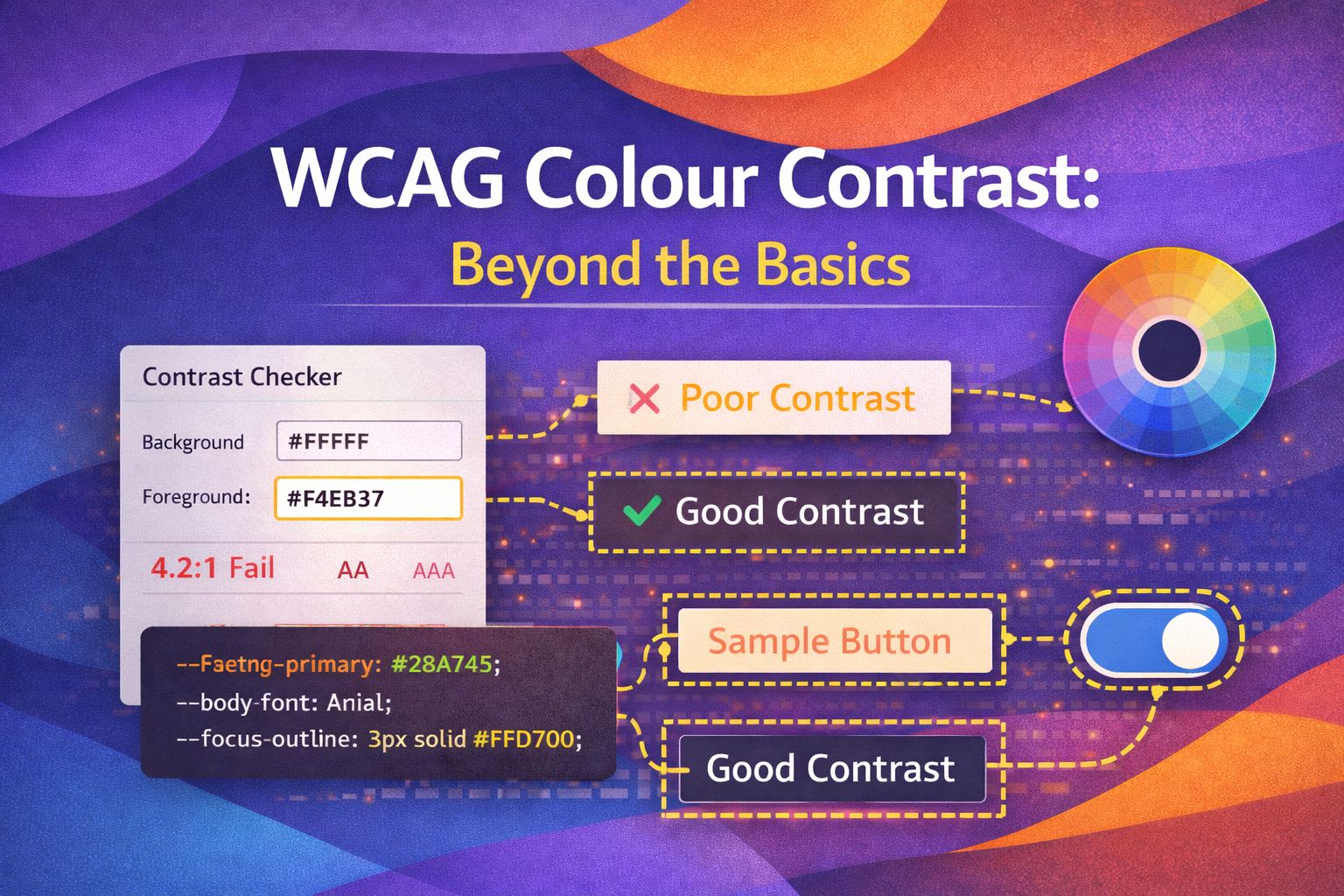
I've spent years obsessing over design systems, and if there's one thing I've learnt, it's that contrast is about much more than just passing a hex-code checker. While WCAG 2.1 is our current north star, I love exploring how we can use modern CSS to make our interfaces truly inclusive without sacrificing aesthetic flair.
The Logic of Relative Luminance
Before diving into code, it's essential to understand why contrast matters mathematically. WCAG contrast ratios are calculated using relative luminance—a measure of how bright a colour appears to the human eye.
The formula weights RGB channels differently because our eyes are more sensitive to green light than red, and far more sensitive to both than blue. This isn't arbitrary; it's based on decades of vision science research.
Understanding this helps you make informed decisions when your design tool says "4.48:1" but your users still struggle to read the text.
/* Defining our brand tokens with HSL for better control */
:root {
  --brand-hue: 210;
  --brand-saturation: 100%;
  --brand-lightness: 50%;

  --bg-color: hsl(var(--brand-hue), var(--brand-saturation), var(--brand-lightness));

  /* A simple toggle logic: if lightness > 60%, use black, else white */
  --text-color: lch(from var(--bg-color) calc((100 - l) * infinity) 0 0);
}
/* A more robust approach using CSS relative colours */
.card {
background: var(--surface-primary);
/* We calculate a high-contrast border based on the background */
border: 1px solid color-mix(in srgb, var(--surface-primary), black 20%);
color: oklch(from var(--surface-primary) clamp(0, (0.5 - l) * infinity, 1) 0 0);
}Implementing APCA in Your Workflow
APCA (Advanced Perceptual Contrast Algorithm) is the next evolution in contrast measurement, designed for WCAG 3.0. Unlike the current 2.1 algorithm, APCA considers:
- Polarity: Dark text on light backgrounds behaves differently than light text on dark backgrounds
- Font size and weight: Larger, bolder text can work with lower contrast
- Real-world perception: Based on modern vision science rather than 1990s research
While APCA isn't officially required yet, implementing it now future-proofs your design system and often produces better real-world readability results.
// A simple JS helper to check APCA contrast ratios
import { calcAPCA } from 'apca-w3';

const checkContrast = (fg, bg) => {
  const contrastValue = calcAPCA(fg, bg);
  console.log(`Perceptual Contrast: ${contrastValue}`);

  // APCA targets depend on font size and weight
  return Math.abs(contrastValue) >= 75 ? 'Pass for body text' : 'Fail';
};

checkContrast('#FFFFFF', '#004a99'); // Returns perceptual score
/* Using OKLCH to ensure uniform perceptual brightness across hues */
:root {
--success-oklch: oklch(65% 0.15 150);
--warning-oklch: oklch(65% 0.15 60);
--error-oklch: oklch(65% 0.15 25);
}
.badge {
/* Because the 'L' (lightness) is the same, they share contrast properties */
background: var(--success-oklch);
color: oklch(20% 0.04 150);
}Handling High Contrast Mode
Windows High Contrast Mode and prefers-contrast media query support users with low vision who need extreme contrast ratios. These aren't edge cases—millions of users rely on these settings daily.
The key principle: don't fight the system. Instead of trying to preserve your exact design, provide semantic meaning through borders, outlines, and system colours that adapt automatically.
This section shows how to gracefully enhance your components when high contrast is detected, ensuring your UI remains functional without breaking.
@media (forced-colors: active) {
  .button-primary {
    /* Ensure the button has a visible outline in high contrast mode */
    outline: 2px solid ButtonText;
    background: ButtonFace;
    color: ButtonText;
  }

  .icon-decorative {
    /* Hide icons that might become messy or redundant */
    forced-color-adjust: none;
    fill: CanvasText;
  }
}
/* Using system colours for semantic meaning */
.error-message {
border: 1px solid transparent;
}
@media (forced-colors: active) {
.error-message {
/* MarkText is specifically for highlighted or important text */
border-color: Mark;
outline: 1px solid Mark;
}
}Dynamic Contrast Adjustment with React
Real-world design systems need runtime contrast checking—especially when users can customise themes or when content comes from a CMS with unknown colours.
This React hook demonstrates how to:
- Calculate contrast ratios on-the-fly
- Automatically swap text colours when backgrounds change
- Provide accessible colour suggestions when contrast fails
This pattern is invaluable for theming systems, dark mode toggles, and any interface where colour combinations aren't predetermined.
import React, { createContext, useContext } from 'react';

const AccessibilityContext = createContext({ highContrast: false });

export const ThemeProvider = ({ children }) => {
  const [isHighContrast, setIsHighContrast] = React.useState(
    window.matchMedia('(prefers-contrast: more)').matches
  );

  return (
    <AccessibilityContext.Provider value={{ isHighContrast }}>
      <div className={isHighContrast ? 'theme--high-contrast' : 'theme--standard'}>
        {children}
      </div>
    </AccessibilityContext.Provider>
  );
};
.theme--high-contrast {
--text-main: #000000;
--text-muted: #222222;
--border-subtle: #000000;
--focus-ring: 3px solid #005a9c;
}
/* Standard theme for comparison */
.theme--standard {
--text-main: #1a1a1a;
--text-muted: #666666;
--border-subtle: #e5e5e5;
--focus-ring: 2px solid #3b82f6;
}Wrapping Up
Mastering colour contrast isn't just about passing a test; it's about creating a resilient UI that works for everyone, regardless of their environment or vision. Here's what I recommend focusing on:
- Leverage modern CSS relative colours and OKLCH to create perceptually uniform palettes.
- Always test your components in 'forced-colors' mode to ensure layout integrity.
- Move beyond AA standards and look toward APCA for a more human-centric approach to readability.
I encourage you to try implementing the relative colour syntax in your next project—it's a game-changer for dynamic themes! If you found this helpful, I'd love to connect! Follow me on Twitter/X or LinkedIn for more CSS and design system tips.