Right, let's talk about the elephant in the room: WCAG 3. Specifically, the 10 September 2026 working draft that's just landed. If you're like me, you've probably spent the last few days squinting at the new W3C documentation, trying to figure out how this actually changes our day-to-day work in design systems.
It's important to start with a reality check. This isn't a replacement standard yet; it's an evolving model for how we report accessibility progress. The biggest shift? The move toward outcome-oriented guidance and the introduction of a tiered reporting system.
Core vs. Supplemental: The New Hierarchy
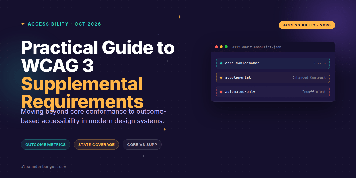
The September draft introduces a fundamental split. We now have core requirements, which form the baseline for conformance, and supplemental requirements. According to the W3C, these supplemental bits aren't required for basic conformance, but they're used to document "additional achievements" and help compare the accessibility quality of different products.
Think of it like this: Core requirements get you to Tier 3. If you want to reach those gold-standard Tiers 4 through 6, you'll need to start ticking off supplemental requirements and assertions. It's a way of rewarding teams that go above and beyond the bare minimum.
Translating the Draft into Your Design System
So, how do we actually use this in our component libraries? We need to stop thinking about simple pass/fail checklists and start thinking about state coverage and interaction patterns. I've found that breaking this down into three key areas makes it much more manageable.
- Interaction Patterns: You've got to test every component state—pointer, touch, focus, disabled, and validation. The goal is to ensure status changes are perceivable without relying solely on colour or animation.
- Content States: We need 'content contracts' for things like empty states, loading indicators, and localized strings. If your design system doesn't account for long-text or stale data, it's not fully accessible.
- Measurable Outcomes: This is the big one. We need to move from counting rules to measuring task completion. Can a user actually recover from an error using only a keyboard? That's the metric that matters.
Interaction States in Practice
In my experience, the 'default' state of a component is rarely where the accessibility issues hide. It's in the error messages, the loading spinners, and the dynamic updates. Here's a quick look at how we should be handling accessible error states in our forms:
<label for="email">Email address</label>
<input id="email" name="email" type="email"
       aria-describedby="email-error" aria-invalid="true">
<p id="email-error" role="alert">
  Enter a valid email address.
</p>
And don't forget your focus indicators. The supplemental requirements often point toward enhanced contrast and visibility. I always recommend a robust :focus-visible style that doesn't just rely on the browser default.
:focus-visible {
  outline: 3px solid currentColor;
  outline-offset: 3px;
}

@media (prefers-reduced-motion: reduce) {
  *, *::before, *::after {
    animation-duration: 0.01ms !important;
    transition-duration: 0.01ms !important;
    scroll-behavior: auto !important;
  }
}
Common Gotchas to Avoid
I've seen plenty of teams get tripped up by the new draft. First off, don't treat supplemental requirements as mandatory for basic conformance. The draft explicitly states they are for 'beyond-conformance' reporting. If you try to hit every supplemental requirement on day one, you'll likely burn out your engineering team.
Secondly, stop relying solely on automated pass rates. Automated tools are great for catching low-hanging fruit, but they can't tell you if a user can actually understand a dynamic status change or recover from a complex error. You need structured usability sessions and task-success logs for that.
Lastly, remember that this is still a working draft. The W3C has been clear that the thresholds—like the exact contrast ratios or the number of supplemental requirements needed for higher tiers—are still under development. Don't hard-code these values into your tooling just yet.
Wrapping Up
- Differentiate between Core and Supplemental requirements to set realistic conformance goals.
- Expand your component testing to include empty, error, loading, and localized states.
- Focus on user outcomes (task completion and error recovery) rather than just automated rule counts.
The WCAG 3 draft is a signal that the industry is moving toward a more holistic, human-centred view of accessibility. I'd encourage you to start experimenting with these supplemental requirements in your own design systems—not because they're 'required' yet, but because they'll make your products demonstrably better for everyone.
If you want to go deeper and learn how to build real, production-ready CSS design systems step by step, check out my full course here: CSS Design Systems Course
I cover the full pipeline in Ship Your Design System, 200 pages on Amazon Kindle.
Let's keep the conversation going. You can find me sharing more thoughts on Twitter or connect with me professionally on LinkedIn.