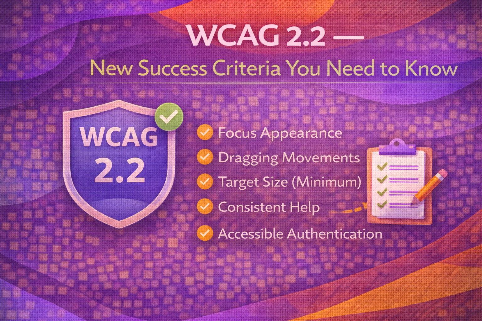
Ever wondered why some websites feel like a cognitive workout just to log in? Or why you keep accidentally clicking the 'Cancel' button when you meant to hit 'Save'? Well, the W3C has finally dropped WCAG 2.2, and honestly, it's about time. This update isn't just a minor tweak; it's a solid step towards making the web more inclusive for people with cognitive disabilities and those of us with slightly clumsy thumbs.
I've been digging through the new specs, and while 'compliance' might sound like a dry topic, the actual impact on UX is huge. Let's break down the most critical changes you need to bake into your design system today.
The Big Picture: What's New?
The update introduces 9 new success criteria. We've got 2 at Level A, 4 at Level AA (the sweet spot for most of us), and 3 at Level AAA. The focus has shifted heavily towards mobile interactions, cognitive load, and ensuring that focus indicators aren't playing hide-and-seek behind sticky headers.
1. Target Size (Minimum) - 2.5.8 (AA)
Here's the thing: we've all struggled with tiny buttons on mobile. WCAG 2.2 now mandates a minimum target size of 24x24 CSS pixels. If your button is smaller than that, it needs enough spacing around it so that a 24px circle centered on the target doesn't overlap another target.
The cool bit? You don't necessarily have to make every icon huge. You can use padding or invisible touch targets to meet the requirement. In a design system, I prefer setting a base variable for this.
/* Ensuring a minimum touch target in your design system */
.btn-icon {
  --min-target: 24px;
  min-width: var(--min-target);
  min-height: var(--min-target);

  /* If the icon is 16px, we add padding to hit 24px */
  display: inline-flex;
  align-items: center;
  justify-content: center;
  padding: 4px;

  /* Reset button styles */
  background: none;
  border: none;
  cursor: pointer;
}2. Focus Not Obscured - 2.4.11 (AA)
We've all been there: you're tabbing through a page, and suddenly the focus ring disappears under a sticky header or a cookie banner. It's infuriating. This new criterion says that when an item receives keyboard focus, it shouldn't be entirely hidden by other content.
To fix this globally, I always recommend using `scroll-margin-top`. It's a CSS lifesaver that ensures when you tab to an element, the browser leaves enough 'breathing room' at the top.
/* Global fix for sticky headers and focus */
:target,
:focus-visible {
  /* Set this to the height of your sticky header */
  scroll-margin-top: var(--header-height, 80px);
}

/* Pro move: Only apply when header is actually sticky */
.has-sticky-header :focus-visible {
  scroll-margin-block-start: 5rem;
}3. Accessible Authentication - 3.3.8 (AA)
Let's be honest—traditional CAPTCHAs are broken. Asking someone with a cognitive disability to solve a puzzle or remember a complex string just to log in is a massive barrier. WCAG 2.2 now requires that authentication doesn't rely on 'cognitive function tests' unless there's an alternative.
- Allowing password managers (don't block 'paste'!)
- Magic links or email codes
- Biometric login (FaceID/TouchID)
- Object recognition (if the user can upload their own photo)
/* React example: Ensure we don't block password managers */
const LoginForm = () => {
  return (
    <form>
      <label htmlFor="password">Password</label>
      <input
        id="password"
        type="password"
        autoComplete="current-password"
        /* NEVER do this: onPaste={(e) => e.preventDefault()} */
      />
      <p className="hint">
        Tip: You can use your password manager to auto-fill this field.
      </p>
    </form>
  );
};4. Redundant Entry - 3.3.7 (A)
If I've already told you my shipping address, don't make me type it again for billing. This isn't just good UX; it's now a Level A requirement. You must either auto-populate the data or allow the user to select it.
Wrapping Up
WCAG 2.2 is a major win for user experience. By focusing on these new criteria, we're not just 'ticking boxes'—we're making the web significantly more usable for everyone. Trust me on this one: auditing your design system for target sizes and focus visibility now will save you a massive headache later.
- Audit your components for the 24x24px minimum target size.
- Use scroll-margin-top to prevent sticky headers from hiding focus.
- Enable password managers and avoid redundant data entry in forms.
If you want to go deeper and learn how to build real, production-ready CSS design systems step by step, check out my full course here: CSS Design Systems Course
Got questions or want to share how you're implementing these new standards? Drop me a message on LinkedIn - I always enjoy chatting about this stuff!