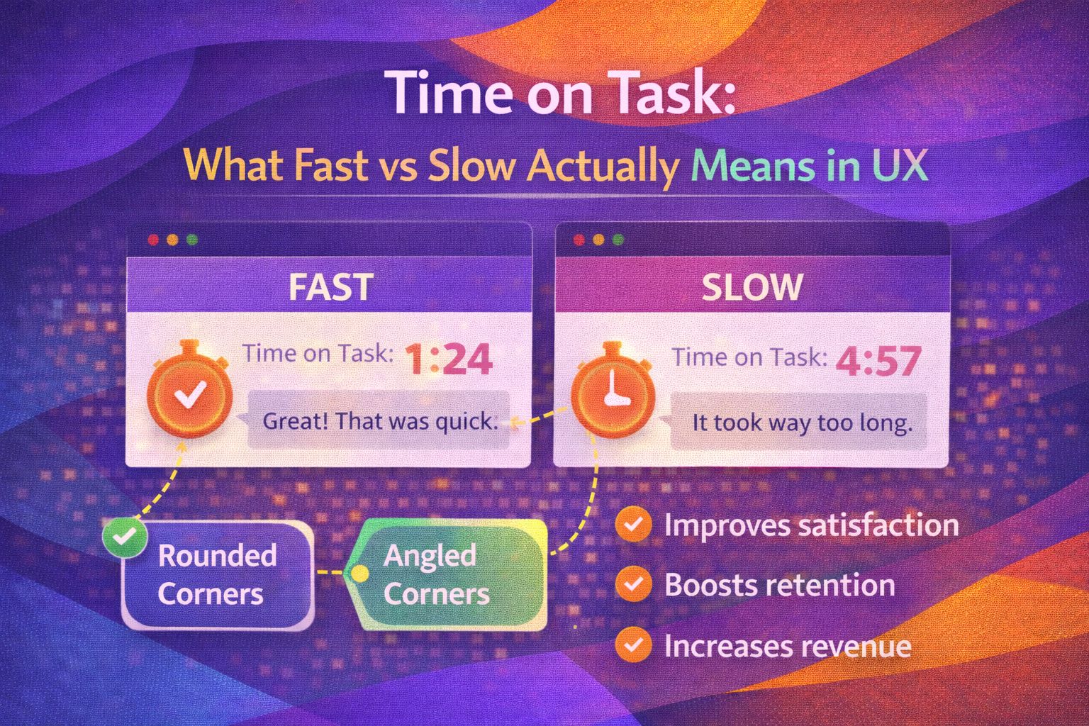
Ever wondered why we’re so obsessed with speed? In the world of UX, we often treat 'Time on Task' like a 100-metre sprint. If a user finishes quickly, we pat ourselves on the back and call it a win. If they linger, we start worrying about friction, confusing UI, or poor information architecture.
But here's the thing: speed is a bit of a liar. Sometimes, a 'fast' interaction is actually a sign of a user rushing through a confusing process, while a 'slow' interaction might mean they're deeply engaged or carefully considering a major purchase. Let's peel back the layers on what these metrics actually tell us about the human experience.
The Efficiency Trap
We’ve all been there—staring at a dashboard, looking at a drop in 'Average Time on Task' and thinking we've cracked the code. But we have to ask: why is it faster? Is it because the UI is more intuitive, or because we've removed necessary friction? In UX theory, we often distinguish between 'productive' and 'unproductive' time.
The Psychology of Cognitive Load
When we talk about time, we’re really talking about cognitive load. If a task takes a long time because the user has to hold too much information in their working memory, that's a failure. This is where Hick’s Law comes into play: the time it takes to make a decision increases with the number and complexity of choices.
I’ve found that the best designs don't necessarily aim for the shortest time, but for the lowest perceived effort. If a user is 'in the flow', they might spend five minutes on a task and feel like it took thirty seconds. Conversely, a frustrating thirty-second form can feel like an eternity.
Accessibility: The Time Multiplier
This is where we need to talk about A11y (Accessibility). For many users, 'Time on Task' isn't just about UI polish; it's about fundamental access. A screen reader user navigating a poorly structured table will always have a higher time on task than a sighted user. But is that 'slow' time because of the user, or because of the design?
When we ignore accessibility, we bake 'time penalties' into our products. If a keyboard-only user has to tab through fifty irrelevant links to get to a submit button, we've failed them. Our goal should be to reduce the relative time on task for all users, ensuring the gap between different interaction methods is as narrow as possible.
Measuring Success Beyond the Clock
So, if raw time isn't the ultimate truth, what should we look at? I like to combine Time on Task with two other critical metrics: Error Rate and Subjective Satisfaction.
- Error Rate: If they're fast but making mistakes, the UI is likely 'slippery' rather than efficient.
- Completion Rate: If they're slow but everyone finishes, the friction might be educational rather than obstructive.
- Satisfaction (ASQ): The After-Scenario Questionnaire helps us understand if the time spent felt 'worth it' to the user.
Real-World Scenario: The Checkout Experience
Imagine two checkout flows. Flow A is a single page with 20 fields. Flow B is a 3-step 'wizard'. Often, Flow B takes longer in seconds because of the transitions between steps. However, Flow B usually has a higher completion rate and lower perceived effort. Why? Because it reduces the cognitive load by focusing the user on one thing at a time.
Wrapping Up
Time on task is a nuanced metric. It’s a signal, not a verdict. As UX engineers and designers, our job isn't just to make things fast; it's to make them meaningful, accessible, and effortless.
- Context is King: A 'slow' time on a banking app's security settings is better than a 'fast' time that misses a critical toggle.
- A11y is Efficiency: Improving accessibility naturally lowers the time on task for your most vulnerable users.
- Perception over Precision: Focus on reducing cognitive load rather than just shaving off milliseconds.
Next time you're looking at your analytics, don't just ask 'how fast?'. Ask 'how much effort?'. Trust me, your users will thank you for it.
If you found this breakdown helpful, I'd love to hear your thoughts! Do you prioritise speed or flow in your designs? Let's chat on LinkedIn or follow me on Twitter/X @alexandersstudi for more UX insights.