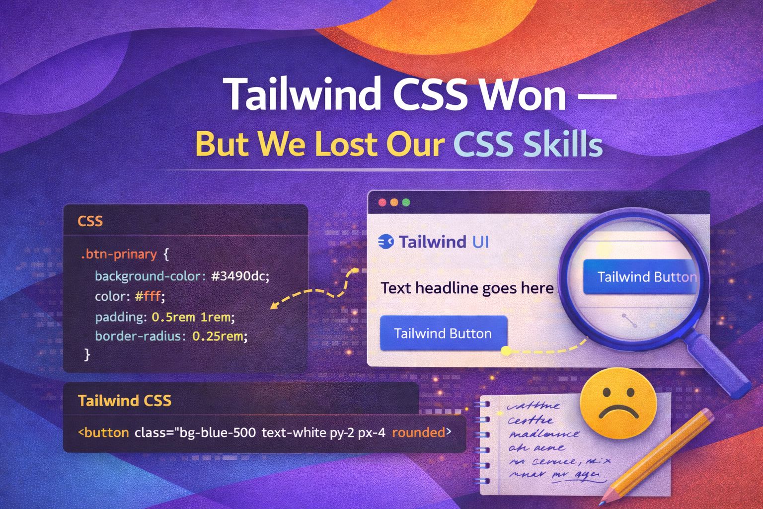
I've watched Tailwind grow from a niche utility library to an absolute juggernaut with over 20 million weekly downloads. It's undeniable: Tailwind has won the CSS framework wars, but I'm starting to worry that we're losing our grip on the actual language that powers the web.
The Syntax Trap: Utility vs. Reality
Many developers I interview today can tell me exactly how to centre a div in Tailwind, but they struggle to explain what's actually happening under the hood. Here's how we've swapped understanding for memorisation.
<!-- The Tailwind way -->
<div class="flex items-center justify-center h-screen">
  <p>I'm centred, but do you know why?</p>
</div>
This works brilliantly until you're in a legacy codebase or a vanilla environment and realize you've forgotten the fundamental properties that make this possible.
/* The platform reality */
.container {
  display: flex;
  align-items: center;
  justify-content: center;
  height: 100vh;
}

/* Or the modern shorthand I personally prefer */
.container-modern {
  display: grid;
  place-items: center;
  min-height: 100dvh;
}The Dark Side of Hover and State
Tailwind makes states like hover and focus incredibly easy, but it abstracts away the cascading nature of CSS that makes complex UI interactions possible. I've seen developers struggle to style a child element based on a parent's state without a utility class for every single permutation.
<!-- Tailwind's group-hover is clever, but proprietary -->
<div class="group p-4 hover:bg-slate-100">
  <h2 class="group-hover:text-blue-600">Hover the parent!</h2>
</div>
When we rely solely on 'group-hover', we lose sight of how powerful CSS combinators actually are for managing complex component logic.
/* Standard CSS allows for much more granular control */
.card:hover .card-title {
  color: var(--primary-600);
}

/* We can even target elements based on sibling states */
.input:focus + .label {
  transform: translateY(-100%);
  font-size: 0.8rem;
}
AI Loves Tailwind, but Humans Need Context
LLMs are incredibly good at spitting out Tailwind strings because the patterns are predictable, but this leads to 'div soup' that is a nightmare to audit for accessibility or performance.
/* AI generated Tailwind mess */
<button class="inline-flex items-center px-4 py-2 border border-transparent text-sm font-medium rounded-md shadow-sm text-white bg-indigo-600 hover:bg-indigo-700 focus:outline-none focus:ring-2 focus:ring-offset-2 focus:ring-indigo-500 transition-colors duration-200">
  Submit
</button>
Compare that to a clean, semantic approach where the CSS handles the heavy lifting, keeping your HTML readable and your intent clear.
/* Semantic and reusable */
.btn-primary {
  appearance: none;
  padding: 0.5rem 1rem;
  border-radius: 0.375rem;
  background-color: var(--brand-color);
  transition: background 200ms ease;
}

.btn-primary:focus-visible {
  outline: 2px solid var(--brand-color);
  outline-offset: 2px;
}Maintenance at Scale: The Utility Debt
In large-scale design systems, I've found that Tailwind can actually become a maintenance burden when you need to update a core brand colour across 500 components that all have hardcoded utility classes.
// React component with Tailwind debt
const Card = ({ children }) => (
  <div className="bg-white dark:bg-gray-800 rounded-lg shadow-md p-6 border border-gray-200 dark:border-gray-700">
    {children}
  </div>
);
By using CSS variables and logical properties, we can create systems that are far more resilient to design changes without touching the markup.
/* Design System Tokens */
:root {
  --card-bg: #ffffff;
  --card-border: #e5e7eb;
  --card-padding: 1.5rem;
}

@media (prefers-color-scheme: dark) {
  :root {
    --card-bg: #1f2937;
    --card-border: #374151;
  }
}

.card {
  background: var(--card-bg);
  border: 1px solid var(--card-border);
  padding: var(--card-padding);
  border-radius: var(--radius-lg);
}When Tailwind Makes Sense
Don't get me wrong, I use Tailwind for rapid prototyping and small projects. It's a tool, not a religion. The trick is knowing when to use it and when to stick to the platform.
<!-- Perfect for quick layouts -->
<section class="grid grid-cols-1 md:grid-cols-3 gap-4">
  <div class="p-4 bg-blue-50">Feature 1</div>
  <div class="p-4 bg-blue-50">Feature 2</div>
  <div class="p-4 bg-blue-50">Feature 3</div>
</section>
But for complex UI components like accessible tabs or modals, I'll always reach for standard CSS to handle the intricate state management.
/* Managing complex state with CSS */
.tab-panel[aria-hidden="true"] {
  display: none;
}

.tab-control[aria-selected="true"] {
  border-bottom: 2px solid var(--accent);
  color: var(--accent-bold);
}Wrapping Up
Tailwind is an incredible achievement in DX, but it shouldn't be a replacement for learning the language of the web. If you can't build your layout without it, you aren't a CSS expert; you're a Tailwind expert.
- Tailwind is a great productivity tool, but it abstracts away the fundamentals of the CSS box model and cascade.
- Relying solely on utilities can lead to maintenance debt and 'div soup' that is harder to debug and audit.
- True seniority in UX Engineering comes from understanding the platform (CSS) first, and the tooling (Tailwind) second.
I encourage you to try building your next small component using only vanilla CSS and modern features like CSS Grid and Variables. You might be surprised at how much cleaner it feels! If you found this helpful, I'd love to connect! Follow me on Twitter/X or LinkedIn for more CSS and design system tips.