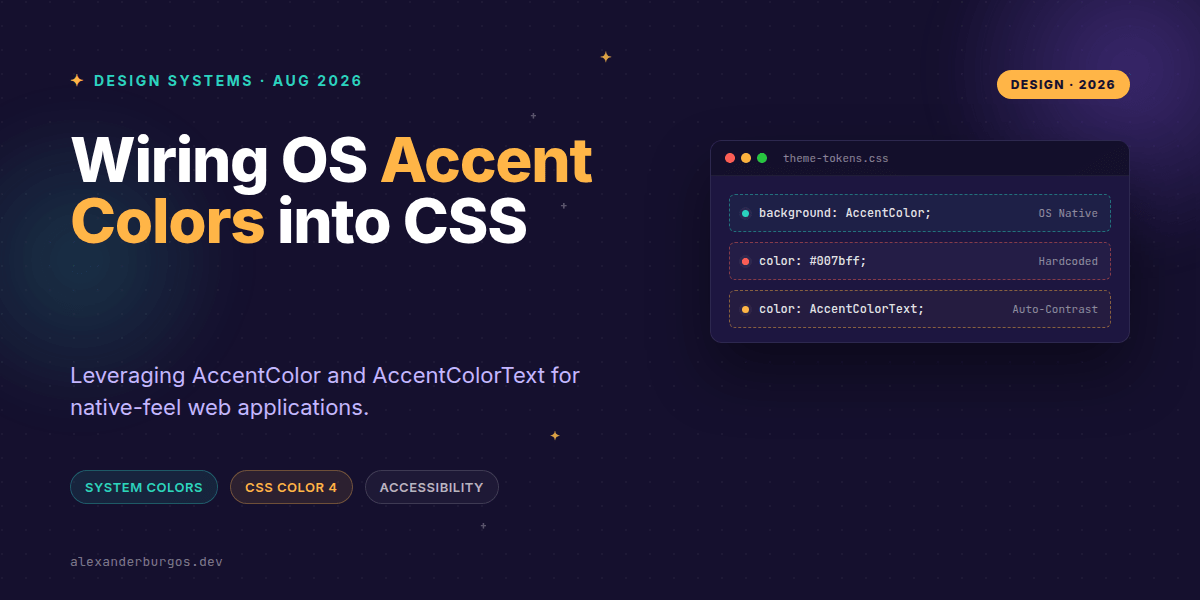
Ever wondered why some web apps feel like they truly belong on your desktop while others feel like a foreign layer sitting on top of your OS? The secret usually lies in how they handle the user's personal preferences. We've spent years building complex theming engines to let users pick their favourite primary colour, but we often ignore the one they've already chosen in their system settings.
Right, let's talk about AccentColor and AccentColorText. These aren't just new properties; they represent a fundamental shift in how we think about design system tokens. Instead of forcing our brand onto every single interaction, we can now wire the OS-level accent color directly into our components with zero custom JavaScript.
The Difference Between Property and Keyword
Before we dive into the implementation, I've noticed a bit of confusion in the community regarding the naming. It's easy to mix up accent-color (the property) with AccentColor (the system color keyword). Let's clear that up.
- accent-color (Property): This allows you to change the colour of native form elements like checkboxes and radio buttons. It's been around for a bit and is great for quick branding.
- AccentColor (Keyword): This is a dynamic value from the CSS Color Module Level 4. It represents the background colour of accented UI controls as defined by the user's OS.
- AccentColorText (Keyword): This is the companion keyword that ensures accessibility. It provides a contrasting foreground colour that is guaranteed to be readable against
AccentColor.
In my experience, the real magic happens when you use these keywords outside of form controls. Think badges, active navigation states, or custom focus rings that respect the user's setup.
Implementing Native-Feel Components
Last week I was debugging a design system where we had about fifteen different shades of blue just to handle various hover and active states. It was a nightmare to maintain. By switching to system keywords, you can simplify your CSS significantly. Here is a basic example of how you might style a status badge:
.badge-active {
  background-color: AccentColor;
  color: AccentColorText;
  border-radius: 4px;
  padding: 0.2em 0.5em;
}
The beauty of this approach is that if a user changes their Windows accent to 'Electric Purple' or their macOS highlight to 'Graphite', your UI updates automatically. It feels integrated, accessible, and intentional.
Production-Safe Theming and Progressive Enhancement
I'm a big fan of progressive enhancement. While browser support is growing—with Microsoft Edge 150 and recent Chromium updates leading the way—you shouldn't just bin your brand colours entirely. The smartest way to handle this in a production design system is via CSS variables.
:root {
  /* Fallback to brand blue if system colors aren't supported */
  --brand-primary: #007bff;
  --brand-on-primary: #ffffff;
}

@supports (color: AccentColor) {
  :root {
    --brand-primary: AccentColor;
    --brand-on-primary: AccentColorText;
  }
}

.button-primary {
  background: var(--brand-primary);
  color: var(--brand-on-primary);
}
This pattern ensures that your application remains functional on older browsers while providing a premium, native experience for users on modern platforms. It's the best of both worlds.
Accessibility and Forced Colors Mode
We've all been there—building a beautiful theme only to realise it completely breaks for users with visual impairments using High Contrast modes. The spec for AccentColor explicitly addresses Forced Colors Mode.
When a user enables a high-contrast theme, the browser will override your AccentColor values with the system's forced palette. Because you're using the standard keywords, your UI will adapt gracefully rather than fighting the user's accessibility settings. It's a massive win for WCAG compliance with almost zero effort on our part.
Potential Gotchas
Don't assume AccentColor is a stable branding token. Since it's tied to device settings, you lose a bit of control over the exact hex code. If your marketing team insists on a specific shade of 'Sunset Orange' for every single button, this might not be the tool for those specific elements.
Also, keep an eye on privacy discussions. There have been mentions in Chromium groups regarding fingerprinting—since exposing a specific OS accent color could theoretically help identify a user. However, for most of us building internal tools or standard SaaS apps, the UX benefits far outweigh these edge-case concerns.
Wrapping Up
- Use
AccentColorandAccentColorTextas a pair to ensure accessible contrast ratios automatically. - Implement these keywords via CSS variables with fallbacks to maintain brand consistency on unsupported browsers.
- Leverage system colors to reduce the complexity of your theming logic and improve integration with Forced Colors Mode.
I'd encourage you to try swapping out your primary action colours in a feature branch today. You might be surprised at how much cleaner your CSS feels when you let the operating system do the heavy lifting for you.
If you want to go deeper and learn how to build real, production-ready CSS design systems step by step, check out my full course here: CSS Design Systems Course
If you want the long-form version of this with 23 chapters and runnable code, Ship Your Design System on Amazon is the handbook.
Let's keep the conversation going! You can find me sharing more CSS tips on Twitter at https://x.com/alexandersstudi or connect with me for design system deep-dives on LinkedIn at https://www.linkedin.com/in/alexandersstudio/