Right, let's talk about the property we all spent a decade pretending didn't exist. For the longest time, zoom was the black sheep of CSS—a proprietary Internet Explorer relic that felt slightly "dirty" to use in a professional codebase. We reached for transform: scale() instead, even when we knew it was a poor fit for layout.
But things have changed. As of 2026, CSS zoom has effectively standardized. With Chrome 151 adding key implementation details like animatability, it's time to re-evaluate how we handle multi-scale UI and dense data views. If you've ever struggled to build a "compact mode" for a dashboard, this is for you.
Why Zoom Wins Over Transforms
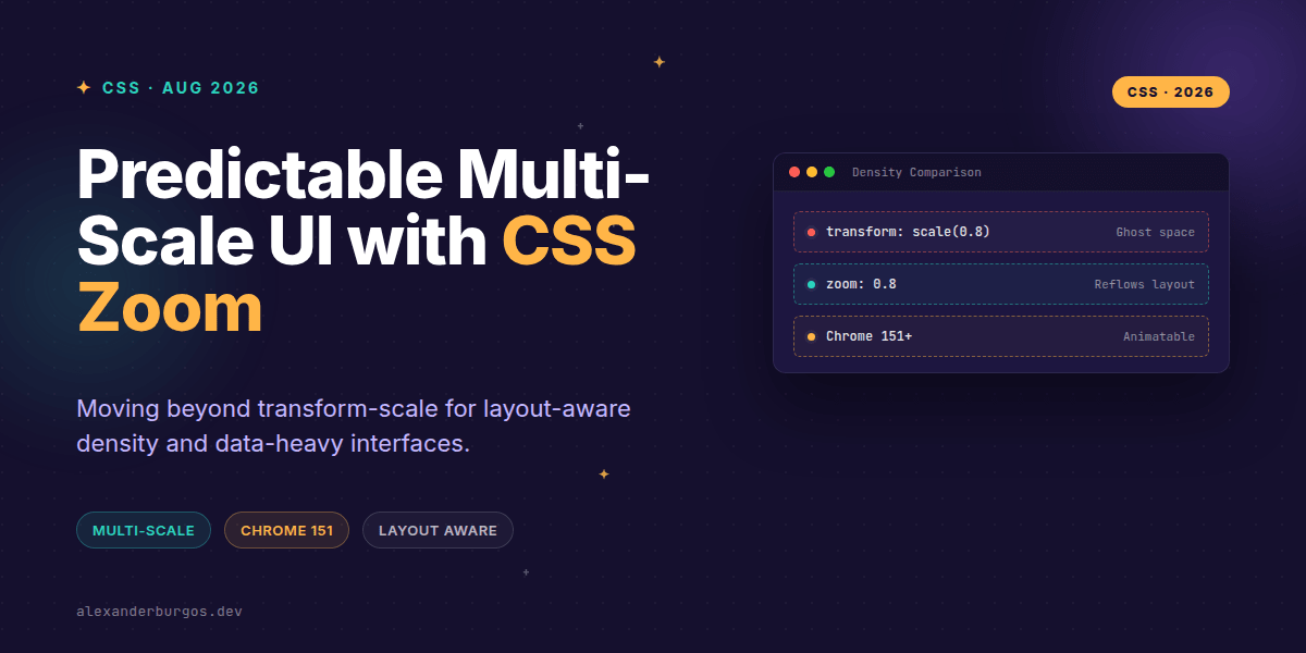
The fundamental problem with transform: scale() is that it's a visual lie. It scales the rendering of an element, but the browser still calculates the layout based on the original size. This leaves you with awkward "ghost whitespace" around your components that you then have to fix with negative margins or absolute positioning.
In contrast, zoom actually scales the element and its layout. As Stefan Judis noted, “zoom really scales the element and its layout.” When you zoom an element down to 80%, the surrounding elements reflow to fill the space. It’s predictable, clean, and exactly what we need for design system density levels.
Standardization and Browser Support
Forget the old warnings about non-standard behavior. We now have broad support across the board. Chrome (since version 4, but refined in 151), Edge, and Safari have supported it for years. The big news was Firefox joining the party around version 126. We’ve reached a tipping point where we can use this safely as a core part of our CSS architecture.
- Chrome/Edge: Full support, now with interpolation for animations.
- Firefox: Modern versions (126+) now respect the property.
- Safari: Supported, though you need to watch out for
getBoundingClientRectquirks.
Implementing Multi-Scale Tokens
I've found the best way to use this in a design system is through density tokens. Instead of writing custom CSS for every "compact" variant, you can apply a zoom level to a container and let the browser do the heavy lifting.
:root {
  --density-compact: 0.85;
  --density-normal: 1;
  --density-spacious: 1.15;
}

.data-grid[data-density="compact"] {
  zoom: var(--density-compact);
}

.data-grid[data-density="spacious"] {
  zoom: var(--density-spacious);
}
This approach keeps your spacing units (like rem or px) consistent across the app while providing a perfectly scaled-down view for power users who need to see more data at once.
The Chrome 151 Advantage: Animation
One of the most exciting recent updates is that zoom is now animatable. Per the Chrome release notes, it interpolates as a number. This means we can smoothly transition between density states without the jarring "jump" we used to see.
.dashboard-panel {
  transition: zoom 0.3s cubic-bezier(0.4, 0, 0.2, 1);
}

.dashboard-panel:focus-within {
  zoom: 1.1; /* Smoothly focus the active area */
}
Accessibility and Gotchas
We need to be careful with zoom: reset. MDN points out that this prevents the element from being magnified by non-pinch user zooming (like Ctrl++). Unless you have a very specific technical reason to break user expectations, I'd suggest avoiding reset to keep your interface accessible.
Also, keep an eye on Safari. While it supports zoom, it sometimes fails to update layout metrics immediately in JavaScript. If you're calculating positions based on getBoundingClientRect(), you might get the unzoomed values. Always test your drag-and-drop or popover logic in WebKit when using high zoom factors.
Wrapping Up
- Use
zoomfor layout-aware scaling wheretransform: scalefails. - Leverage design system tokens to manage density across data-heavy views.
- Take advantage of Chrome 151's animatability for smooth density transitions.
I'd encourage you to experiment with this on your next dashboard project. It's one of those "hidden in plain sight" properties that finally has the browser backing it deserves.
If you want to go deeper and learn how to build real, production-ready CSS design systems step by step, check out my full course here: CSS Design Systems Course
I cover this and the other twenty-seven CSS shifts of 2026 in Modern CSS 2026 on Amazon, my catch-up book for people who learned CSS five years ago.
Let's keep the conversation going. You can find me sharing more CSS tips on Twitter or connect with me on LinkedIn.