Ever wondered why, despite all our modern tooling, we're still fighting the CSS cascade like it's 2010? We want components that are perfectly isolated, yet we also need them to play nice with our global design system themes. It's a classic tug-of-war between encapsulation and integration.
For a long time, Shadow DOM was the only way to get true 'style isolation'. But it often felt like a walled garden—great for keeping things out, but a nightmare when you actually wanted to let a global brand colour in. That's why I'm genuinely excited about how the CSS @scope at-rule is changing the game for those of us building production design systems.
The New Reality of Scoped CSS
With the full cross-browser support of @scope (hello, Firefox 131!), we finally have a native way to define boundaries within our subtrees. Unlike Shadow DOM, which provides a hard physical boundary, @scope gives us a logical one. When you combine them, you get the best of both worlds: performance and predictability.
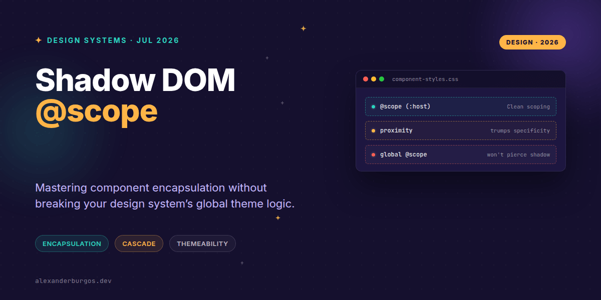
One of the most powerful shifts here is how the cascade works. We're used to specificity (IDs beating classes, and so on). But with @scope, we get scoping proximity. This means the browser looks at how close the style definition is to the element in the DOM tree. If two rules conflict, the 'closer' scope wins, even if it has lower specificity. It's a much more intuitive way to handle overrides in a complex UI.
Shadow DOM meets @scope
I've found that using @scope inside a Shadow Root is the 'secret sauce' for modern web components. It allows you to write styles that are implicitly scoped to the shadow root itself without relying on complex selectors.
/* Inside the component's shadow DOM */
@scope {
  :scope {
    display: inline-block;
  }

  button {
    padding: 0.5rem 1rem;
    background: var(--ds-btn-bg, #007bff);
    border: none;
  }
}
In this example, the button style is tightly locked to the component. Global CSS cannot reach in and break it. However, because we're using CSS variables, the design system can still 'reach through' the boundary to apply branding.
Why Performance Matters at Scale
If you're building a design system that powers thousands of pages, performance isn't just a 'nice to have'. Research by Nolan Lawson has shown that Shadow DOM scoping is often the fastest way for browsers to calculate styles. Why? Because the browser only has to look at a tiny subset of the DOM and a small set of rules at any given time.
Instead of the browser having to check every global rule against every element on the page, the shadow boundary acts as a shortcut. When you add @scope into the mix, you're giving the browser even clearer instructions on how to process your CSS efficiently.
Common Pitfalls to Avoid
Right, let's talk about the 'gotchas' because they will trip you up if you aren't careful. First, remember that global @scope does not pierce the Shadow DOM. If you define a scope in your main index.css, it won't affect elements inside your Web Components. This is a common point of confusion.
- Inheritance still happens: Properties like
font-familyandcolorwill still leak into your shadow DOM. This is usually what you want for a consistent UX, but it can be a surprise if you're expecting total isolation. - Specificity vs Proximity: Don't forget that proximity can trump specificity. If you're used to just adding another class to win a CSS battle, that might not work if a closer scope is defined.
- The !important flip: In a weird twist of the spec, for normal rules, the outer context wins, but for
!importantrules, the inner context (the shadow DOM) wins. Use this power wisely!
Themeable Architecture with :host
The best way to handle themes in a design system is by using :host or :host() as your scope root. This allows your component to respond to its surrounding environment while keeping its internal structural styles protected.
/* Design System Global Styles */
@scope (.theme-dark) {
  my-custom-button {
    --ds-btn-bg: #222;
    --ds-btn-text: #fff;
  }
}

/* Inside Web Component */
<style>
  @scope (:host) {
    button {
      background-color: var(--ds-btn-bg);
      color: var(--ds-btn-text);
    }
  }
</style>
This pattern is incredibly robust. The outer scope handles the 'intent' (dark mode), while the inner scope handles the 'implementation' (how the button looks). It's clean, it's native, and it's remarkably easy to debug in the dev tools.
I cover this and the other twenty-seven CSS shifts of 2026 in Modern CSS 2026 on Amazon, my catch-up book for people who learned CSS five years ago.
Wrapping Up
- Use
@scopeinside Shadow DOM to create high-performance, predictable component styles. - Leverage scoping proximity to manage overrides instead of fighting specificity wars.
- Remember that global scopes won't pierce the shadow boundary—use CSS variables for theming instead.
The combination of @scope and Shadow DOM is a massive leap forward for UX engineering. I'd encourage you to start experimenting with it in your small utility components first before rolling it out across an entire library. It feels like we're finally getting the tools we've deserved for years.
If you want to go deeper and learn how to build real, production-ready CSS design systems step by step, check out my full course here: CSS Design Systems Course
Let's keep the conversation going! You can find me sharing daily CSS tips on Twitter or connect with me for a more professional deep dive on LinkedIn.