Here's the thing -- most design systems don't fail because the components are ugly or the code is broken. They fail because tokens are applied inconsistently, there's no single source of truth, and the moment someone says "can we add a dark mode?" the whole thing falls apart.
Sound familiar?
I've seen teams with beautifully crafted component libraries where every developer uses slightly different colour values. One person grabs the hex from the design file, another copies the RGB from the browser inspector, and someone else creates a variable called blue-ish because they couldn't find the token. The result? A system that looks consistent on the surface but is held together with duct tape underneath.
The good news is there's a proper way to solve this. Semantic tokens combined with Figma Variables give you a single source of truth, effortless theming, and a clean bridge between design and code. Let me walk you through the whole thing.
What Are Design Tokens?
Design tokens are the smallest building blocks of a design system. They store visual decisions -- colours, spacing, typography, border radii -- as named, reusable values instead of hard-coded numbers.
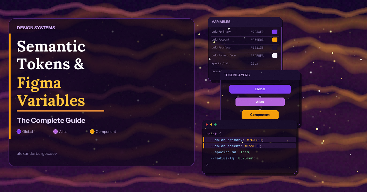
But not all tokens are created equal. The architecture that actually works at scale has three tiers:
1. Primitive Tokens (Global / Core)
These are your raw values. Think of them as your palette -- the complete set of options available in your system.
- color.blue.500 ? #3b82f6
- color.gray.900 ? #0f172a
- spacing.16 ? 16px
- font.size.14 ? 0.875rem
Important rule: you should never apply primitive tokens directly to components. They exist only to be referenced by the next tier.
2. Semantic Tokens (Alias / Purpose)
Semantic tokens carry meaning. They describe what a value is used for, not what it looks like.
- color.text.primary ? references color.gray.900
- color.bg.surface ? references color.white
- color.text.error ? references color.red.500
- spacing.section ? references spacing.64
This is where the magic happens. Because semantic tokens reference primitives, you can swap the underlying value for a different mode (like dark theme) without touching a single component.
3. Component Tokens (Optional Third Tier)
Some design systems add a third layer for component-specific decisions:
- button.background.primary.default ? references color.bg.action
- button.background.primary.hover ? references color.bg.action-hover
- alert.title.color ? references color.text.error
My honest take -- component tokens are brilliant for large organisations with multiple product teams, but they add complexity. If your team is fewer than 10 people, start with just primitives and semantics. You can always add the third tier later.
The Token Chain in Action
Here's how a single value flows through the system:
#ef4444  ?  color.red.500  ?  color.text.error  ?  alert.title.color
(raw value)   (primitive)      (semantic)           (component)
If you decide to change your error colour from red to orange, you update one primitive token and every component in every theme updates automatically. That's the power of this architecture.
Why Semantic Tokens Matter
Let's be honest -- you could skip semantic tokens entirely and just reference primitives everywhere. But the moment your system needs to grow, you'll regret it. Here's why semantic tokens are worth the effort:
- Theme switching -- Switch between light, dark, high-contrast, or brand themes by changing which primitives each semantic token points to. Zero component changes needed.
- Consistency at scale -- When every developer uses color.text.primary instead of picking their own grey, things stay consistent across products.
- Better design-dev handoff -- Designers and developers speak the same language. The Figma variable name is the CSS variable name.
- Single source of truth -- Change it once, it updates everywhere. No more find-and-replace across 47 files.
- Reduced cognitive load -- Developers don't need to remember that "the main text colour is gray-900 in light mode but gray-100 in dark mode". They just use color.text.primary and the system handles the rest.
Figma Variables: The Setup
Figma Variables launched in 2023 and they've fundamentally changed how we build design systems in Figma. If you were using Figma Styles before, variables are the next level -- they support modes, aliasing, and scoping.
Collections and Modes
A collection is a group of related variables. A mode is a variant of that collection -- like Light and Dark for your semantic colours.
I use numeric prefixes to control the order in the panel:
- 00 Primitives -- raw colour palette, spacing scale, type scale
- 01 Semantic -- purpose-based tokens with Light/Dark modes
- 02 Component -- component-specific overrides (optional)
On standard Figma plans, you get up to 4 modes per collection. That's enough for Light, Dark, High Contrast, and one more (perhaps a specific brand). Enterprise plans unlock more.
Variable Types
Figma Variables support four types:
- Colour -- hex, RGB, or RGBA values (the one you'll use the most)
- Number -- spacing, sizing, border radius, opacity
- String -- font families, text content (less common)
- Boolean -- show/hide layers, toggle component props
Building Your Token Structure in Figma
Let me walk you through the practical setup, step by step.
Step 1: Create Your Primitives Collection
Open the Variables panel (right sidebar or use the shortcut). Create a new collection called 00 Primitives. This collection only needs one mode -- primitives don't change between themes.
Add your colours with a structured naming convention:
color/blue/50     #eff6ff
color/blue/100    #dbeafe
color/blue/500    #3b82f6
color/blue/900    #1e3a8a

color/gray/50     #f8fafc
color/gray/100    #f1f5f9
color/gray/900    #0f172a

spacing/4         4
spacing/8         8
spacing/16        16
spacing/24        24
spacing/32        32
spacing/64        64

radius/4          4
radius/8          8
radius/full       9999
Use forward slashes to create groups -- Figma will display them as collapsible folders in the panel. Much cleaner than flat lists.
Step 2: Create Your Semantic Collection
Create a new collection called 01 Semantic. This time, add two modes: Light and Dark.
Now create your semantic variables. The key here is that each value references a primitive rather than holding a raw hex value. In Figma, you do this by clicking the colour swatch and selecting a variable from the 00 Primitives collection.
Variable name              Light mode             Dark mode
-------------------------  ---------------------  ---------------------
color/text/primary         color/gray/900         color/gray/50
color/text/secondary       color/gray/600         color/gray/400
color/text/error           color/red/500          color/red/400
color/bg/surface           color/white            color/gray/900
color/bg/surface-raised    color/gray/50          color/gray/800
color/border/default       color/gray/200         color/gray/700
color/action/primary       color/blue/500         color/blue/400
Step 3: Apply Semantic Tokens to Components
This is the part most people get wrong. When you build your components, never apply primitive tokens directly. Always use semantic tokens.
For example, a card component should use color/bg/surface for its background, color/text/primary for its heading, and color/border/default for its border. If you use color/gray/900 directly, it won't switch when you change modes.
Use Variable Scoping
You know what's a real time-saver? Variable scoping. Right-click any variable and choose "Edit variable". Under "Scoping", you can restrict where a variable can be applied -- for example, limit a spacing variable so it only shows up for gap, padding, and margin properties, not for width or height.
This stops designers from accidentally using spacing/4 as a border width or a corner radius. Small thing, but it keeps the system clean.
And while you're editing variables, add descriptions to every one. Future you (and every other team member) will thank you. Something like "Primary text colour for body copy and headings" is enough.
Naming Conventions That Scale
Naming tokens is one of those things that feels trivial until you have 400 of them and realise half don't make sense. I've learnt this the hard way.
The taxonomy I recommend comes from Nathan Curtis and follows this pattern:
category / concept / property / variant / state

Examples:
color / text / primary
color / bg / surface / raised
color / action / primary / hover
spacing / section / gap
Rules That Keep Things Consistent
- Use forward slashes in Figma for grouping -- they create collapsible folders in the panel
- Use full words -- background or bg is fine, just pick one and stick with it
- Stay language-neutral -- use primary, secondary, inverse instead of dark, light, white
- Be consistent with prefixes -- if colours start with color/, don't suddenly switch to clr/
Good vs Bad Examples
? Bad                          ? Good
-----------------------------  -----------------------------
blue-500                       color/action/primary
dark-text                      color/text/primary
btn-bg                         color/action/primary
card-shadow-dark               elevation/shadow/medium
my-spacing                     spacing/content/gap
Dark Mode in 5 Minutes
Here's where all the setup pays off. If you've built your semantic layer properly, adding dark mode is almost embarrassingly easy.
- Open your 01 Semantic collection
- Make sure you have two modes: Light (default) and Dark
- For each semantic token, set the Dark mode value to a different primitive
- That's it. Select any frame, change its mode to Dark, and watch everything update
The same color/text/primary token points to color/gray/900 in Light mode and color/gray/50 in Dark mode. Your components don't change at all -- they just reference the semantic token, and the mode determines which primitive gets resolved.
One component, both themes. No duplicated designs. No separate dark-mode artboards. This is what I use daily and it's a genuine game-changer.
From Figma to Code: The Bridge
Having a perfect token setup in Figma means nothing if it doesn't translate to code cleanly. Here's how I approach it.
CSS Custom Properties Structure
The CSS structure should mirror your Figma collections. Primitives go on :root. Semantic tokens reference primitives and are scoped to themes:
/* Primitives -- raw values */
:root {
  --gray-50: rgb(248 250 252);
  --gray-100: rgb(241 245 249);
  --gray-900: rgb(15 23 42);
  --blue-500: rgb(59 130 246);
  --red-500: rgb(239 68 68);
}

/* Semantic -- Light mode (default) */
:root,
.light {
  --color-text-primary: var(--gray-900);
  --color-text-secondary: var(--gray-600);
  --color-bg-surface: var(--white);
  --color-action-primary: var(--blue-500);
}

/* Semantic -- Dark mode */
.dark {
  --color-text-primary: var(--gray-50);
  --color-text-secondary: var(--gray-400);
  --color-bg-surface: var(--gray-900);
  --color-action-primary: var(--blue-400);
}
Components only ever use semantic variables. This means your component CSS never changes between themes:
.card {
  background: var(--color-bg-surface);
  color: var(--color-text-primary);
  border: 1px solid var(--color-border-default);
}
Automating the Pipeline
You don't want to manually sync tokens between Figma and code. There are several approaches:
- Design System SYNC -- Export variables from Figma as JSON, then run them through Style Dictionary to generate CSS, SCSS, iOS, Android -- whatever you need. This is the most popular pipeline right now.
- Figma REST API -- Programmatically fetch variables from your Figma file. Great for custom integrations.
- GitHub Actions -- Set up a workflow that pulls tokens from Figma, transforms them with Style Dictionary, and creates a pull request. Your tokens update automatically whenever someone changes them in Figma.
What I've learnt is that the best pipeline is the one your team will actually use. If that's a simple export and a copy-paste into a JSON file, that's fine for now. Automate when it becomes painful.
W3C Design Tokens Format
Quick mention of something important -- the W3C Design Tokens Community Group published a stable specification in October 2025. This gives us a standardised JSON format for design tokens that tools can agree on.
The format uses $value and $type properties:
{
  "color": {
    "text": {
      "primary": {
        "$value": "{color.gray.900}",
        "$type": "color",
        "$description": "Primary text colour for body copy"
      }
    }
  }
}
Both Tokens Studio and Style Dictionary already support this format. If you're starting fresh, adopt it from day one.
Common Mistakes (and How to Avoid Them)
I've made most of these mistakes myself, so learn from my pain:
- Naming tokens after visual values -- Calling a token color.blue instead of color.action.primary. The moment your brand colour changes from blue to green, the name is a lie.
- Applying primitives directly to components -- This is the most common mistake. If you use color/gray/900 on a text layer instead of color/text/primary, dark mode won't work.
- Over-engineering too early -- Don't create 500 tokens on day one. Start with what you need, add more as your system grows. You can always refactor.
- No deprecation strategy -- At some point you'll need to rename or remove tokens. Without a plan, you'll have zombie tokens haunting your codebase for years.
- Mixing purposes in modes -- Modes should represent the same concept (Light/Dark) not different concepts (Light/Mobile). If you need responsive tokens, use a separate collection.
- Not adding descriptions -- Every token should explain its purpose. "Used for primary body text and headings" takes 5 seconds and saves hours of confusion.
- Ignoring variable scoping -- If a spacing token can be applied to a fill colour, someone will do it. Scope your variables to prevent misuse.
Real-World Examples
It always helps to see how established companies handle this.
Google Maps
Google Maps had over 700 individual colours before they implemented a proper token system. They reduced that to around 25 semantic hues that get mapped to different use cases. The result was a more consistent product and a much simpler process for adding new themes and map styles.
Salesforce Lightning
Salesforce was one of the pioneers of design tokens. Their Lightning Design System uses a comprehensive token architecture to maintain consistency across dozens of product teams and multiple platforms. They open-sourced a lot of their thinking, and it's still worth reading.
GitLab (Pajamas Design System)
GitLab uses a clean three-tier token architecture and integrates it with Tailwind CSS. Their semantic tokens map directly to Tailwind utility classes, which means developers get the flexibility of utility-first CSS with the consistency of a managed token system. It's a smart approach if your team already uses Tailwind.
The Bottom Line
Semantic tokens aren't just a nice-to-have -- they're the foundation that makes everything else in your design system work. Without them, you're building on sand. Theme switching becomes a nightmare, consistency relies on human memory, and the gap between design and code keeps widening.
With a proper token architecture in Figma -- primitives that hold the raw values, semantics that carry meaning, and components that reference semantics -- you get a system that scales, themes effortlessly, and translates cleanly to code.
Start small. Get your primitives right. Layer semantics on top. Connect it to your code with CSS custom properties. And whatever you do, don't name your tokens after their visual values.
Happy designing!
Resources
- Figma Blog -- Variables in Figma
- W3C Design Tokens Format Specification
- Style Dictionary -- Token Transformation Tool
- Tokens Studio Plugin for Figma
- Nathan Curtis -- Naming Tokens in Design Systems
- Adobe Spectrum -- Design Tokens Reference
- Salesforce Lightning Design Tokens
If you want to go deeper and learn how to build real, production-ready CSS design systems step by step, check out my full course here: CSS Design Systems Course
If you found this helpful, I'd love to connect! Follow me on Twitter/X @alexandersstudi or LinkedIn for more CSS and design system tips.