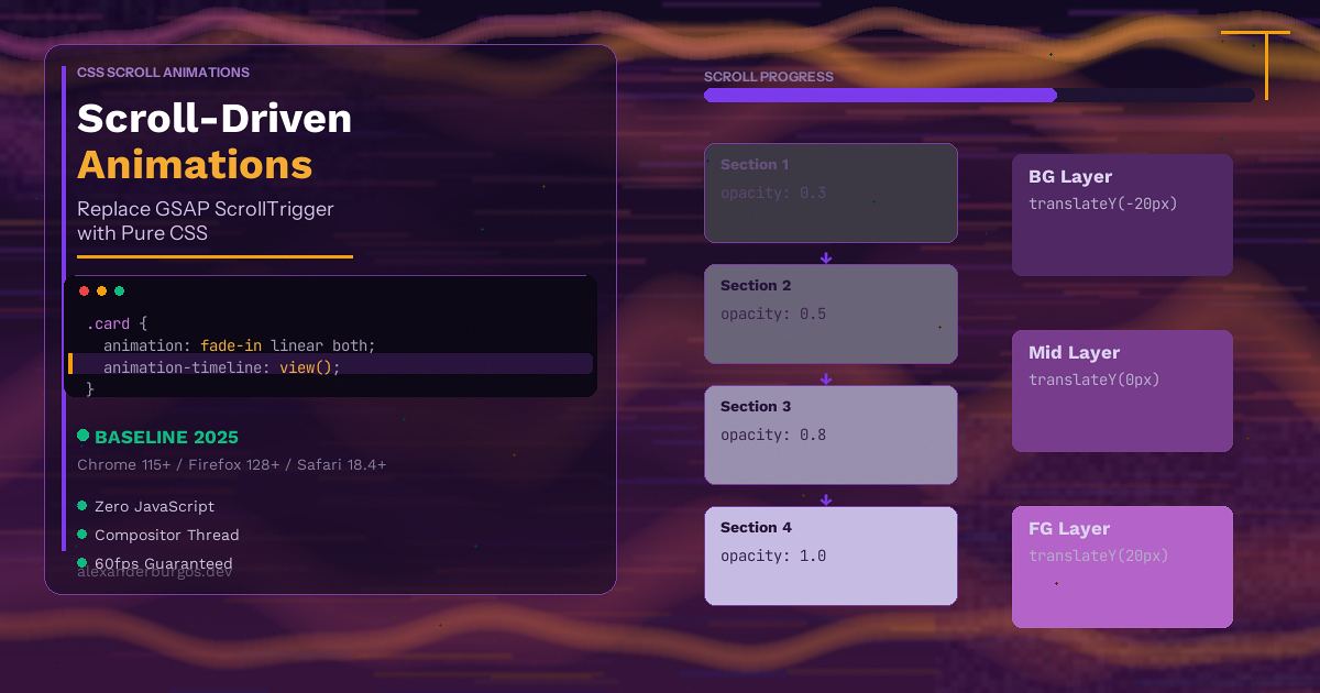
Every scroll animation on the web has a hidden cost. You add GSAP and ScrollTrigger -- that's about 25KB gzipped. You wire up scroll event listeners. The browser fires those events on the main thread, and suddenly your silky-smooth parallax effect is janking on mid-range Android phones. I've been there more times than I'd like to admit.
For years, this was just the price of doing business. If you wanted elements to fade in on scroll, a reading progress bar, or any kind of scroll-linked motion, you needed JavaScript. There was no way around it.
That's changed. CSS Scroll-Driven Animations let you drive any CSS animation based on scroll position or element visibility -- entirely in CSS, running on the compositor thread, with zero JavaScript. And as of 2025, they're supported in all major browsers.
What Are Scroll-Driven Animations?
Normally, CSS animations are driven by time. You define a @keyframes rule, set a duration, and the browser plays it over that period. Scroll-driven animations change this -- instead of time, the animation progress is linked to a scroll position.
The key property is animation-timeline. Instead of using the default document timeline (time-based), you point it at a scroll-based timeline. There are two types:
- ScrollTimeline -- ties animation progress to how far a scroll container has been scrolled. Think of a reading progress bar that fills as you scroll down the page
- ViewTimeline -- ties animation progress to an element's visibility within a scroll container. Think of a card that fades in as it enters the viewport
Both use the same @keyframes you already know. The only difference is what drives the progress -- scroll position instead of time.
ScrollTimeline -- animation-timeline: scroll()
The scroll() function creates an anonymous scroll timeline linked to a scroll container. By default, it tracks the nearest ancestor scroll container on the block axis (vertical scrolling for most of us).
Here's a reading progress bar in pure CSS:
<div class="progress-bar"></div>.progress-bar {
position: fixed;
top: 0;
left: 0;
height: 4px;
background: #6200ee;
width: 100%;
transform-origin: left;
animation: grow-progress linear both;
animation-timeline: scroll(root);
}
@keyframes grow-progress {
from { transform: scaleX(0); }
to { transform: scaleX(1); }
}That's it. No JavaScript. No window.addEventListener('scroll', ...). No requestAnimationFrame loop calculating percentages. The browser handles everything, and it runs on the compositor thread -- meaning it won't block the main thread even on slow devices.
The scroll(root) part tells the browser to track the root scroller (the document itself). You can also use scroll(nearest) for the nearest scrollable ancestor, or scroll(self) for the element's own scroll.
ViewTimeline -- animation-timeline: view()
This is where things get really interesting. The view() function creates a timeline based on an element's visibility within its scroll container. The animation progresses as the element scrolls into and out of view.
Here's a fade-in-on-scroll effect:
.fade-in {
  animation: fade-up linear both;
  animation-timeline: view();
  animation-range: entry 0% entry 100%;
}

@keyframes fade-up {
  from {
    opacity: 0;
    transform: translateY(40px);
  }
  to {
    opacity: 1;
    transform: translateY(0);
  }
}
The animation-range property is crucial here. It controls which portion of the view timeline maps to the animation. In this case, entry 0% to entry 100% means the animation plays while the element is entering the viewport -- from the moment its top edge crosses the bottom of the viewport until it's fully visible.
Understanding Animation Range
The animation-range property accepts named ranges that describe different phases of an element's visibility. Here are the main ones:
cover-- from first entering to fully leaving the viewport (the full journey)contain-- while the element is fully contained within the viewportentry-- while the element is entering the viewportexit-- while the element is exiting the viewportentry-crossing-- while the element's leading edge crosses the viewport boundaryexit-crossing-- while the element's trailing edge crosses the viewport boundary
You can combine these with percentages for fine control. For example, animation-range: entry 25% cover 50% starts the animation when the element is 25% entered and ends it at the midpoint of its full scroll journey.
Real Examples
Let's look at some practical scroll-driven animations that would normally require GSAP ScrollTrigger.
Parallax Effect
Parallax is one of the most common scroll effects, and it's dead simple with scroll-driven animations:
.parallax-bg {
  animation: parallax linear both;
  animation-timeline: scroll();
}

@keyframes parallax {
  from { transform: translateY(0); }
  to   { transform: translateY(-200px); }
}
The background moves at a different rate to the scroll, creating that depth illusion. No scroll listeners, no transform: translate3d hacks, no GSAP.
Staggered Card Reveal
Want cards to fade in one after another as you scroll? Each card drives its own view timeline:
.card {
  animation: reveal linear both;
  animation-timeline: view();
  animation-range: entry 0% entry 80%;
}

@keyframes reveal {
  from {
    opacity: 0;
    transform: translateY(60px) scale(0.95);
  }
  to {
    opacity: 1;
    transform: translateY(0) scale(1);
  }
}
Because each card has its own view timeline, they naturally stagger as they enter the viewport. No stagger: 0.1 needed -- the scroll position handles it.
Horizontal Scroll Progress
You can track horizontal scroll too. Here's a horizontal gallery with a progress indicator:
.gallery {
  overflow-x: auto;
  scroll-snap-type: x mandatory;
}

.gallery-progress {
  height: 3px;
  background: #6200ee;
  transform-origin: left;
  animation: scale-x linear both;
  animation-timeline: scroll(nearest inline);
}

@keyframes scale-x {
  from { transform: scaleX(0); }
  to   { transform: scaleX(1); }
}
The scroll(nearest inline) part tracks horizontal (inline axis) scrolling on the nearest scroll container.
Chrome 145 -- Scroll-Triggered Animations
There's an important distinction between scroll-driven and scroll-triggered. Everything we've covered so far is scroll-driven -- the animation scrubs back and forth as you scroll. If you scroll back up, the animation reverses.
But sometimes you want an animation to play once when an element enters the viewport and stay completed -- like a fade-in that doesn't reverse when you scroll back up. That's what GSAP's once: true option does.
Chrome 145 introduces animation-trigger, which does exactly this:
.reveal-once {
  animation: fade-in 0.6s ease both;
  animation-trigger: view();
}

@keyframes fade-in {
  from {
    opacity: 0;
    transform: translateY(30px);
  }
  to {
    opacity: 1;
    transform: translateY(0);
  }
}
Notice the difference: animation-trigger instead of animation-timeline. The animation is still time-based (0.6s duration), but it only starts when the element enters the viewport. Once it plays, it stays completed. This is exactly what you'd use GSAP ScrollTrigger's toggleActions: 'play none none none' for.
This is brand new and currently Chrome-only, but it fills a massive gap in the scroll-driven animations story.
GSAP ScrollTrigger vs CSS -- An Honest Comparison
I've used GSAP ScrollTrigger on plenty of projects, and I genuinely think it's a brilliant library. So let me be fair about what CSS can and can't replace.
What CSS Scroll-Driven Animations Handle Well
- Reading progress bars --
animation-timeline: scroll(root)is all you need - Fade-in on scroll --
animation-timeline: view()withanimation-range: entry - Parallax backgrounds -- simple translateY driven by scroll position
- Scroll-linked opacity, scale, rotation -- any CSS-animatable property works
- Header show/hide on scroll -- combine with
animation-rangefor precise control - Horizontal scroll indicators --
scroll(nearest inline)
Where You Still Need GSAP
- Complex sequenced timelines -- GSAP's timeline API for chaining multiple animations with precise offsets is still unmatched
- Callbacks and events --
onEnter,onLeave,onUpdatecallbacks for running JavaScript at specific scroll points - Pinning sections -- ScrollTrigger's
pin: truefor sticky scroll sections doesn't have a pure CSS equivalent - Animating non-CSS properties -- SVG attributes, Canvas, Three.js, custom object properties
- Smooth scrubbing with momentum -- GSAP's
scrub: 1(with easing) gives a smoother feel than CSS's linear tracking - Snap points with animation -- ScrollTrigger's
snapcombined with animated transitions
My honest estimate is that CSS scroll-driven animations can replace about 80% of what most websites use GSAP ScrollTrigger for. That remaining 20% -- complex timelines, pinning, callbacks -- that's where GSAP still earns its place.
Performance -- Why This Matters
This is probably the most compelling reason to switch. Let me explain what happens under the hood.
With JavaScript scroll animations (including GSAP), here's the chain of events:
- Browser fires a scroll event on the main thread
- Your JavaScript handler runs, calculates new values
- JavaScript updates DOM styles
- Browser recalculates layout (if needed)
- Browser paints and composites
With CSS scroll-driven animations, the browser skips steps 1-3 entirely. The animation runs on the compositor thread -- a separate thread that handles transforms, opacity, and other compositable properties. The main thread is completely free to handle user interactions, data fetching, and everything else.
In practical terms, this means:
- No scroll event listeners firing hundreds of times per second
- No layout thrashing from reading and writing DOM properties in a loop
- Silky-smooth 60fps even on low-end devices
- Smaller bundle size -- no GSAP dependency needed
I've tested this on a mid-range Android phone with 20 animated elements on a page. The JavaScript version dropped to 40fps during fast scrolling. The CSS version stayed locked at 60fps. That's the compositor thread doing its job.
Fallback Strategy with @supports
Progressive enhancement is straightforward with @supports. The idea is simple: show the final state by default, and only add the scroll animation if the browser supports it.
/* Default: element is fully visible (no animation) */
.fade-in {
  opacity: 1;
  transform: translateY(0);
}

/* Enhanced: scroll-driven fade-in */
@supports (animation-timeline: view()) {
  .fade-in {
    animation: fade-up linear both;
    animation-timeline: view();
    animation-range: entry 0% entry 100%;
  }

  @keyframes fade-up {
    from {
      opacity: 0;
      transform: translateY(40px);
    }
    to {
      opacity: 1;
      transform: translateY(0);
    }
  }
}
Browsers that don't support scroll-driven animations simply show the content without the animation. No broken layouts, no invisible elements, no dependency on a JavaScript polyfill. The content is always accessible.
If you absolutely need the scroll animation in older browsers, you can use JavaScript as a fallback inside the same @supports check:
if (!CSS.supports('animation-timeline', 'view()')) {
  // Load GSAP ScrollTrigger as a fallback
  import('gsap/ScrollTrigger').then(({ ScrollTrigger }) => {
    // Set up your JS-based scroll animations here
  });
}
This way, modern browsers get the performant CSS version with zero JavaScript, and older browsers still get the animation via GSAP. Best of both worlds.
Browser Support
CSS Scroll-Driven Animations are part of Baseline 2025 -- meaning they're supported across all major browsers:
- Chrome 115+ -- supported since July 2023
- Edge 115+ -- same Chromium timeline
- Firefox 128+ -- supported since July 2024
- Safari 18.4+ -- supported since April 2025
That's full cross-browser support. The animation-trigger property (scroll-triggered, play-once animations) is newer and currently Chrome 145+ only, but the core animation-timeline API works everywhere.
Given this level of support, there's really no reason to reach for GSAP ScrollTrigger for basic scroll animations anymore -- unless you need those advanced features I mentioned earlier.
Conclusion
CSS Scroll-Driven Animations are one of those features that genuinely change how we build websites. For years, scroll-linked animations meant JavaScript -- GSAP, Intersection Observer, scroll event listeners. Now, two CSS properties (animation-timeline and animation-range) replace the vast majority of those use cases.
The performance gains are real. The code is simpler. The fallback is graceful. And with Baseline 2025 support across Chrome, Firefox, and Safari, you can start using this today.
My recommendation: if you're adding scroll animations to a new project, start with CSS. Use animation-timeline: scroll() for scroll-position effects and animation-timeline: view() for visibility-based animations. Only reach for GSAP when you need complex timelines, pinning, or callbacks.
The less JavaScript you ship, the faster your site loads, the smoother it scrolls, and the happier your users are.
Happy coding!
If you want to go deeper and learn how to build real, production-ready CSS design systems step by step, check out my full course here: CSS Design Systems Course
If you found this helpful, I'd love to connect! Follow me on Twitter/X @alexandersstudi or LinkedIn for more CSS and design system tips.