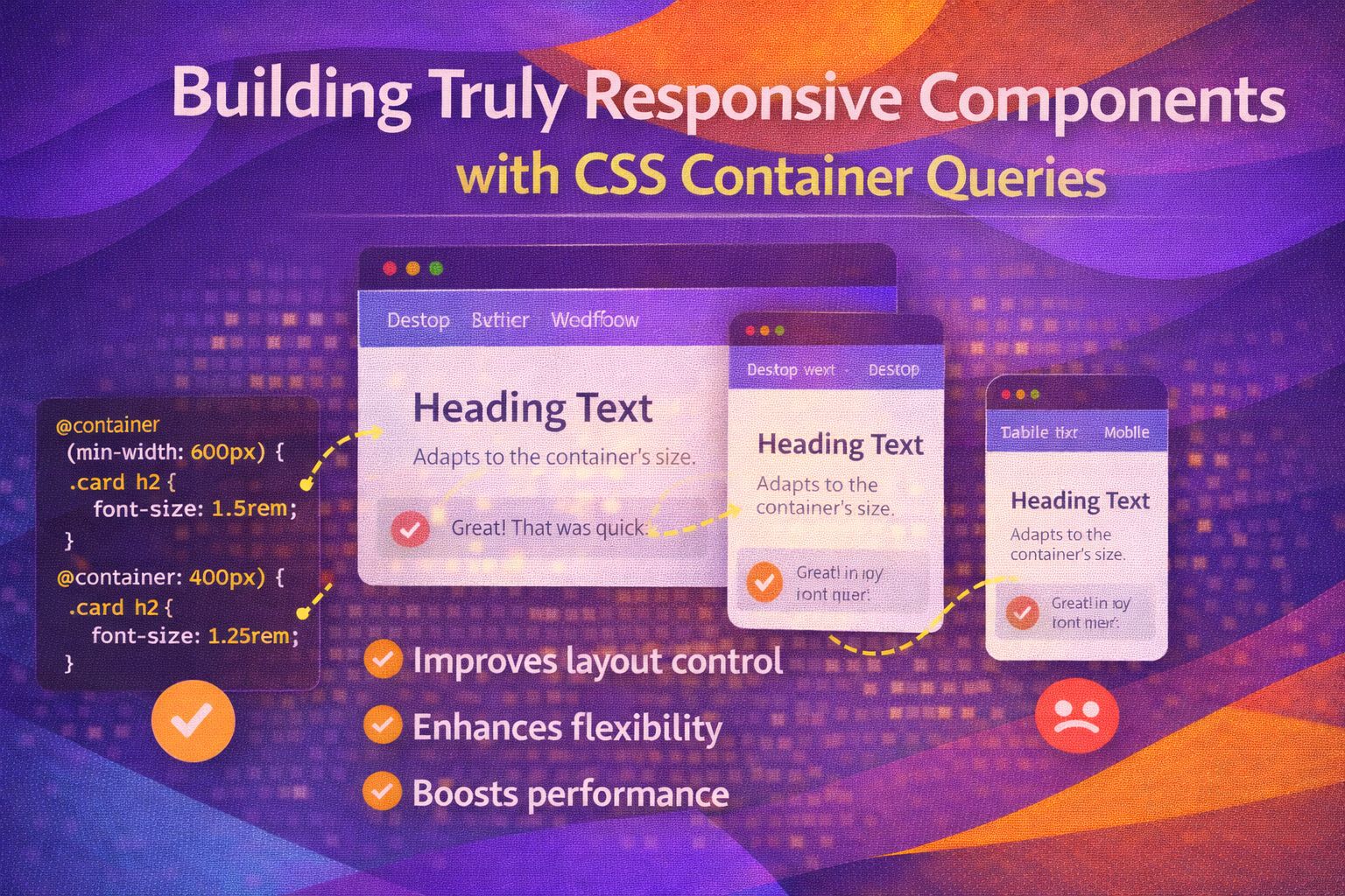
Let's be honest — the viewport-based media query has always been a bit of a blunt instrument for component-driven design. We've all wrestled with that awkward moment where a card looks perfect on a mobile screen but absolutely breaks when placed in a narrow sidebar on a desktop layout.
The good news? CSS Container Queries are finally here, and they're a total game changer for how we build design systems. I'm genuinely excited about this because it means our components can finally be truly context-aware.
Setting Up the Container
First things first: you have to tell the browser which element is the 'parent' that children should be looking at. We do this using the `container-type` property.
/* The container (parent) */
.card-wrapper {
  container-type: inline-size;
  /* Optional: naming it allows specific targeting */
  container-name: product-grid;
}
If you're a fan of shorthand, you can combine these into a single line which I find much cleaner in a large codebase.
/* Shorthand: name / type */
.sidebar-area {
  container: sidebar / inline-size;
}Querying the Container
Once the container is defined, the children can now ask 'how much space do I have?' and adjust their styles accordingly. This is where the magic happens.
/* Default mobile-first styles */
.card {
  display: flex;
  flex-direction: column;
  gap: 1rem;
}

/* Adjust based on the parent container width */
@container (min-width: 400px) {
  .card {
    flex-direction: row;
    align-items: center;
  }
}
You can also use the modern range syntax, which I personally find much more readable than `min-width`.
@container (inline-size > 600px) {
  .card-title {
    font-size: 2rem;
    color: var(--primary-accent);
  }
}The Named Container Pro Move
Here's the thing: sometimes you have nested containers and you want a component to respond to a specific ancestor, not just the immediate parent. This is where named containers save the day.
/* Higher level container */
.page-layout {
  container: main-content / inline-size;
}

/* Target the specific named container */
@container main-content (min-width: 800px) {
  .article-body {
    column-count: 2;
    column-gap: 2rem;
  }
}
This prevents 'style leakage' where a component might accidentally respond to a container you didn't intend.
/* Complex conditional logic */
@container (inline-size > 400px) and (orientation: landscape) {
  .profile-pic {
    border-radius: 50%;
    width: 100px;
  }
}Container Query Units
Just like `vw` and `vh`, we now have units relative to the container. `cqi` (container query inline) is my absolute favourite for fluid typography.
.dynamic-text {
  /* Sets font size to 5% of the container's width */
  font-size: clamp(1rem, 5cqi, 3rem);
}
You can use `cqw` (width), `cqh` (height), `cqi` (inline-size), and `cqb` (block-size) to make components truly fluid within their bounds.
.hero-image {
  /* Height relative to the container's inline size */
  height: 20cqi;
  object-fit: cover;
}Browser Support
Honestly, the support is fantastic. As of mid-2023, all major evergreen browsers (Chrome, Edge, Firefox, Safari) fully support size queries. If you need to support legacy browsers, I recommend a simple flexbox fallback.
/* Basic fallback for older browsers */
.card {
  display: flex;
  flex-wrap: wrap;
}

/* Enhancement for modern browsers */
@supports (container-type: inline-size) {
  .card-wrapper {
    container-type: inline-size;
  }
  /* ... container styles ... */
}Wrapping Up
Container queries represent a massive shift in how we think about responsive design. We're moving from 'page-based' layouts to 'component-based' logic, and it makes our CSS so much more robust.
- Always set `container-type: inline-size` on the parent to enable width-based queries.
- Use `@container` instead of `@media` for components intended for reuse in different layouts.
- Leverage `cqi` units for typography that scales perfectly with the container size.
Trust me on this one — once you start using container queries, you'll wonder how we ever managed without them. Give it a go in your next project!
If you found this helpful, I'd love to connect! Follow me on Twitter/X @alexandersstudi or LinkedIn for more CSS and design system tips.