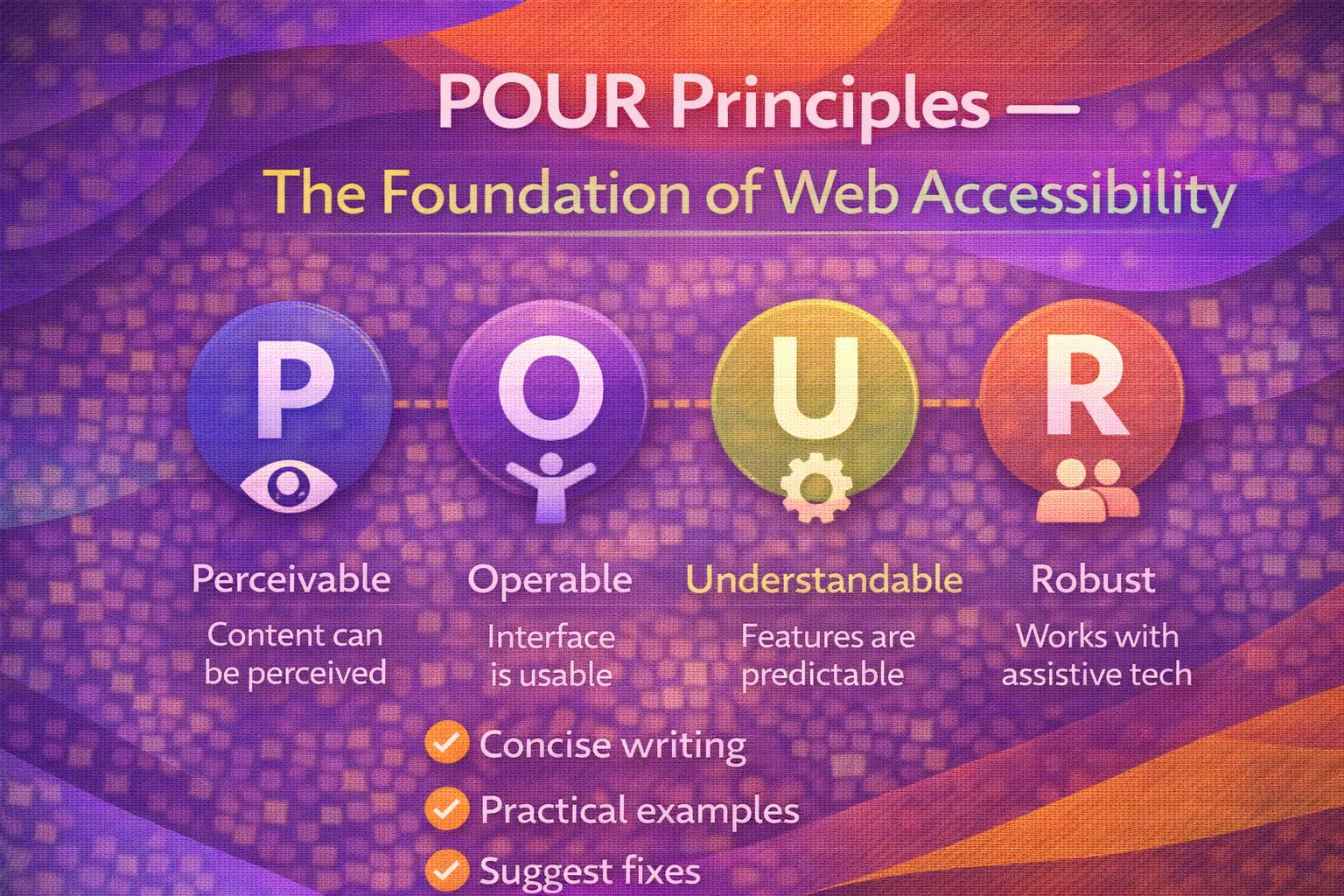
Let's be honest - accessibility can feel like a massive mountain of checklists and legal jargon. But here's the thing: if you strip away the complexity, it all boils down to four simple letters: POUR. I've found that once you grasp these principles, writing inclusive code becomes second nature.
1. Perceivable: Don't Hide Your Content
Perceivable means users must be able to process the information using the senses available to them. The most common way we tackle this is by providing text alternatives for non-text content.
<!-- Bad: Screen readers only hear 'image-72.jpg' -->
<img src="hero-banner.jpg" alt="">

<!-- Good: Provides a descriptive context -->
<img src="hero-banner.jpg" alt="A group of developers collaborating on a design system in a bright office.">
It's not just about images; we also need to ensure our UI components don't rely solely on colour to convey meaning, which is a pro move for supporting colour-blind users.
/* Bad: Only colour indicates an error */
.input-error {
  border: 2px solid red;
}

/* Good: Uses colour AND an icon/text to indicate state */
.input-error {
  border: 2px solid #D32F2F;
  background-image: url('error-icon.svg');
  background-repeat: no-repeat;
  padding-left: 40px;
}2. Operable: Make it Usable for Everyone
Operable means the interface cannot require interaction that a user cannot perform. In my experience, the biggest win here is ensuring your site is fully keyboard-navigable.
/* Never remove the focus ring without a replacement! */
:focus {
  outline: 3px solid #2DD4BF;
  outline-offset: 4px;
}

/* Ensure interactive elements are large enough to hit */
button, .btn {
  min-width: 44px;
  min-height: 44px;
  padding: 12px 24px;
}
If you're building custom components, you'll need a bit of JavaScript to handle keyboard events like the 'Escape' key for closing modals.
// Handling keyboard interaction for a modal
document.addEventListener('keydown', (e) => {
  if (e.key === 'Escape' && isModalOpen) {
    closeModal();
  }
});

// Ensure buttons are triggered by both Mouse and Enter/Space
button.addEventListener('click', (e) => {
  performAction();
});3. Understandable: Keep it Simple and Predictable
Understandable means users must be able to comprehend the information and the operation of the user interface. I always start by defining the document language so screen readers use the correct accent.
<!-- Mandatory for screen reader pronunciation -->
<html lang="en-GB">

<!-- Predictable navigation: labels are linked to inputs -->
<label for="email-address">Email Address</label>
<input type="email" id="email-address" name="email" aria-describedby="email-hint">
<p id="email-hint">We will never share your email with third parties.</p>
Validation messages should be clear and helpful, telling the user exactly what went wrong and how to fix it.
// Providing clear feedback for form errors
function validateForm() {
  if (input.value === "") {
    errorContainer.innerText = "Error: The 'Full Name' field cannot be empty.";
    input.setAttribute('aria-invalid', 'true');
  }
}4. Robust: Build for the Future
Robust means content must be interpreted reliably by a wide variety of user agents, including assistive technologies. This is where semantic HTML does the heavy lifting.
<!-- Bad: Divs don't tell the browser what they are -->
<div onclick="submit()">Submit Form</div>

<!-- Good: Semantic elements have built-in roles and states -->
<button type="submit" aria-busy="false">Submit Form</button>
When you have to use custom components, ARIA roles help the browser understand the 'what' and 'how' of your dynamic elements.
/* Using ARIA to bridge the gap in custom components */
<div role="navigation" aria-label="Main Menu">
  <ul role="menubar">
    <li role="none"><a role="menuitem" href="/home">Home</a></li>
    <li role="none"><a role="menuitem" href="/about">About</a></li>
  </ul>
</div>Wrapping Up
The POUR principles aren't just a compliance checkbox—they're a framework for building a better web for literally everyone. Here's what I want you to take away:
- Perceivable: Ensure content is available to multiple senses (alt text, contrast).
- Operable: Make sure everything works with a keyboard and is easy to navigate.
- Understandable & Robust: Use semantic HTML and clear instructions to ensure current and future devices can read your code.
If you want to go deeper and learn how to build real, production-ready CSS design systems step by step, check out my full course here: CSS Design Systems Course
Got questions or want to share how you're using this? Drop me a message on LinkedIn - I always enjoy chatting about this stuff!