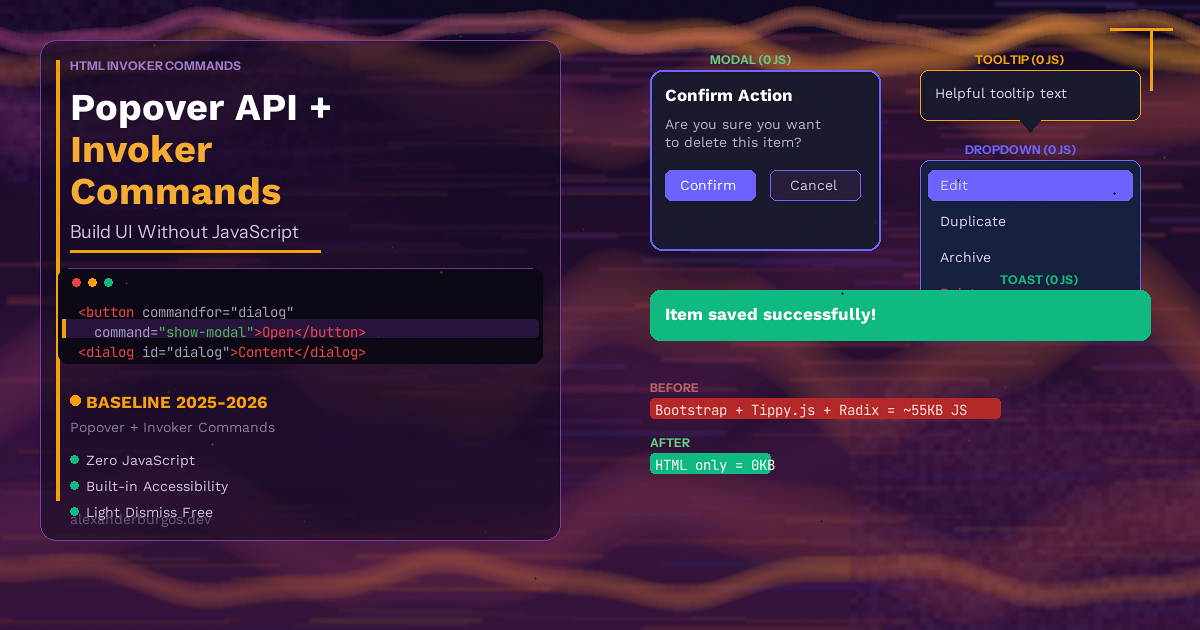
Let's talk about the JavaScript tax you're paying for basic UI patterns. A modal dialog? That's Bootstrap at 15-20KB, or Radix Dialog at 8KB. Tooltips? Tippy.js adds 12KB. Dropdowns? Headless UI brings 30-40KB. Add it all up and you're shipping 30-50KB of JavaScript just so users can open a popup, see a tooltip, or close a menu.
Every single kilobyte of that JavaScript has to be downloaded, parsed, and executed before your UI becomes interactive. On a mid-range phone, that's real seconds of delay.
But here's the thing -- the browser can do all of this natively now. The Popover API and Invoker Commands let you build modals, tooltips, dropdowns, and toast notifications using nothing but HTML attributes and a bit of CSS. No JavaScript. No libraries. No bundle size.
Both are Baseline 2025 -- available in Chrome, Firefox, and Safari. Let me show you how they work.
Popover API Basics
The Popover API gives any HTML element the ability to pop up above the rest of the page. You add a popover attribute to an element and a popovertarget attribute to the button that controls it. That's the whole setup.
<button popovertarget="my-popup">Open popup</button>

<div id="my-popup" popover>
  <p>I'm a popover! Click outside to close me.</p>
</div>
When you click the button, the div appears in the top layer -- above everything else on the page. It escapes overflow: hidden, ignores z-index stacking, and sits on top of any other content. Click outside, press Escape, or click the button again, and it closes.
No JavaScript. No event listeners. No state management.
auto vs manual vs hint
The popover attribute accepts three values that control how the popover behaves:
popoverorpopover="auto"-- The default. Supports light dismiss (clicking outside closes it), pressing Escape closes it, and only one auto popover can be open at a time (unless they're nested). This is what you want for menus, dropdowns, and dialogspopover="manual"-- No light dismiss. The popover stays open until you explicitly close it. Multiple manual popovers can be open at the same time. Perfect for toast notifications and persistent UIpopover="hint"-- Designed for tooltips. Only one hint popover can be open at a time, but it doesn't close other auto popovers. Note: this is Chromium-only for now
<!-- Auto: light dismiss, one at a time -->
<div id="menu" popover>
  <p>Click outside to close me</p>
</div>

<!-- Manual: stays open, multiple allowed -->
<div id="toast" popover="manual">
  <p>I'll stay here until you close me</p>
</div>

<!-- Hint: tooltip behaviour -->
<div id="tip" popover="hint">
  <p>Tooltip content</p>
</div>
Light Dismiss and the Popover Stack
Light dismiss means the popover closes when you click outside of it or press the Escape key. This is exactly the behaviour users expect from dropdowns and menus, and the browser handles it automatically for popover="auto".
For nested popovers, the browser maintains a popover stack. If you have a menu that opens a submenu, opening the submenu doesn't close the parent menu -- they're stacked. But clicking outside closes the entire stack. This is the kind of interaction that used to take dozens of lines of JavaScript to get right.
Controlling Popovers with popovertargetaction
By default, a popovertarget button toggles the popover open and closed. But you can control this more precisely with popovertargetaction:
<!-- Toggle (default) -->
<button popovertarget="popup">Toggle</button>

<!-- Only show -->
<button popovertarget="popup" popovertargetaction="show">Open</button>

<!-- Only hide -->
<button popovertarget="popup" popovertargetaction="hide">Close</button>
This is really useful when you want a close button inside the popover itself, or when you want separate open and close controls.
Invoker Commands -- The Next Step
The Popover API is brilliant, but it only handles popovers. What about <dialog> elements? What about custom interactive components? That's where Invoker Commands come in.
Invoker Commands use two attributes: commandfor and command. They work like popovertarget and popovertargetaction, but they're more powerful because they work with multiple element types and support custom commands.
<button commandfor="my-dialog" command="show-modal">
  Open dialog
</button>

<dialog id="my-dialog">
  <h2>Confirmation</h2>
  <p>Are you sure you want to continue?</p>
  <button commandfor="my-dialog" command="close">Cancel</button>
</dialog>
That opens a native <dialog> as a modal. No dialog.showModal() call in JavaScript. No event listener on the button. The commandfor attribute points to the target element and command specifies what to do.
Built-in Commands
Invoker Commands come with several built-in commands that cover the most common UI patterns:
show-popover-- shows a popover (same aspopovertargetaction="show")hide-popover-- hides a popovertoggle-popover-- toggles a popovershow-modal-- opens a<dialog>as a modalclose-- closes a<dialog>
The show-modal and close commands are the real game-changers here. Before Invoker Commands, opening a dialog as a modal always required JavaScript. Now it's purely declarative.
Custom Commands
You can also create custom commands using the -- prefix. When a button with a custom command is clicked, it fires a command event on the target element. This lets you use the declarative pattern for your own interactive components:
<button commandfor="carousel" command="--next-slide">
  Next
</button>

<div id="carousel">
  <!-- slides here -->
</div>

<script>
  document.getElementById('carousel')
    .addEventListener('command', (e) => {
      if (e.command === '--next-slide') {
        // advance the carousel
      }
    });
</script>
Yes, this does use a small amount of JavaScript for the custom logic. But the important bit is that the button-to-target relationship is declared in HTML, not wired up with query selectors and event listeners. The HTML tells you exactly what each button does just by reading the markup.
Real Examples
Let's build some real UI patterns that you'd normally reach for a library to create.
Modal Dialog
A confirmation dialog with a backdrop, focus trapping, and keyboard support -- all without JavaScript:
<button commandfor="confirm-dialog" command="show-modal">
  Delete account
</button>

<dialog id="confirm-dialog">
  <h2>Delete your account?</h2>
  <p>This action cannot be undone. All your data will be
     permanently removed.</p>
  <div class="dialog-actions">
    <button commandfor="confirm-dialog" command="close">
      Cancel
    </button>
    <button class="danger" commandfor="confirm-dialog" command="close">
      Delete
    </button>
  </div>
</dialog>
dialog {
border: none;
border-radius: 1rem;
padding: 2rem;
max-width: 28rem;
box-shadow: 0 24px 48px rgba(0, 0, 0, 0.2);
}
dialog::backdrop {
background: rgba(0, 0, 0, 0.5);
backdrop-filter: blur(4px);
}
.dialog-actions {
display: flex;
gap: 0.75rem;
justify-content: flex-end;
margin-top: 1.5rem;
}
.danger {
background: #dc2626;
color: white;
border: none;
padding: 0.5rem 1.25rem;
border-radius: 0.5rem;
cursor: pointer;
}The browser gives you focus trapping, Escape to close, a backdrop, and proper focus restoration -- all for free. This would normally require Radix Dialog (8KB) or a Bootstrap modal (15-20KB).
Tooltip
A tooltip that appears on hover with the popover="hint" value and CSS anchor positioning:
<button popovertarget="tooltip-info"
        popovertargetaction="show"
        style="anchor-name: --info-btn"
        onmouseenter="this.click()"
        onmouseleave="document.getElementById('tooltip-info').hidePopover()">
  What's this?
</button>

<div id="tooltip-info" popover="hint"
     style="position-anchor: --info-btn;
            top: anchor(bottom);
            left: anchor(center);">
  This feature is in beta and may change.
</div>
I'll be honest -- the tooltip example still needs a tiny bit of inline JavaScript for hover behaviour, because popovertarget only triggers on click. For fully zero-JS tooltips, you'd use CSS :hover with display toggling instead. But the popover approach gives you top-layer rendering and collision avoidance with anchor positioning, which is much harder to replicate with pure CSS.
Dropdown Menu
A dropdown menu with light dismiss -- the kind of thing you'd use Headless UI or Radix for:
<button popovertarget="user-menu"
style="anchor-name: --menu-btn">
Account ▾
</button>
<nav id="user-menu" popover
style="position-anchor: --menu-btn;
top: anchor(bottom);
left: anchor(left);">
<ul role="menu">
<li role="menuitem"><a href="/profile">Profile</a></li>
<li role="menuitem"><a href="/settings">Settings</a></li>
<li role="menuitem"><a href="/logout">Log out</a></li>
</ul>
</nav>[popover]#user-menu {
margin: 0;
padding: 0.5rem;
border: 1px solid #e5e7eb;
border-radius: 0.75rem;
box-shadow: 0 8px 24px rgba(0, 0, 0, 0.12);
min-width: 12rem;
}
[popover]#user-menu ul {
list-style: none;
margin: 0;
padding: 0;
}
[popover]#user-menu a {
display: block;
padding: 0.625rem 1rem;
border-radius: 0.5rem;
text-decoration: none;
color: #1f2937;
}
[popover]#user-menu a:hover {
background: #f3f4f6;
}Click the button, the menu appears. Click outside, it closes. Press Escape, it closes. Zero JavaScript.
Toast Notification
A toast that stays visible until the user dismisses it, using popover="manual":
<button popovertarget="toast" popovertargetaction="show">
  Show notification
</button>

<div id="toast" popover="manual" class="toast">
  <p>Changes saved successfully.</p>
  <button popovertarget="toast" popovertargetaction="hide">
    Dismiss
  </button>
</div>
.toast {
position: fixed;
bottom: 1.5rem;
right: 1.5rem;
margin: 0;
padding: 1rem 1.5rem;
background: #065f46;
color: white;
border-radius: 0.75rem;
border: none;
box-shadow: 0 4px 16px rgba(0, 0, 0, 0.2);
display: flex;
align-items: center;
gap: 1rem;
}Because it's popover="manual", clicking outside won't close it -- the user has to click the dismiss button. You could also auto-dismiss it with a small setTimeout if needed, but the core open/close mechanism is entirely HTML.
CSS Animations for Popovers
One of the best things about popovers being in the top layer is that you can animate their entrance and exit using @starting-style and transition-behavior: allow-discrete. These two CSS features work together to let you animate elements that go from display: none to display: block -- something that was impossible before without JavaScript.
/* Open state */
[popover]:popover-open {
  opacity: 1;
  transform: translateY(0) scale(1);
}

/* Starting style for entry animation */
@starting-style {
  [popover]:popover-open {
    opacity: 0;
    transform: translateY(-8px) scale(0.96);
  }
}

/* Exit animation */
[popover] {
  opacity: 0;
  transform: translateY(-8px) scale(0.96);
  transition: opacity 0.2s ease,
              transform 0.2s ease,
              overlay 0.2s allow-discrete,
              display 0.2s allow-discrete;
}

/* Backdrop animation */
[popover]::backdrop {
  background: rgba(0, 0, 0, 0);
  transition: background 0.2s ease,
              overlay 0.2s allow-discrete,
              display 0.2s allow-discrete;
}

[popover]:popover-open::backdrop {
  background: rgba(0, 0, 0, 0.3);
}

@starting-style {
  [popover]:popover-open::backdrop {
    background: rgba(0, 0, 0, 0);
  }
}
Let me break this down:
:popover-open-- targets the popover when it's visible@starting-style-- defines the "from" state for the entry animation. The browser transitions from this state to the:popover-openstatetransition-behavior: allow-discrete(orallow-discretein the shorthand) -- lets you transitiondisplayandoverlay, which are normally not animatable- The exit animation is defined on the base
[popover]selector -- when the popover closes, it transitions from the open state back to these values
The result is a smooth fade-and-slide animation on open and close, with zero JavaScript. This replaces libraries like Framer Motion or GSAP for simple popover animations.
Accessibility -- What the Browser Handles for Free
This is where native HTML really pulls ahead of JavaScript libraries. When you use the Popover API and Invoker Commands, the browser provides a complete accessibility experience out of the box:
- Focus management -- When a modal dialog opens, focus moves into it. When it closes, focus returns to the button that opened it. You don't have to code this
- Keyboard support -- Escape closes popovers and dialogs. Tab cycles through focusable elements. This is built in
- ARIA relationships -- The browser automatically establishes the connection between the trigger button and the popover. Screen readers understand that pressing the button will open or close something
- Top-layer rendering -- Popovers and modals render above everything, so screen readers don't get confused by elements hidden behind overlays
- Inert background -- When a modal dialog is open, the rest of the page is automatically made inert. Users can't tab to elements behind the dialog
Compare this to building a modal with a div and JavaScript. You'd need role="dialog", aria-modal="true", aria-labelledby, a focus trap, an escape key handler, scroll locking, and inert management for background elements. Most implementations get at least one of these wrong.
With native elements, the browser gets it right every time.
Bundle Size Comparison -- Before vs After
Let's look at what a typical project saves by switching from JavaScript UI libraries to native HTML.
Before: JavaScript Libraries
# Modal dialog
npm install @radix-ui/react-dialog    # ~8KB gzipped

# Tooltips
npm install tippy.js                   # ~12KB gzipped

# Dropdown menu
npm install @headlessui/react          # ~30-40KB gzipped

# Toast notifications
npm install react-hot-toast            # ~5KB gzipped

# Total: roughly 55-65KB of JavaScript
After: Native HTML
<!-- Modal dialog -->
<dialog>...</dialog>
<!-- with command="show-modal" and command="close" -->

<!-- Tooltips -->
<div popover="hint">...</div>

<!-- Dropdown menu -->
<nav popover>...</nav>

<!-- Toast notifications -->
<div popover="manual">...</div>

<!-- Total: 0KB of JavaScript -->
That's a reduction from roughly 55-65KB to 0KB of JavaScript for these four UI patterns. The only cost is some CSS for styling and animations, which is typically under 1KB.
Even if you only replace one or two of these libraries, you're looking at 15-30KB less JavaScript. On mobile networks and lower-powered devices, that's a meaningful performance improvement.
Limitations -- An Honest Take
I'm a big fan of these APIs, but I want to be honest about where they fall short. They don't replace JavaScript libraries in every case:
- No conditional logic -- You can't conditionally prevent a popover from opening based on form validation or some application state. The HTML attributes always trigger. If you need "show this modal only if the form is valid", you still need JavaScript
- No complex multi-step flows -- A multi-step wizard or a confirmation-then-action flow still requires JavaScript to manage the state between steps
popover="hint"is Chromium-only -- The tooltip-specific popover type only works in Chrome and Edge as of March 2026. Firefox and Safari haven't shipped it yet- No hover triggering for popovers --
popovertargetonly works on click. For hover-triggered tooltips, you need either inline JavaScript or a CSS-only approach - Anchor positioning is still new -- CSS anchor positioning works well, but it's still maturing. Complex positioning scenarios (like flipping a tooltip when it hits the viewport edge) may need the CSS Anchor Positioning API, which has limited support
For straightforward show/hide UI -- menus, modals, notifications, simple tooltips -- the Popover API and Invoker Commands are brilliant. For complex interactive patterns with business logic, you'll still need JavaScript. But that's fine -- the goal isn't to eliminate JavaScript entirely. It's to stop shipping 50KB of it for things the browser can handle natively.
Browser Support
Here's where things stand as of March 2026:
Popover API (Baseline 2025):
- Chrome 114+ -- stable
- Edge 114+ -- stable
- Firefox 125+ -- stable
- Safari 17+ -- stable
Invoker Commands (Baseline 2025):
- Chrome 135+ -- stable
- Edge 135+ -- stable
- Firefox 144+ -- stable
- Safari 26.2+ -- stable
The Popover API has wide support already. Invoker Commands are newer but have landed in all major browsers. If you need to support older browsers, the popover attributes are simply ignored -- the element stays hidden and the buttons do nothing. You can use feature detection to add a JavaScript fallback:
if (!HTMLElement.prototype.hasOwnProperty('popover')) {
  // load a lightweight polyfill or fallback
}
Conclusion
The Popover API and Invoker Commands are exactly the kind of platform features I love -- they take something that required a library and make it native. Modals, tooltips, dropdowns, toasts -- all of these are now declarative HTML patterns with built-in accessibility and zero JavaScript.
You get light dismiss, focus management, keyboard support, the top layer, and smooth CSS animations. You save 30-50KB of JavaScript. And you write code that's easier to read, easier to maintain, and works better for everyone -- especially users on slower devices and connections.
Next time you reach for a modal library or a tooltip package, stop and ask yourself: can I do this with a popover attribute and a commandfor? Chances are, you can.
Happy coding!
If you want to go deeper and learn how to build real, production-ready CSS design systems step by step, check out my full course here: CSS Design Systems Course
If you found this helpful, I'd love to connect! Follow me on Twitter/X @alexandersstudi or LinkedIn for more CSS and design system tips.