Ever wondered why your perfectly coded sticky header suddenly stops sticking the moment you wrap your content in a carousel or a scrollable table? It's one of those "pull your hair out" CSS moments that has plagued UI engineers for a decade.
We've all been there: you add overflow: hidden or overflow: auto to a parent container to keep things tidy, and suddenly, position: sticky loses its mind. It's because you've inadvertently created a new scroll container, and your sticky element is now tracking that tiny box instead of the page viewport.
But there's a modern solution that's finally ready for prime time. Let's talk about overflow: clip and how it's changing the way we build design system components.
The Problem: The Accidental Scroll Container
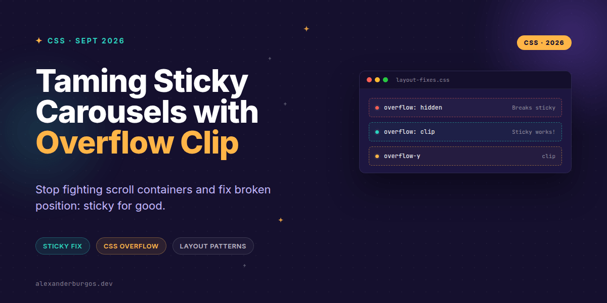
The root of the issue lies in how CSS handles overflow. Historically, if you wanted to hide content that spilled out of a box, you used overflow: hidden. While it looks like it just clips the content, under the hood, it actually turns that element into a scroll container.
According to the Chrome Developers team, using overflow: clip makes it possible to prevent scrolling without starting a new formatting context. This is the magic bullet. When an element is NOT a scroll container, any sticky children will ignore it and keep looking up the DOM tree until they find the actual viewport.
Why overflow: clip is different
MDN defines a clear distinction: "The difference between clip and hidden is that the clip keyword also forbids all scrolling, including programmatic scrolling. No new formatting context is created."
- No Scroll Container: It doesn't hijack sticky positioning.
- No BFC: It doesn't automatically create a Block Formatting Context (you'll need
display: flow-rootif you need that behavior). - Hard Clip: It strictly forbids programmatic scrolling via JavaScript (like
scrollTo).
Pattern 1: The Sticky Table Header
In many design systems, tables need horizontal scrolling on mobile but must keep their headers sticky at the top of the screen while the user scrolls down the page. This used to be a nightmare. Now, it's a few lines of CSS.
.table-wrapper {
  /* Allow horizontal scrolling */
  overflow-x: auto;
  /* Clip vertical overflow WITHOUT breaking sticky */
  overflow-y: clip;
}

thead th {
  position: sticky;
  top: 0;
  background: var(--surface-default);
}
By using overflow-y: clip, the wrapper doesn't become a vertical scroll container. Therefore, the thead remains sticky relative to the document body. It's clean, performant, and requires zero JavaScript hacks.
Pattern 2: Carousels with Sticky Controls
I've seen many carousels where the "Next/Prev" buttons are supposed to stay pinned to the side or top, even if the carousel itself is inside a complex layout. If the carousel container uses overflow: hidden, those buttons lose their sticky reference point.
Switching to overflow-x: auto and overflow-y: clip ensures that your horizontal rail scrolls beautifully while your vertical layout logic remains untouched.
The Gotchas: Don't get caught out
While overflow: clip is powerful, it's not a drop-in replacement for every situation. Because it doesn't create a formatting context, things like margin collapsing might behave differently than they did with overflow: hidden.
Also, remember that clip is final. If you actually NEED to programmatically scroll that container later with a script, clip will block it. In that specific case, you might still need the old-school scroll container approach.
Wrapping Up
- Use
overflow: clipinstead ofhiddenwhen you want to prevent visual spill without breakingposition: sticky. - Leverage per-axis scrolling (e.g.,
overflow-x: auto; overflow-y: clip;) for production-ready tables and carousels. - Remember that
clipdoes not create a Block Formatting Context, so usedisplay: flow-rootif you need to contain floats or prevent margin collapse.
I've found that moving to this pattern has simplified my component library code significantly. I'd highly encourage you to try swapping out hidden for clip in your next layout refactor—you might be surprised how many 'bugs' just disappear.
If you want to go deeper and learn how to build real, production-ready CSS design systems step by step, check out my full course here: CSS Design Systems Course
I cover the full pipeline in Ship Your Design System, 200 pages on Amazon Kindle.
For more CSS tips and layout deep-dives, let's connect on Twitter https://x.com/alexandersstudi or LinkedIn https://www.linkedin.com/in/alexandersstudio/.