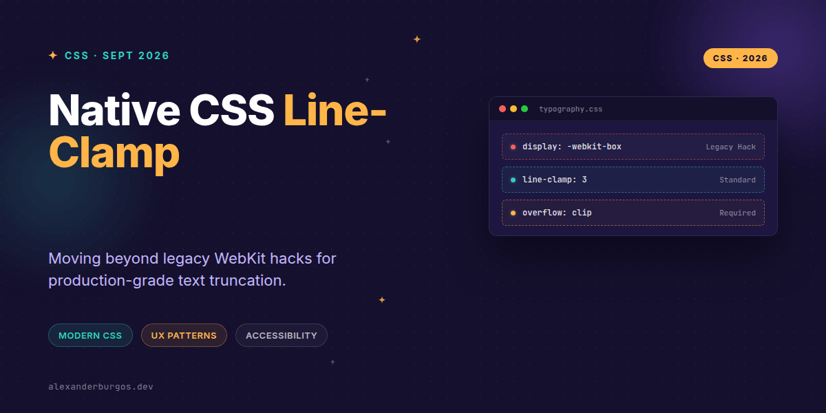
We've all been there: you're building a card component, and the marketing team provides copy that's three times longer than the design allows. For years, we've relied on a specific flavour of CSS magic—the infamous -webkit-line-clamp hack—to keep our layouts from exploding.
But let's be honest, that legacy approach was always a bit of a mess. It required display: -webkit-box, a non-standard box-orient property, and a prayer that the browser wouldn't break the layout. The good news? The wait for a proper standard is over.
The Standard: CSS Overflow Module Level 4
Native line-clamp is now a formal part of the CSS Overflow Module Level 4. Unlike its predecessor, it's designed to be a clean shorthand for three distinct properties: max-lines, block-ellipsis, and continue.
The W3C spec defines it beautifully: it limits the contents of a block container to a specific number of lines, and the remaining content is "fragmented away and neither rendered nor measured." This is a massive win for performance and predictable layout logic.
.card-description {
  line-clamp: 3;
  overflow: clip;
}
Why the legacy hack was brittle
I've spent a fair amount of time debugging why a clamped element suddenly lost its flexbox alignment or why an ellipsis appeared in the wrong place. The old -webkit version was tied to an ancient version of the WebKit box model.
- It forced a specific
displaytype that often conflicted with modern Flex or Grid layouts. - It wasn't part of any official standard, leading to inconsistent rendering across engines.
- It was difficult to toggle dynamically without resetting multiple properties.
Implementing in Production Design Systems
When building a design system, you want to offer your team a robust way to handle text. I usually suggest a progressive enhancement strategy. Modern browsers get the clean standard, while older engines get the tried-and-tested fallback.
.text-truncate {
  line-clamp: 2;
  overflow: clip;
}

@supports not (line-clamp: 2) {
  .text-truncate {
    display: -webkit-box;
    -webkit-box-orient: vertical;
    -webkit-line-clamp: 2;
    overflow: hidden;
  }
}
One thing to keep in mind is the overflow property. While the spec allows for flexibility, pairing line-clamp with overflow: clip (or hidden) is the safest way to ensure the visual truncation behaves as expected across all browsers.
The Accessibility Elephant in the Room
Right, let's talk about the most common mistake I see: ignoring the UX of truncated content. If you clamp a paragraph, the user can't see the rest of the information. For a sighted user, the ellipsis is a visual cue, but for a screen reader user, it can be confusing if not handled correctly.
If the content is critical, always provide a way to see the full text. In React, I often implement a 'Show More' pattern that toggles the clamp state. This isn't just good for accessibility; it's a better user experience for everyone.
function ExpandableText({ content, limit = 3 }) {
  const [isExpanded, setIsExpanded] = useState(false);

  return (
    <div>
      <p style={{ lineClamp: isExpanded ? 'none' : limit, overflow: 'clip' }}>
        {content}
      </p>
      <button onClick={() => setIsExpanded(!isExpanded)}>
        {isExpanded ? 'Show less' : 'Read more'}
      </button>
    </div>
  );
}
Gotchas and Localisation
Don't forget that two lines of English might become four lines of German. When setting a fixed line count in your CSS variables, test with different languages. A line-clamp: 2 might be far too aggressive for languages with longer average word lengths, leading to crucial information being lost before the user even interacts.
Wrapping Up
- Switch to native
line-clampto align with W3C standards and move away from legacy box model dependencies. - Use
@supportsto provide fallbacks for older browsers without cluttering your modern styles. - Always consider accessibility—ensure users have a way to access the full content if it's truncated.
It's a great time to be writing CSS. Standardisation is finally catching up with the 'hacks' we've used for a decade. Go ahead and audit your card components—you'll likely find some legacy code that's ripe for a clean-up!
If you want to go deeper and learn how to build real, production-ready CSS design systems step by step, check out my full course here: CSS Design Systems Course
If you want the long-form version of this with 23 chapters and runnable code, Ship Your Design System on Amazon is the handbook.
Catch me on Twitter for more CSS tips, or let's connect on LinkedIn to chat about UX engineering.