Right, let's talk about the carousel. It's the component everyone loves to hate, yet every design system seems to need one. For years, we've been trapped between two bad options: shipping a 50kb JavaScript library or building a 'simple' CSS scroller that lacks basic navigation buttons and accessible pagination dots.
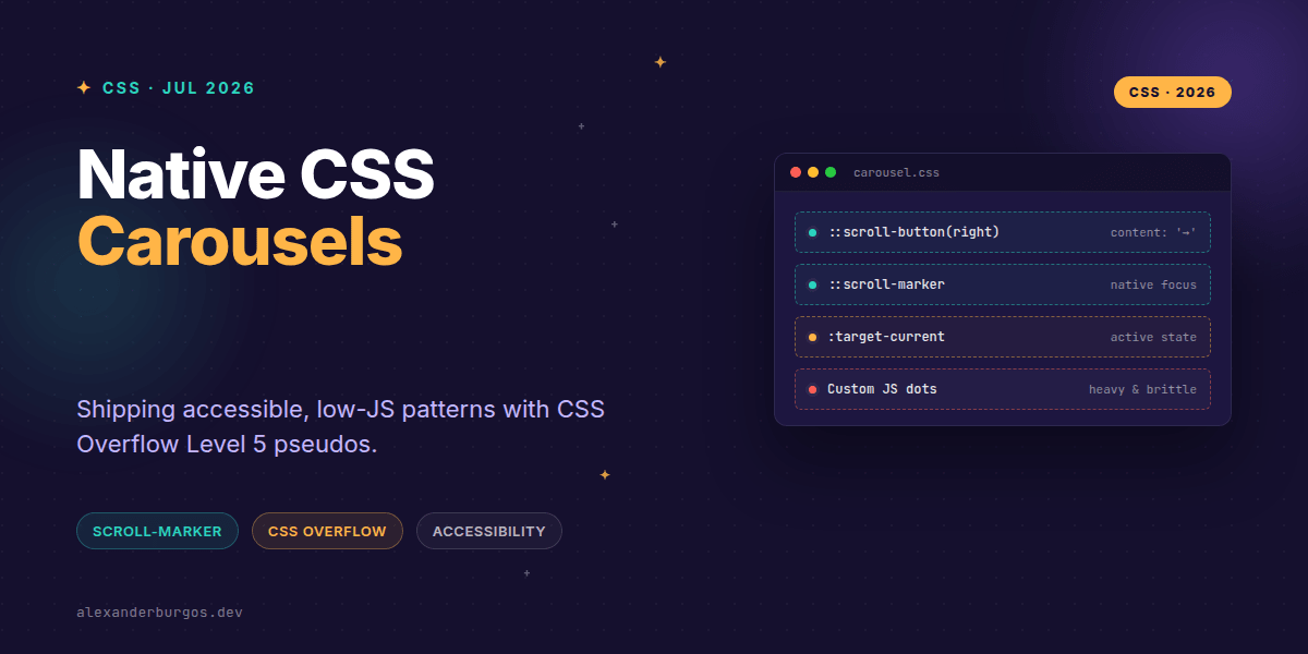
But things are changing. With the CSS Overflow Module Level 5, we're finally getting native, browser-level controls for scroll containers. We're talking about ::scroll-button() and ::scroll-marker. These aren't just decorative elements; they're real, functional UI generated by the browser.
The End of the Custom Control Struggle
In my experience, the hardest part of building a carousel isn't the scrolling—it's the plumbing. You have to sync the scroll position with the pagination dots, handle keyboard navigation, manage focus, and ensure screen readers know what's happening. It's a lot of brittle JavaScript for a 'simple' UI pattern.
The new CSS pseudos flip the script. Instead of you building the buttons and wiring them up, the browser creates them for you. As Chrome for Developers puts it: "The browser will create real buttons, with your content inside, as siblings to the scroller." This means accessibility and focus management are baked in from the start.
Generating Native Buttons
The ::scroll-button(direction) pseudo-element allows you to generate up to four buttons per scroll container. You can target up, down, left, right, or the logical equivalents like inline-start and inline-end.
.carousel {
  display: flex;
  overflow-x: auto;
  scroll-snap-type: x mandatory;
}

/* Generate the buttons */
.carousel::scroll-button(left) {
  content: "←" / "Previous slide";
  display: block;
  padding: 1rem;
}

.carousel::scroll-button(right) {
  content: "→" / "Next slide";
  display: block;
}
Notice the syntax in the content property? We're providing a visual string and an accessible fallback name. This is huge for design systems because it ensures that even though the button is CSS-generated, it remains accessible to assistive technology.
Markers and Groups: The New Pagination
Pagination dots (or markers) have always been a headache. We usually ended up mapping an array of items to a list of buttons. Now, we use ::scroll-marker on the items themselves and collect them in a ::scroll-marker-group.
.carousel {
  scroll-marker-group: after; /* Position markers after the scroller */
}

.carousel-item::scroll-marker {
  content: "";
  width: 12px;
  height: 12px;
  background: var(--color-neutral-300);
  border-radius: 50%;
  cursor: pointer;
}

.carousel-item::scroll-marker:target-current {
  background: var(--color-primary-600);
  transform: scale(1.2);
}
The :target-current pseudo-class is the secret sauce here. It automatically applies to the marker associated with the item currently in view. No Intersection Observer required, no scroll event listeners—just pure, declarative CSS.
Design System Implementation Strategy
When building this for a production design system, I've found that a progressive enhancement approach is non-negotiable. While these features are exciting, browser support is still evolving. You don't want to leave users with a broken experience.
- Baseline: A standard overflow-x container with
scroll-snap. This works everywhere and provides a decent touch experience. - Enhancement: Check for support of
::scroll-markerand::scroll-button. If supported, the browser renders the controls automatically. - Fallback: For browsers that don't support these pseudos but require navigation buttons (like older desktop browsers), you can provide a lightweight JS fallback that injects buttons.
The Component API
If you're building this in React or Vue, your component props should map directly to these CSS capabilities. This keeps the abstraction thin and the performance high. Here’s a look at how I'd structure the API:
<Carousel
  orientation="horizontal"
  showControls={true}
  showIndicators={true}
  indicatorPosition="after" // Maps to scroll-marker-group
  nextLabel="Go to next slide"
>
  {items.map(item => <Slide key={item.id}>{item.content}</Slide>)}
</Carousel>
Common Gotchas I've Encountered
I've seen teams get tripped up by a few things when experimenting with these new pseudos. First, ::scroll-button() only exists if you set a content value. If you leave it as none, the browser won't generate the control at all.
Second, don't assume these features replace 100% of your accessibility work. While the browser handles the focus and the 'button' nature of the controls, you still need to ensure your slides have proper semantics (like role="group" or role="listitem") and that the overall carousel is labelled correctly.
Wrapping Up
- Native CSS carousels reduce JS overhead by letting the browser handle button generation and marker syncing.
- Use
::scroll-button(direction)for navigation and::scroll-markerwith:target-currentfor pagination dots. - Always treat these as progressive enhancements; ensure the core scroll-snap experience is solid first.
I'm genuinely excited about this shift. Moving more UI logic into the CSS engine means faster, more resilient components for everyone. Give it a try in your next design system audit!
If you want to go deeper and learn how to build real, production-ready CSS design systems step by step, check out my full course here: CSS Design Systems Course
If you want the long-form version of this with 23 chapters and runnable code, Ship Your Design System on Amazon is the handbook.
Got questions about CSS carousels? Let's chat on Twitter or LinkedIn.