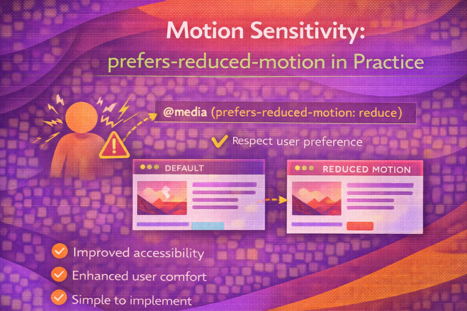
Ever wondered why some users find your beautifully crafted parallax scroll or bouncy entrance animations physically nauseating? It's a tough pill to swallow, but for many people with vestibular disorders or motion sensitivity, our "delightful" animations are actually a massive barrier to using the web. We spend so much time polishing our transitions that we often forget some people literally need them to stop.
The good news? We have a direct line to the user's preferences through the `prefers-reduced-motion` media query. It's not about stripping away the soul of your design; it's about providing a safe, comfortable experience for everyone. Let's dive into how we can handle motion responsibly without losing our creative edge.
The Core Concept: Why Motion Matters
Here's the thing: motion isn't just an aesthetic choice. For some, it's a trigger for dizziness, headaches, or even seizures. When we talk about "reduced motion," we aren't necessarily saying "zero motion." We're talking about removing the types of movement that cause issues—think heavy scaling, spinning, or high-speed sliding across the screen.
The CSS Implementation Strategy
I've seen many developers try to fix this with a blanket reset. While it's a quick win, it can sometimes be a bit too aggressive. Honestly, the most robust way to handle this is to rethink how we apply motion in the first place. Instead of adding motion and then taking it away, what if we only added it when the user says it's okay?
However, if you're working on an existing project, the "Nuclear Option" is often where people start. It's effective, but use it with caution as it can break some functional transitions (like layout shifts you actually want to see slowly).
/* The 'Nuclear Option' - use with care! */
@media (prefers-reduced-motion: reduce) {
  *,
  *::before,
  *::after {
    animation-duration: 0.01ms !important;
    animation-iteration-count: 1 !important;
    transition-duration: 0.01ms !important;
    scroll-behavior: auto !important;
  }
}
Wait, why `0.01ms` and not `none`? Sometimes, JS libraries rely on transition events to fire. If you set it to `none`, those events might never trigger, leaving your app in a broken state. Using a tiny duration keeps the logic happy while making the change invisible to the eye.
The 'Motion-First' vs 'Safety-First' Approach
In my experience, the cleanest code comes from the 'Safety-First' approach. You define your base styles as static, and then wrap your animations in a `no-preference` query. This ensures that if a browser doesn't support the query (rare nowadays, but still), the user gets the safest version by default.
/* Safety-First: Only animate if they haven't asked us not to */
.card {
  transform: none;
  opacity: 1;
}

@media (prefers-reduced-motion: no-preference) {
  .card {
    transition: transform 0.3s ease, opacity 0.3s ease;
  }

  .card:hover {
    transform: translateY(-10px);
  }
}
Handling JavaScript Animations
CSS is only half the battle. If you're using GSAP, Framer Motion, or just plain old `requestAnimationFrame`, the CSS media query won't save you. You need to check the preference in your scripts. The cool bit? You can even listen for when the user changes their system settings in real-time.
const motionQuery = window.matchMedia('(prefers-reduced-motion: reduce)');

function handleMotion(isReduced) {
  if (isReduced) {
    console.log('Stop the heavy JS engines!');
    // Kill your GSAP timelines or Three.js loops here
  } else {
    console.log('Smooth sailing.');
  }
}

// Initial check
handleMotion(motionQuery.matches);

// Listen for system setting changes
motionQuery.addEventListener('change', (e) => {
  handleMotion(e.matches);
});
UX Considerations and Best Practices
Let's be honest—sometimes we get carried away. When designing for motion sensitivity, keep these rules of thumb in mind. It's not just about passing a WCAG audit; it's about genuine empathy for your users.
- Avoid large-scale movement: Moving the whole background is much more likely to cause nausea than a small button hover.
- Replace, don't just remove: Instead of a slide-in, use a simple fade-in. It still provides a visual cue without the 'whoosh' factor.
- Respect the OS: Don't build a custom toggle in your app that overrides the system setting unless you have a very good reason. Users expect their system-wide preference to be honoured.
- Don't forget scroll-behavior: Smooth scrolling can be a major trigger. Always set `scroll-behavior: auto` when motion is reduced.
Wrapping Up
Implementing `prefers-reduced-motion` is one of those high-impact, low-effort wins for web accessibility. It shows you care about the physical well-being of your users, and it keeps your site usable for everyone, regardless of their vestibular health.
- Use the 'Safety-First' approach by wrapping animations in `no-preference` queries.
- Always handle JavaScript-driven motion using `window.matchMedia`.
- Remember that 'reduced' doesn't always mean 'none'—subtle fades are often perfectly fine.
I'd encourage you to try this out today. Open your system settings, toggle 'Reduce Motion', and see how your favourite sites behave. It's a real eye-opener!
If you want to go deeper and learn how to build real, production-ready CSS design systems step by step, check out my full course here: CSS Design Systems Course
If you found this helpful, I'd love to connect! Follow me on Twitter/X @alexandersstudi or LinkedIn for more CSS and design system tips.