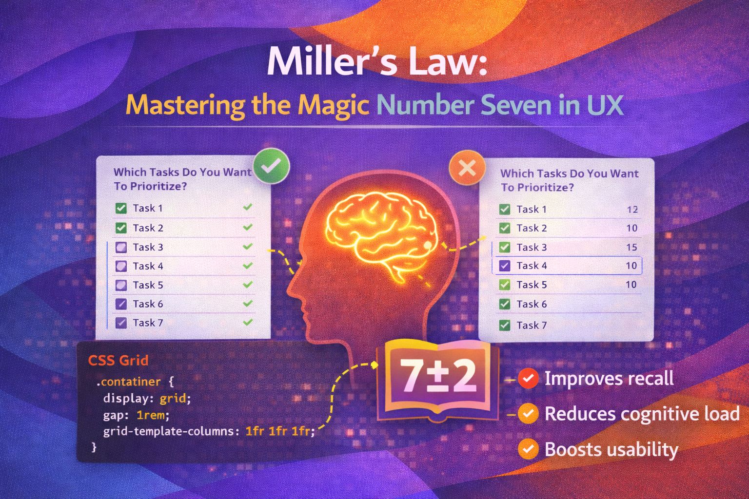
I’ve spent a lot of time looking at cluttered dashboards and overly complex navigation menus. You know the ones—where you feel like you need a degree in rocket science just to find the 'Settings' button. In my experience, these usability nightmares usually stem from ignoring one of the most fundamental principles of cognitive psychology: Miller’s Law.
It’s a concept that often gets misinterpreted as a hard rule for UI design, but when you truly understand the theory behind it, it changes how you approach information architecture forever. Let’s dive into why our brains struggle with 'too much' and how we can design better experiences by respecting our mental limits.
What is Miller’s Law?
Back in 1956, George A. Miller, a cognitive psychologist at Harvard, published a paper titled 'The Magical Number Seven, Plus or Minus Two.' He argued that the average human mind can only hold about seven 'chunks' of information in its short-term memory at any given time.
What I find fascinating is that Miller wasn't necessarily talking about UI elements or menu items; he was talking about the capacity of our working memory. If you throw ten unrelated items at a user, their brain starts 'dropping' the earlier ones to make room for the new ones. It’s like a mental juggling act where we can only keep so many balls in the air before one falls.
The Power of Chunking
The secret sauce of Miller’s Law isn’t actually the number seven—it’s the concept of 'chunking.' Chunking is the process of taking individual pieces of information and grouping them into familiar, manageable units. This is a trick I use constantly when designing complex data visualisations or long forms.
Think about a phone number. 07700900123 is much harder to remember than 07700 900 123. By adding spaces, we’ve reduced eleven individual digits into three distinct chunks. In UX, we do this by using whitespace, borders, and logical categorisation to help users process information without burning out their cognitive batteries.
Common Misconceptions
I’ve seen many designers use Miller’s Law as a reason to limit every menu to exactly seven items. This is a bit of a myth! If you have twenty items that need to be there, hiding thirteen of them behind a 'More' button can actually hurt usability by increasing the number of clicks and hiding important features.
The goal isn't to limit functionality, but to organise it. It’s about reducing the 'Search Time' it takes for a user to find what they need. I personally love using the 'Rule of Three' or 'Rule of Five' for primary navigation, as it leaves plenty of 'mental overhead' for the user to focus on their actual task.
Applying Miller’s Law in Real-World Design
So, how do we apply this theory to our daily work as UX engineers and designers? Here are a few scenarios where Miller's Law is the difference between a delight and a disaster:
- Form Design: Instead of one long page with thirty inputs, break the form into logical steps (e.g., Personal Info, Shipping, Payment). This keeps the user's focus on one 'chunk' at a time.
- Navigation: Use mega-menus that group links into columns with clear headings. This allows the user to scan categories rather than reading every single link.
- Content Strategy: Use short paragraphs, descriptive sub-headings, and bulleted lists. This 'chunks' the text and makes it scannable for the 80% of users who don't read word-for-word.
- Dashboard Layouts: Group related metrics together using cards and containers. A user should be able to look at a dashboard and see four or five 'areas' of information, rather than fifty individual numbers.
Wrapping Up
Miller’s Law reminds us that human attention is a finite resource. As designers and engineers, our job is to be good stewards of that attention. By grouping information logically and respecting the limits of working memory, we create products that feel intuitive and effortless.
- Focus on Chunking: Group related items to reduce the number of individual pieces of information a user must process.
- Don't take '7' literally: It's a guideline for working memory capacity, not a hard limit for every list or menu.
- Prioritise Hierarchy: Use visual cues like size, colour, and spacing to help the brain identify what's important first.
I’d encourage you to take a look at your current project. Is there a screen that feels 'noisy'? Try grouping related elements into clear containers and see how much lighter it feels. It's often the simplest changes that have the biggest impact on user satisfaction!
If you found this helpful, I'd love to connect! Follow me on Twitter/X @alexandersstudi or LinkedIn for more CSS and design system tips.