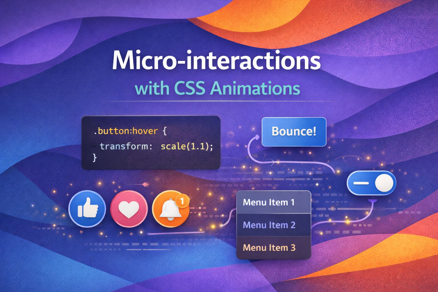
I've always believed that the difference between a good product and a great one lies in the details—those tiny, functional animations we call micro-interactions. In my experience, you don't need heavy JavaScript libraries to create delight; modern CSS is more than capable of handling the heavy lifting while keeping your performance metrics green.
The Logic of Subtle Feedback
I love using CSS variables to control the 'spring' of an interaction, as it allows for a consistent feel across an entire design system. Here is a basic setup I use for tactile button presses that feel responsive and physical.
/* Defining our motion tokens */
:root {
  --spring-easing: cubic-bezier(0.175, 0.885, 0.32, 1.275);
  --bounce-duration: 200ms;
}

.btn-interactive {
  transition: transform var(--bounce-duration) var(--spring-easing);
  cursor: pointer;
}

.btn-interactive:active {
  transform: scale(0.95);
}
By using a custom cubic-bezier, we simulate a natural elastic effect that feels much more 'human' than a standard linear transition. We can extend this to complex multi-stage animations using keyframes for more character.
/* A subtle 'nudge' animation for drawing attention */
@keyframes nudge {
  0%, 100% { transform: translateX(0); }
  25% { transform: translateX(-4px); }
  75% { transform: translateX(4px); }
}

.input-error {
  animation: nudge 0.4s var(--spring-easing);
  border-colour: #ef4444;
}
State-Driven Transitions
What I find fascinating is how we can use the sibling selector to animate adjacent elements, creating a sense of flow in the UI. I typically use this for floating labels or interactive form fields to provide instant visual confirmation.
/* Floating label interaction */
.field-group {
  position: relative;
  margin-top: 2rem;
}

.input-field:placeholder-shown + .field-label {
  opacity: 0;
  transform: translateY(1rem);
}

.input-field:not(:placeholder-shown) + .field-label {
  opacity: 1;
  transform: translateY(-1.5rem);
  transition: all 0.25s ease-out;
  color: #6366f1;
}
This pattern ensures the user never loses context of what they are typing while adding a sophisticated layer of polish. To make it even better, let's look at how we handle loading states within buttons using pseudo-elements.
/* Loading micro-interaction */
.btn-submit {
  position: relative;
  overflow: hidden;
}

.btn-submit.is-loading {
  color: transparent;
}

.btn-submit.is-loading::after {
  content: '';
  position: absolute;
  width: 16px;
  height: 16px;
  top: calc(50% - 8px);
  left: calc(50% - 8px);
  border: 2px solid white;
  border-radius: 50%;
  border-right-colour: transparent;
  animation: spin 0.75s linear infinite;
}

@keyframes spin {
  from { transform: rotate(0deg); }
  to { transform: rotate(360deg); }
}
The Power of Transform-Origin
Here's a trick I use to make navigation links feel more grounded: changing the `transform-origin` based on hover state. It creates a 'drawing' effect that guides the eye naturally across the menu.
/* Directional underline animation */
.nav-link {
  position: relative;
  text-decoration: none;
}

.nav-link::after {
  content: '';
  position: absolute;
  bottom: -2px;
  left: 0;
  width: 100%;
  height: 2px;
  background: var(--accent-colour);
  transform: scaleX(0);
  transform-origin: right;
  transition: transform 0.3s ease-in-out;
}

.nav-link:hover::after {
  transform: scaleX(1);
  transform-origin: left;
}
By switching the origin, the underline appears to enter from one side and exit from the other. For card components, I prefer a subtle lift combined with a shadow shift to indicate depth.
/* Depth and elevation interaction */
.card-item {
  transition:
    transform 0.2s ease,
    box-shadow 0.2s ease;
  box-shadow: 0 4px 6px -1px rgb(0 0 0 / 0.1);
}

.card-item:hover {
  transform: translateY(-8px);
  box-shadow: 0 20px 25px -5px rgb(0 0 0 / 0.1);
}
Accessibility Matters: Motion Control
As much as I love animations, we must respect users who prefer reduced motion. I always wrap my micro-interactions in a media query to ensure the experience is inclusive.
/* Respecting user preferences */
@media (prefers-reduced-motion: reduce) {
  *,
  ::before,
  ::after {
    animation-duration: 0.01ms !important;
    animation-iteration-count: 1 !important;
    transition-duration: 0.01ms !important;
    scroll-behavior: auto !important;
  }
}
This snippet is a staple in my design systems. If you want to be more surgical, you can just disable the 'bouncy' parts while keeping essential state changes.
/* Selective motion reduction */
@media (prefers-reduced-motion: reduce) {
  .btn-interactive:active {
    transform: none;
    outline: 3px solid currentColor;
  }
}
Wrapping Up
Micro-interactions are the secret sauce of UX engineering. They provide feedback, guide tasks, and make a digital interface feel tangible. I encourage you to take these snippets and tweak the timings—animation is all about the feel!
- Use CSS variables for consistent timing and easing across your system.
- Prioritize 'transform' and 'opacity' properties to keep animations at 60fps.
- Always include a 'prefers-reduced-motion' check for accessibility.
If you found this helpful, I'd love to connect! Follow me on Twitter/X or LinkedIn for more CSS and design system tips.