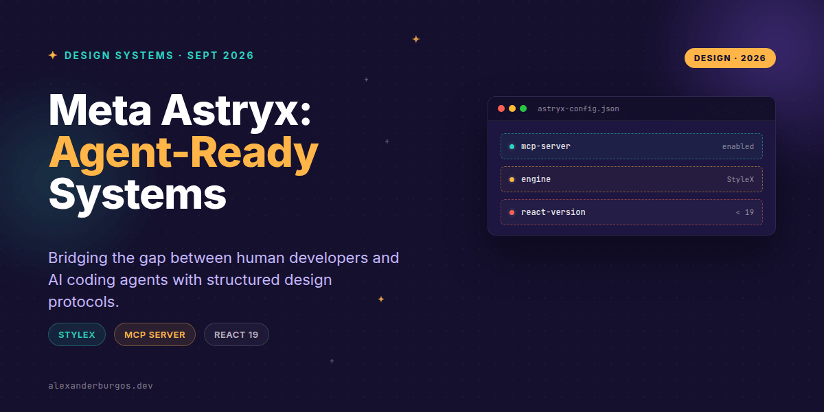
Right, let's talk about Meta's latest gift to the open-source world: Astryx. Released in June 2026 under the MIT license, this isn't just another component library to add to the pile; it's the culmination of eight years of internal development powering over 13,000 applications at Meta.
What makes Astryx particularly spicy isn't just its scale, but its philosophy. It's built for a world where AI agents like Claude or GitHub Copilot aren't just autocomplete tools, but active participants in our design system engineering. By shipping with a Model Context Protocol (MCP) server, Meta is effectively giving AI a 'seat at the table' by providing a machine-readable interface to the system's guts.
The Architecture of Separation
At its core, Astryx leans heavily on React 19+ and StyleX. The architecture follows a strict separation of concerns that I've long championed: keeping behavior entirely distinct from appearance. This isn't just about clean code; it's about longevity.
- The Behavior Layer: This handles the hard stuff—keyboard navigation, focus management, and ARIA states. It's the logic that stays the same whether your button is blue, red, or a neon pink gradient.
- The Visual Layer: Powered by StyleX, this is where your design tokens live. Colors, spacing, and typography are injected as CSS, meaning you don't need a heavy runtime to change the look and feel.
- The Consumption Model: You import typed components and CSS. If you need to rebrand, you tweak the tokens, not the interaction logic.
I've found that this approach is the only way to scale design systems across massive organisations. By decoupling the 'how it works' from the 'how it looks', Meta has created a system that is both incredibly robust and surprisingly flexible.
Making Systems Legible for AI
This is where things get really interesting. We've all seen AI struggle to hallucinate the correct props for a component. Astryx solves this by providing the @astryxdesign/cli and a dedicated MCP server.
Instead of an AI agent trying to 'guess' how to use a Button component by reading a README file, it can query the CLI for structured JSON. It gets a machine-readable contract of every prop, every theme token, and every template available. It's like giving your AI a direct API into your design system documentation.
npx astryx docs Button --jsonAnd for those using MCP-compatible environments, the integration is even tighter. You can hook the Astryx server directly into your workflow, allowing your tools to fetch components and themes on the fly. It even features a 'dense output mode' designed specifically to save context window space—because we all know how precious those tokens are.
The Accessibility Reality Check
I need to wave a yellow flag here. While Meta advertises Astryx as 'accessible', that doesn't mean your app is automatically WCAG compliant the moment you run npm install. Accessibility is a practice, not a package.
Remember the first rule of ARIA: if you can use a native HTML element, do it. Astryx does a lot of the heavy lifting for complex components, but you still need to provide the correct labels, ensure a logical focus order, and test with actual screen readers. A library can give you a tool, but you still have to build the house correctly.
Common Pitfalls to Avoid
- React Versioning: Don't try to force this into an older project. It requires React 19+ as a baseline.
- Browser Support: Be careful here. The public docs are currently a bit quiet on the exact browser support matrix. Always verify and test your target browsers before a production rollout.
- MCP isn't Magic: An agent still needs permissions and correct configuration to talk to the Astryx server. It's a protocol, not a silver bullet.
Wrapping Up
- Astryx is built for scale, separating interaction logic from StyleX-based visual tokens.
- The MCP server and CLI make the system 'legible' to AI agents, reducing hallucination and improving dev velocity.
- Accessibility is baked into the components, but developer implementation and testing remain vital for WCAG compliance.
I'd highly encourage you to spin up a small project and try the CLI yourself. Seeing how an AI agent interacts with a structured design system is a glimpse into the future of our industry.
If you want to go deeper and learn how to build real, production-ready CSS design systems step by step, check out my full course here: CSS Design Systems Course
The full story including the testing layers and governance lives in Ship Your Design System on Amazon.
Let's keep the conversation going! You can find me sharing more CSS and UX engineering thoughts on Twitter or connect with me for a deeper dive on LinkedIn.