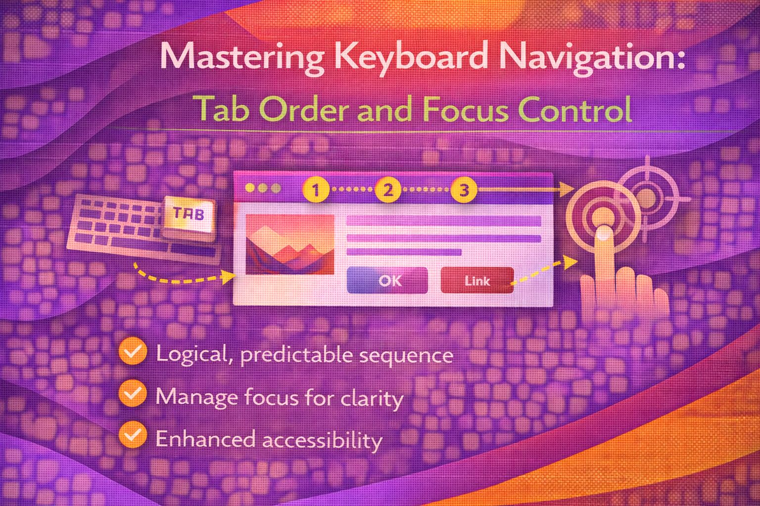
Let's be honest - keyboard navigation is often the last thing on a developer's checklist, but it's arguably the most critical part of a solid UX. If a user can't navigate your site with just a keyboard, your interface is effectively broken for a huge portion of your audience. I've spent plenty of time fixing 'trapped focus' bugs, and I've found that sticking to native patterns is always the best move.
The Golden Rule: Semantic HTML First
Before we reach for JavaScript, we should let the browser do the heavy lifting by using native interactive elements that have keyboard support baked in.
<!-- ✅ DO THIS: Native elements handle Tab and Enter automatically -->
<button type="button" onclick="handleAction()">Save Changes</button>
<a href="/dashboard">Go to Dashboard</a>
<input type="checkbox" id="terms" name="terms">

<!-- ❌ AVOID THIS: Requires manual tabindex and JS listeners -->
<div class="btn" tabindex="0" onclick="handleAction()">Save Changes</div>
When you use a `div` as a button, you're signing up for a lot of manual work to make it accessible to screen readers and keyboard users alike.
Managing Focus with JavaScript
For custom components like modals or dropdowns, we need to handle specific keys like Escape or Arrow keys to meet ARIA standards.
/* Standard keyboard event handler for custom widgets */
const handleKeyDown = (e) => {
  switch (e.key) {
    case 'Enter':
    case ' ':
      // Activate the element
      toggleComponent();
      break;
    case 'ArrowDown':
      e.preventDefault();
      moveFocusNext();
      break;
    case 'ArrowUp':
      e.preventDefault();
      moveFocusPrevious();
      break;
    case 'Escape':
      closeComponent();
      break;
  }
};
Notice the `e.preventDefault()` on the arrow keys; this stops the whole page from scrolling while the user is just trying to navigate your menu.
Visual Focus Indicators
Never remove the default focus ring without providing a high-contrast alternative that's easy to spot.
/* Custom focus styles that look great and stay accessible */
.nav-link:focus-visible {
  outline: 3px solid #005fcc;
  outline-offset: 2px;
  border-radius: 4px;
}

/* Ensure focus is visible even if the element has a background colour */
.button-primary:focus {
  box-shadow: 0 0 0 2px #fff, 0 0 0 4px #005fcc;
  outline: none;
}
The `:focus-visible` pseudo-class is a game changer because it only shows the indicator when a user actually needs it (like during keyboard use), keeping mouse users happy.
The Future: The focusgroup Attribute
I'm genuinely excited about this one. The `focusgroup` attribute allows us to handle arrow-key navigation declaratively without writing a single line of JavaScript.
<!-- Experimental: Declarative arrow-key navigation -->
<div focusgroup="horizontal">
  <button>Item 1</button>
  <button>Item 2</button>
  <button>Item 3</button>
</div>
This tells the browser that only the first item should be in the Tab order, while the rest are reached via the left and right arrow keys.
Browser Support & Fallbacks
While `focusgroup` is the future, it's currently only available for early testing in Chromium-based browsers and Microsoft Edge. For production, you still need a fallback.
/* Production-ready roving tabindex pattern */
<div role="toolbar" aria-label="Formatting options">
  <button tabindex="0">Bold</button>
  <button tabindex="-1">Italic</button>
  <button tabindex="-1">Underline</button>
</div>
Wrapping Up
Getting keyboard navigation right isn't just about ticking an accessibility box; it's about making your site feel professional and predictable. Here are the key takeaways:
- Always prefer native semantic elements like and .
- Never suppress focus indicators without providing a clear, high-contrast alternative.
- Keep an eye on the focusgroup attribute for future-proofing your design systems.
- Ensure the DOM order matches the visual order to prevent 'jumping' focus.
I'd encourage you to put your mouse aside for ten minutes today and try navigating your latest project using only your keyboard. It's often a real eye-opener!
If you want to go deeper and learn how to build real, production-ready CSS design systems step by step, check out my full course here: CSS Design Systems Course
If you found this helpful, I'd love to connect! Follow me on Twitter/X @alexandersstudi or LinkedIn for more CSS and design system tips.