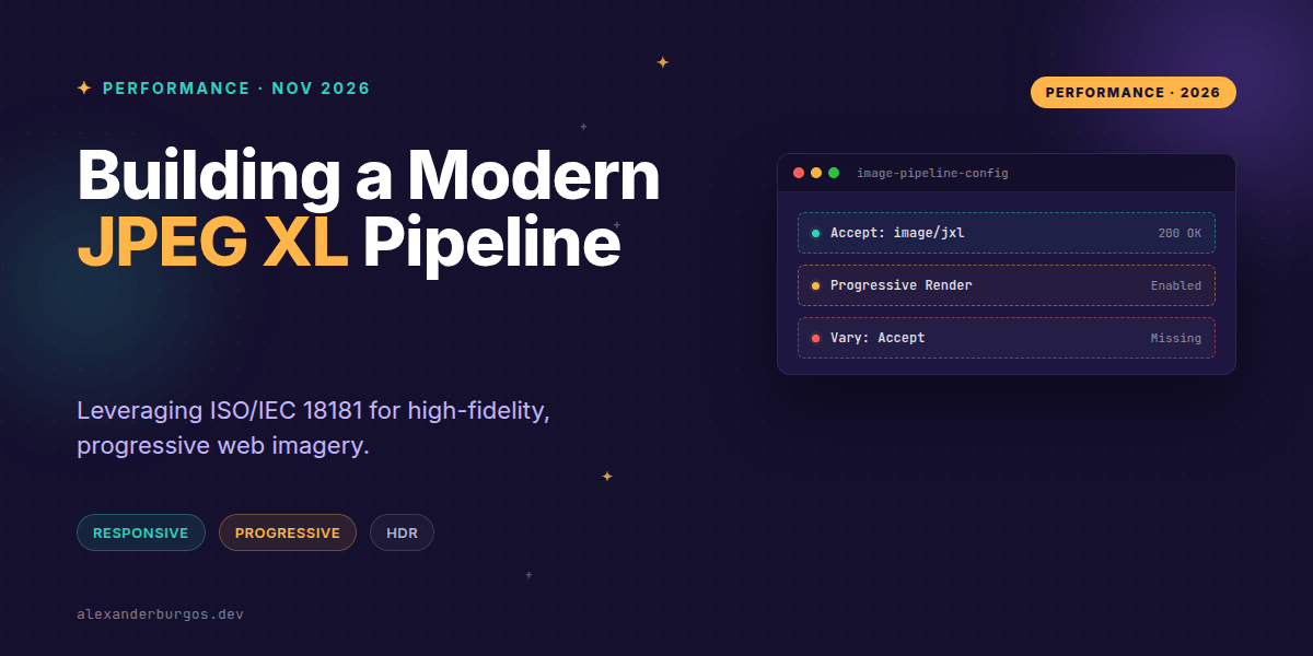
Okay, I'm genuinely excited about this. After years of "will they, won't they" drama in the browser engine world, JPEG XL (JXL) has finally hit the mainstream. With Chrome 155 and Firefox 158 both shipping support by default in late 2026, we've officially crossed the threshold from experimental curiosity to production-ready tool.
But here's the thing: just because the browsers support it doesn't mean we can just flip a switch and delete our old JPEGs. In my experience, the biggest mistake teams make when adopting new media formats is ignoring the "pipeline" aspect. We need a strategy that handles responsive delivery, respects legacy browsers, and—most importantly—measures what's actually happening on the user's screen.
Why JPEG XL Changes the Game
JPEG XL isn't just another incremental update like WebP was. It's a standardized powerhouse (ISO/IEC 18181) designed for the modern web. I've found it particularly impressive for high-fidelity photographic content and archival-quality imagery. Unlike AVIF, which excels at tiny file sizes for small UI elements, JXL shines when you need wide colour gamuts, HDR, and lossless transcoding.
- Progressive Decoding: The image renders as it downloads, which is a massive win for perceived performance.
- Lossless JPEG Transcoding: You can convert existing JPEGs to JXL without losing a single bit of data while still saving space.
- High Bit Depth: Perfect for HDR displays and professional photography.
- Animation & Transparency: It's a true all-in-one format.
The Multi-Format Picture Strategy
We've all been there—trying to serve the sharpest image without breaking the site for someone on an older tablet. The <picture> element remains our best friend here. It allows us to offer JXL as a progressive enhancement while keeping AVIF and standard JPEG as reliable fallbacks.
<picture>
  <source
    type="image/jxl"
    srcset="/img/hero-640.jxl 640w, /img/hero-1280.jxl 1280w"
    sizes="100vw">
  <source
    type="image/avif"
    srcset="/img/hero-640.avif 640w, /img/hero-1280.avif 1280w"
    sizes="100vw">
  <img
    src="/img/hero-1280.jpg"
    srcset="/img/hero-640.jpg 640w, /img/hero-1280.jpg 1280w"
    sizes="100vw"
    width="1280" height="720"
    alt="A high-fidelity hero image">
</picture>
Note that I've kept explicit width and height on the <img> tag. This is non-negotiable for preventing layout shifts, regardless of which format the browser eventually picks.
Server-Side Content Negotiation
If you're using an image CDN or a custom origin server, you can be a bit more clever. Browsers like Firefox now advertise image/jxl in their HTTP Accept header. When your server sees this, it can serve the JXL version even if the URL looks generic.
However, you must be careful with caching. If you don't tell the CDN that the response varies based on the Accept header, you'll end up serving a JXL file to a browser that only understands JPEG. Always include the Vary: Accept header.
HTTP/1.1 200 OK
Content-Type: image/jxl
Vary: Accept
Cache-Control: public, max-age=31536000, immutable
Measuring Success (and Failures)
Don't just assume that because a browser should support JXL, it's actually rendering correctly. I'm a big fan of actual field data. You can use a small snippet of JavaScript to report back which format was actually used for your LCP (Largest Contentful Paint) image.
document.querySelectorAll("img").forEach(img => {
  img.addEventListener("load", () => {
    const format = new URL(img.currentSrc).pathname.split(".").pop();
    navigator.sendBeacon("/metrics/image", JSON.stringify({
      format,
      complete: img.complete,
      width: img.naturalWidth
    }));
  });
});
This helps you catch edge cases, like Safari 17 supporting JXL but not rendering it progressively. If your users are on slow connections, Safari users might see a blank space for longer than Chrome users, even if the file size is identical. Real-world metrics will tell you if your "optimisation" is actually hurting UX.
Common Pitfalls to Avoid
First, don't remove your fallbacks yet. While the big players are on board, Edge support can still be version-dependent, and there are millions of older devices that will never see a JXL update. Second, don't blindly assume JXL is always smaller. For small, simple UI icons, AVIF or even a well-optimised SVG might still win. Benchmark your high-fidelity photos specifically.
Wrapping Up
- Use the
<picture>tag to serve JXL as a progressive enhancement while maintaining AVIF/JPEG fallbacks. - Ensure your server sends
Vary: Acceptto avoid cache poisoning across different browser capabilities. - Monitor real-world performance using
currentSrcto verify that JXL is actually being delivered and rendered as expected.
The web is getting faster and more colourful. I'd encourage you to start experimenting with JXL on your hero images today—the fidelity gains alone are worth the extra few lines of HTML.
If you want to go deeper and learn how to build real, production-ready CSS design systems step by step, check out my full course here: CSS Design Systems Course
The full story including the testing layers and governance lives in Ship Your Design System on Amazon.
Let's keep the conversation going! You can find me sharing more CSS and performance tips on Twitter or connect with me for a deeper dive into UX engineering on LinkedIn.