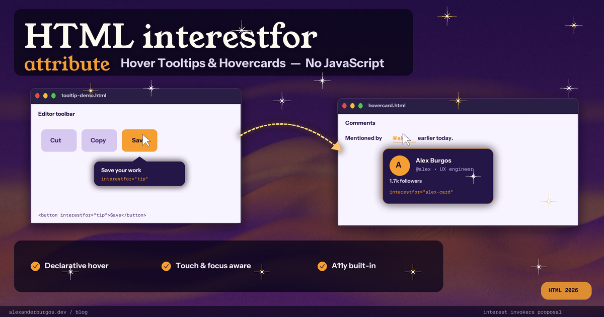
Let's be honest -- how many times have you reached for Floating UI, Popper, or Tippy.js just to show a tooltip on hover? You wire up mouseenter, mouseleave, focusin, focusout, debounce a timer, position the floating element, hand-roll the ARIA, then test it on touch and discover none of it works. All for a tiny piece of contextual UI.
Sound familiar?
The web platform finally has an answer, and it is brilliantly simple. It is called interestfor, it is one HTML attribute, and it lets the browser handle hover, focus, long-press, accessibility wiring and Escape-key dismissal for you. I have been playing with it for the past few weeks and it genuinely feels like the biggest "delete your hover library" moment since :hover itself.
What is interestfor?
interestfor is a brand-new declarative HTML primitive. You add it to a <button>, an <a>, an <area> or an SVG <a>, and you point it at the id of the element you want to reveal. When the user shows "interest" in the invoker -- by hovering it with a mouse, focusing it with the keyboard, or long-pressing it on a touchscreen -- the browser dispatches an InterestEvent on the target. If the target is a popover, it opens automatically.
Here is the smallest possible example. No script, no library, no ARIA glue -- this is the entire program:
<button interestfor="my-popover" type="button">Hover for popover</button>
<div id="my-popover" popover="hint">Hello world</div>
Hover the button, tab to it, or long-press it on a phone, and the popover appears anchored beneath it. Move away and it closes. The browser does the timing, the positioning, the screen-reader announcements, and the touch handling for you.
interestfor sits alongside two other declarative invoker attributes that already shipped: popovertarget (open a popover on click) and commandfor + command (run a built-in or custom command on activation). Where commandfor says "the user definitely wants this", interestfor says "the user might want this -- offer it gently". You can even stack them on the same element to give a button a click action and a hover preview at the same time.
How the trigger model works
The most common misconception about interestfor is that it is a hover-only API. It is not. The browser fires interest on three different signals, and they are all first-class citizens.
Hover
Mouse over the invoker, wait for the start delay (default 0.5s), and the interest event fires on the target. Move the cursor away and after the end delay (also 0.5s by default), loseinterest fires and the popover closes.
Keyboard focus
Tab to the invoker and the same interest event fires after the start delay. Blur it and you get loseinterest. Keyboard users get exactly the same affordance as mouse users, which is one of the best parts of the design.
Touch / long-press
On a touchscreen, the user agent adds a "View more info" item to the long-press context menu. Tapping it fires interest immediately, with no delay. You can also opt in to a visible button via the ::interest-button pseudo-element, which is great for surfacing the affordance on phones where there is no hover.
Both events are instances of InterestEvent and expose a source property that points back to the invoker, so a single popover can be shared between many invokers:
<button interestfor="save-tip">Save</button>
<p id="save-tip" popover="hint">Saves your changes (Ctrl+S)</p>

<style>
  #save-tip { position-area: bottom; }
</style>
Notice position-area: bottom. Because the popover gets an implicit anchor reference to its invoker, CSS anchor positioning works automatically. You do not have to write a single line of positioning logic.
A real example -- hovercard on a username
Tooltips are the obvious use case, but the place where interestfor really earns its keep is the hovercard. Think of an @-mention in a comment that previews the user's profile when you hover. Today that pattern needs a JS library, a positioning engine, debounced timers, and a pile of ARIA. With interestfor it is mostly markup.
<p>
  Nice catch from
  <a href="/u/chris" interestfor="user-chris">@chris</a>
  earlier today.
</p>

<div id="user-chris" popover="hint">
  <img src="/avatars/chris.jpg" alt="" width="48" height="48">
  <strong>Chris Mills</strong>
  <p>Independent tech writer, Greenfield UK.</p>
  <button>Follow</button>
</div>

<style>
  a[interestfor] { interest-delay-start: 1s; }
  #user-chris { position-area: bottom right; }

  /* Smooth fade in/out */
  #user-chris {
    opacity: 0;
    transition:
      opacity 0.3s,
      overlay 0.3s allow-discrete,
      display 0.3s allow-discrete;
  }
  #user-chris:interest-target { opacity: 1; }
  @starting-style {
    #user-chris:interest-target { opacity: 0; }
  }
</style>
Two new pseudo-classes do the heavy styling: :interest-source matches the invoker while interest is being shown, and :interest-target matches the popover. Combined with @starting-style and allow-discrete transitions, you get a smooth fade in and out without any JavaScript at all. Click the link and it still navigates to the profile -- interest is purely additive.
Customising the delays
Half a second is a sensible default for most tooltips, but hovercards usually want a longer dwell so people do not trigger them by accident as the cursor crosses the page. CSS gives you three properties to tune the timing:
- interest-delay-start -- how long to wait before interest fires. Default 0.5s.
- interest-delay-end -- how long to wait before loseinterest fires. Default 0.5s.
- interest-delay -- shorthand for both. interest-delay: 1s 2s means 1s start, 2s end.
/* Snappy tooltips on icon buttons */
.icon-button {
  interest-delay-start: 200ms;
  interest-delay-end: 100ms;
}

/* Patient hovercards on user mentions */
a.mention {
  interest-delay: 1s 400ms;
}
Worth knowing: these delays only apply to mouse and keyboard interactions. Touch (long-press) and the explicit ::interest-button pseudo-element fire immediately, because making someone wait half a second after they have already tapped a button feels broken.
Browser support and standards status
This is the part where I have to be honest with you. Today, 28 April 2026, interestfor is shipping in Chrome 142 stable (and therefore Edge, and Chromium-based browsers) as of 28 October 2025, on desktop, Android, and WebView. No flag required. Mozilla's standards position is "defer" -- supportive in tone but no implementation work signalled yet. WebKit has filed a negative position, citing concerns about touchscreen tooltips and spatial-computing input, and because of that the WHATWG HTML PR has not yet landed. The issue is still in "stage 1: incubation".
What does that mean in practice? Around 70% of your users get the native experience today. The TAG review is supportive. The CSS bits (the new pseudo-classes and the interest-delay-* properties) were accepted into the css-ui-4 and Selectors drafts back in July 2025. The Open UI explainer ships a polyfill for the rest. Feature-detect cleanly:
const supported = Object.hasOwn(
  HTMLButtonElement.prototype,
  "interestForElement"
);

// And for the CSS half
@supports selector(:interest-source) {
  /* style the source */
}
Accessibility wins built in
If you have ever tried to build an accessible tooltip from scratch, you will know the rabbit hole: aria-describedby, role="tooltip", focus management, Escape handling, click-away, and on and on. interestfor takes most of that off your plate, especially for the simple case:
- For plain text-only popover="hint" content, the user agent automatically exposes the popover's text as the accessible description of the invoker, so screen readers announce it as a proper tooltip-style description.
- The popover is hidden from the accessibility tree directly, so there is no duplicate announcement.
- Keyboard focus is a first-class trigger -- not an afterthought. Tab users get the same affordance as hover users.
- The CSS pseudo-classes accept partial and total arguments. :interest-source(partial) matches when interest has started but not yet committed; :interest-source(total) matches the fully-activated state. Lovely for subtle pre-reveal styling.
- Escape always closes. Keyboard users can dismiss the popover at any time, regardless of where focus is.
- popover="hint" is special -- hints do not close other open popover="auto" popovers, so opening a tooltip inside a menu does not destroy your menu.
For richer hovercards with interactive content (a Follow button, links, etc.), the explainer recommends a minimum role of tooltip on the popover, toggling aria-expanded on the invoker, wiring aria-details, and putting the hovercard next in the focus order. The browser handles the simple case, you handle the complex one. That is exactly the trade I want.
What this replaces
Chrome's own data, from the Intent to Ship, found that over 94% of the top-50 production websites use some form of hover-triggered UI: tooltips, profile previews on @-mentions, link previews, icon labels, "showing N comments" hovercards, the lot. interestfor + popover="hint" collapses a surprising amount of plumbing:
- Floating UI / Popper.js hover handlers -- positioning is now handled by CSS anchor positioning out of the box.
- Tippy.js, react-tooltip and friends -- declarative HTML covers the basic case end to end.
- Custom debounce timers -- replaced by the interest-delay-* CSS properties.
- ARIA tooltip plumbing -- accessible description and tree hiding happen for free with popover="hint".
- Hand-rolled hovercards -- the hovercard markup is just a popover with rich content.
- Touch fallbacks -- the long-press "View more info" affordance and ::interest-button are baked in.
Gotchas to know
- Only works on certain elements. HTMLButtonElement, HTMLAnchorElement, HTMLAreaElement, and SVG <a>. You cannot put interestfor on a <div> -- which is a feature, not a bug. It forces a focusable, interactive host so keyboard users always work.
- Touch is not a no-op. The user agent adds a context-menu item on long-press, and you can opt in to ::interest-button. Test on a real phone before you ship.
- Mozilla deferred and Safari is opposed. Plan a polyfill or a JS fallback for non-Chromium users. The Open UI explainer links to a working one.
- :interest-source and :interest-target are still draft CSS. They are accepted into the working drafts but not yet baseline -- gate them behind @supports selector(:interest-source).
- Do not put critical info in a hint. The accessibility model assumes the popover content is supplementary. If the user must read it to use the page, do not hide it behind hover.
- Click still wins. If the user clicks an <a interestfor="...">, the browser navigates as normal. The popover never intercepts clicks.
- Use the IDL property when you can. If you do not want to manage ids, set the relationship directly: link.interestForElement = tooltipEl;.
It is rare for the platform to ship a feature that quietly deletes thousands of lines of JavaScript from a typical product, but interestfor is one of those. Hover-revealed UI has been a missing primitive on the web for two decades, and we have all paid for it -- in performance, in accessibility bugs, in fragile timer logic, and in the sheer weight of libraries we ship just to put a label on an icon. Once Firefox and Safari come around (and they will, eventually) this becomes the default way to build tooltips, hovercards, link previews, and any other "offer it gently" affordance the web has been faking for years.
If you are working on a Chromium-first product or a design system that values progressive enhancement, start using interestfor today behind a feature detect. Your bundle size will thank you, your keyboard users will thank you, and your future self -- the one who would otherwise have been debugging a hover library at 11pm -- will thank you most of all.
Happy coding!
If you want to go deeper and learn how to build real, production-ready CSS design systems step by step, check out my full course here: CSS Design Systems Course
If you found this helpful, I'd love to connect! Follow me on Twitter/X @alexandersstudi or LinkedIn for more CSS and design system tips.