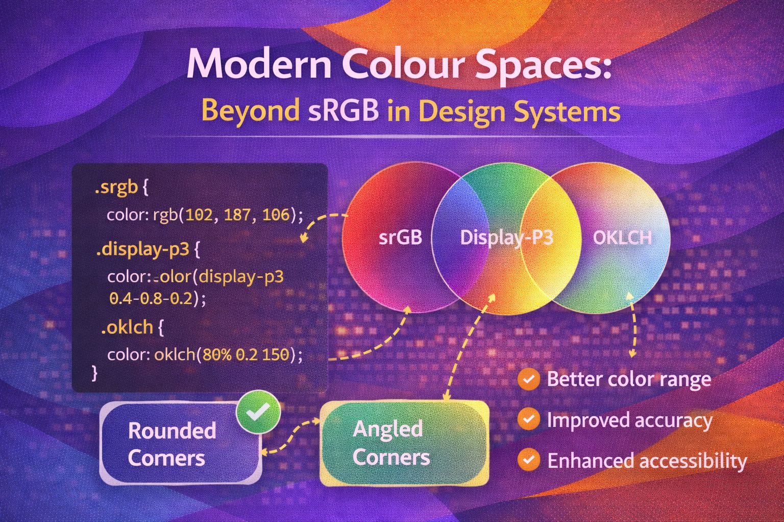
Ever wondered why that vibrant neon green you picked in Figma looks a bit... muddy when it hits the browser? Or why your meticulously crafted accessible colour palette feels wildly inconsistent when you swap from blues to yellows? You're not alone. For decades, we've been trapped in the 'sRGB basement', trying to build high-end design systems with a limited box of crayons.
Right, let's talk about the shift that's happening. We're moving away from the technical limitations of the past and towards a world where our design tokens reflect how humans actually perceive colour. With the rise of Display P3 and the magic of OKLCH, we're finally getting the tools to create palettes that are not only more beautiful but scientifically more consistent.
The Problem: The sRGB Ceiling
Historically, the web has been built on sRGB. It was the lowest common denominator for monitors in the 90s. But here's the kicker: modern iPhones, MacBooks, and even mid-range Android devices can display about 25% more colour than sRGB allows. This extra space is called Display P3.
When we define our branding tokens using old-school Hex or HSL, we're essentially leaving performance on the table. It's like buying a 4K telly but only watching VHS tapes. If your brand relies on a punchy, high-energy orange or a deep, electric violet, sRGB simply can't reproduce those colours. They get 'clipped', appearing duller than intended.
Enter OKLCH: The Designer's Superpower
If you've ever tried to build a design system palette, you've likely wrestled with HSL (Hue, Saturation, Lightness). You'll know that HSL 50% lightness in blue looks much darker than HSL 50% lightness in yellow. This is because HSL is a geometric model, not a perceptual one. Our eyes are naturally more sensitive to green and yellow light than blue.
OKLCH (Lightness, Chroma, Hue) fixes this. It's a perceptually uniform colour space. If you set two different colours to the same 'L' (Lightness) value in OKLCH, they will appear to have the same brightness to the human eye. This is a total game-changer for accessibility (WCAG) and design system tokens.
graph TD
    A[Brand Primary Colour] --> B{Choose Model}
    B --> C[HSL/Hex]
    B --> D[OKLCH]
    C --> E[Inconsistent Perceived Brightness]
    C --> F[Manual Accessibility Tweaking]
    D --> G[Uniform Perceived Brightness]
    D --> H[Automated Accessible Scales]
    G --> I[Better UX & Visual Balance]
The decision path between traditional and perceptual colour models.
Design Tokens and the 'Wide Gamut' Strategy
So, how do we actually apply this to a design system? It's all about how we structure our tokens. I've found that the best approach is to define your 'Source of Truth' in a wide gamut space like Display P3 using OKLCH coordinates, and then provide fallbacks for older screens.
In Figma, this is becoming much easier with the introduction of multi-colour space support. You can now design in P3 and ensure your tokens carry that data through to implementation. The cool bit? When you use OKLCH, you can programmatically generate your 'tints' and 'shades' (the 100 to 900 scale) with the confidence that the contrast will remain stable.
UX Psychology: Why Perceptual Uniformity Matters
This isn't just about looking 'pretty'. It's about cognitive load and visual hierarchy. When a design system has inconsistent perceived lightness, the user's eye is pulled toward 'brighter' elements (like a yellow button) more strongly than 'darker' ones (like a blue button), even if they have the same functional importance.
By using OKLCH tokens, we create a 'level playing field'. We can ensure that our UI elements have a predictable visual weight regardless of their hue. This leads to a more harmonious interface that feels 'right' to the user, even if they can't quite put their finger on why.
Wrapping Up
Moving your design system to modern colour spaces like Display P3 and models like OKLCH is one of the most impactful upgrades you can make. It bridges the gap between high-end hardware and web software, ensuring your branding looks its absolute best while making accessibility a breeze to manage.
- Embrace the Gamut: Don't let sRGB limit your brand's potential on modern hardware.
- Think Perceptually: Switch from HSL to OKLCH to ensure your colour scales are visually consistent and accessible.
- Tokenize for the Future: Build your design system with wide-gamut data today to avoid technical debt tomorrow.
I'm genuinely excited to see more teams moving away from the safe-but-dull sRGB defaults. Give OKLCH a spin in your next palette exploration—I promise you won't want to go back to Hex!
If you found this helpful, I'd love to connect! Follow me on Twitter/X @alexandersstudi or LinkedIn for more design system and UX engineering tips.