Let's be honest -- we've all been there. Someone updates a button component, the PR looks fine, it gets merged, and two weeks later you discover it broke the spacing on three different pages. The card component's border radius changed. A colour token got overwritten. Nobody noticed until a designer opened the staging site and said, "That's not what I designed."
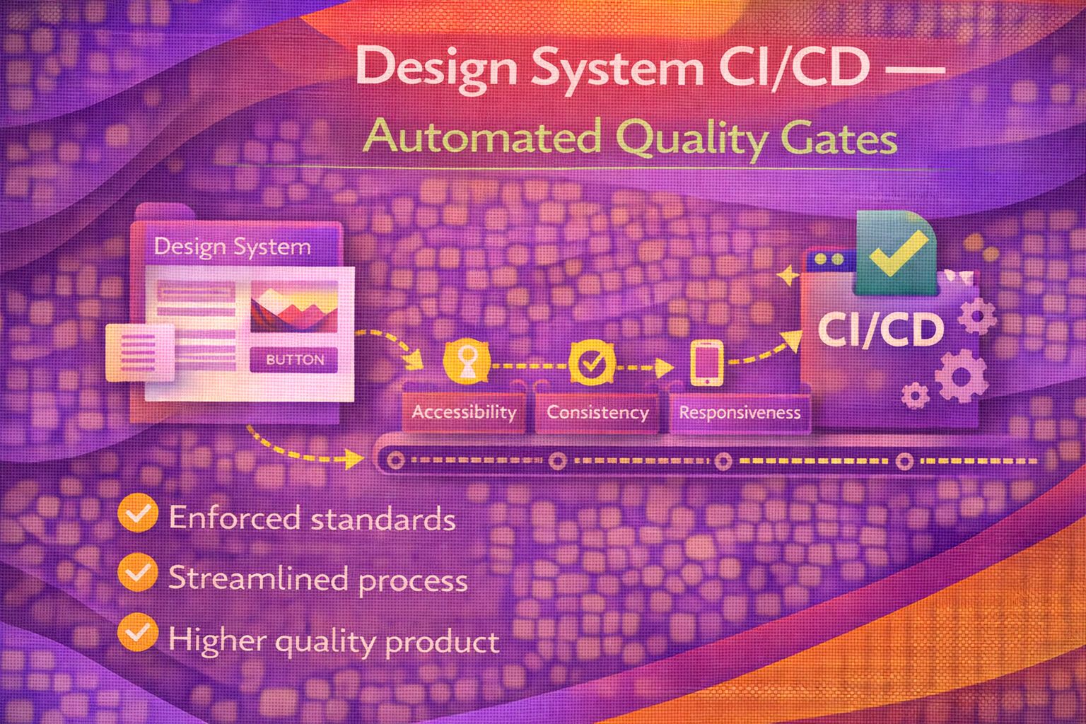
Automated quality gates fix this. They're the checks that run automatically on every pull request to your design system, catching visual regressions, accessibility violations, broken APIs, and token mismatches before they ever reach production. Think of them as your design system's immune system.
And here's the thing -- setting this up is much easier than you'd expect. If you're already using GitHub Actions and Storybook, you're halfway there.
What Are Quality Gates?
A quality gate is simply a check that must pass before code can be merged. In a design system context, these gates ensure that every component change meets your team's standards for visual fidelity, accessibility, API stability, and design token consistency.
The typical design system CI/CD pipeline includes these gates:
- Visual regression testing -- catches unintended visual changes to components
- Accessibility testing -- ensures WCAG compliance on every component
- Unit and interaction testing -- validates component behaviour and API contracts
- Design token validation -- checks that tokens are properly formatted and synchronised
- Bundle size checks -- prevents unexpected size increases
- Documentation linting -- ensures every component has proper docs
The goal is simple: if any of these checks fail, the PR gets blocked. No broken components reach production. No accessibility regressions slip through. No "I didn't realise that changed" moments.
Gate 1: Visual Regression Testing with Chromatic
Chromatic is the gold standard for visual regression testing in design systems. Built by the team behind Storybook, it automatically captures screenshots of every component story, compares them to a baseline, and flags any visual differences -- down to the pixel.
Companies like GitHub, The Guardian, Auth0, and Monday.com use Chromatic in their design system pipelines. It's used by Primer (GitHub's design system), and it's the tool I'd recommend starting with.
How it works
- On every PR, Chromatic builds your Storybook in the cloud
- It captures pixel-perfect screenshots of every story across multiple browsers (Chrome, Firefox, Safari, Edge)
- It compares each screenshot against the accepted baseline
- If changes are detected, it creates a visual diff highlighting exactly what changed
- Reviewers can accept or reject each change through Chromatic's UI
- The PR is blocked until all visual changes are reviewed
Here's a minimal GitHub Actions workflow to get Chromatic running:
# .github/workflows/chromatic.yml
name: Chromatic

on:
  push:
    branches: [main]
  pull_request:
    branches: [main]

jobs:
  chromatic:
    runs-on: ubuntu-latest
    steps:
      - uses: actions/checkout@v4
        with:
          fetch-depth: 0  # Required for Chromatic to compare baselines

      - uses: actions/setup-node@v4
        with:
          node-version: 20
          cache: 'npm'

      - run: npm ci

      - uses: chromaui/action@latest
        with:
          projectToken: ${{ secrets.CHROMATIC_PROJECT_TOKEN }}
          exitZeroOnChanges: true  # Don't fail CI, let reviewers decide
My tip: Start with `exitZeroOnChanges: true` so visual changes don't block your pipeline immediately. Once your team gets comfortable reviewing visual diffs, switch to `exitOnceUploaded: true` for stricter enforcement.
Chromatic also supports TurboSnap, which only captures stories affected by code changes. This can reduce your snapshot count by up to 90%, saving both time and money. Brilliant for large design systems with hundreds of stories.
Gate 2: Accessibility Testing with axe-core
Accessibility shouldn't be an afterthought -- it should be a gate. If a component doesn't meet WCAG standards, it shouldn't ship. Full stop.
axe-core by Deque is the industry standard engine for automated accessibility testing. It powers the accessibility checks in Storybook, Lighthouse, Chrome DevTools, and most CI/CD accessibility tools. It catches about 57% of WCAG issues automatically -- things like missing alt text, insufficient colour contrast, missing form labels, and improper ARIA usage.
Storybook + axe-core (the easy way)
The simplest approach is Storybook's built-in accessibility addon, which runs axe-core against every story:
# Install the addon
npm install @storybook/addon-a11y --save-dev
Then add it to your Storybook config:
// .storybook/main.ts
export default {
  addons: [
    '@storybook/addon-a11y',
    // ...other addons
  ],
};
This gives you an accessibility panel in Storybook that shows violations in real time. But to make it a proper quality gate, you need to run it in CI.
axe-core in CI with Playwright
For CI pipelines, I prefer using axe-core with Playwright. It gives you more control and catches issues at the page level, not just individual stories:
// tests/a11y.spec.ts
import { test, expect } from '@playwright/test';
import AxeBuilder from '@axe-core/playwright';

test.describe('Design System Accessibility', () => {
  test('Button component has no a11y violations', async ({ page }) => {
    await page.goto('/iframe.html?id=components-button--primary');

    const results = await new AxeBuilder({ page })
      .withTags(['wcag2a', 'wcag2aa', 'wcag21aa'])
      .analyze();

    expect(results.violations).toEqual([]);
  });
});
Pro tip from real-world experience: Don't try to fix every existing violation at once. Start by adding the gate with `failOnViolation: false`, fix violations incrementally, then flip it to `true` once your components are clean. GitHub's Primer team does exactly this -- they have an `accessibility-alt-text-bot` that runs on every PR.
Gate 3: Unit and Interaction Testing
Component API stability is crucial. If someone changes a prop name or removes a variant, consuming applications break. Unit tests and interaction tests catch these issues.
Storybook Test Runner
Storybook 8's test runner is a brilliant tool that turns your existing stories into tests. It renders every story and checks for JavaScript errors, ensuring your components at least render without crashing. You can also add interaction tests using the `play` function:
// Button.stories.tsx
import { within, userEvent, expect } from '@storybook/test';

export const ClickTest = {
  play: async ({ canvasElement }) => {
    const canvas = within(canvasElement);
    const button = canvas.getByRole('button');

    // Verify the button is clickable
    await userEvent.click(button);
    await expect(button).toHaveTextContent('Clicked!');
  },
};
Run it in CI with:
# Add to your CI pipeline
npx test-storybook --ci
This is incredibly powerful because you're testing your components in the same environment where designers review them. One source of truth.
Gate 4: Design Token Validation
Design tokens are the bridge between design and code. If they break, everything downstream breaks. A proper token validation gate ensures that:
- Tokens are properly formatted (valid JSON, correct structure)
- Token names follow your naming convention
- No tokens were accidentally deleted
- Token values are within expected ranges (e.g., colours are valid hex/RGB)
- Platform-specific outputs (CSS, iOS, Android) are generated correctly
Style Dictionary by Amazon and Tokens Studio are the two main tools for token transformation in CI. Here's a GitHub Actions step that validates and builds your tokens:
# Token validation step in your CI pipeline
- name: Validate and build tokens
  run: |
    # Validate token JSON structure
    npx ajv validate -s token-schema.json -d tokens/**/*.json

    # Build tokens for all platforms
    npx style-dictionary build --config config.json

    # Check for uncommitted changes (tokens should be pre-built)
    git diff --exit-code -- dist/tokens/

    echo "Tokens validated and built successfully"
My recommendation: Add a step that compares the current token count against the previous build. If tokens were removed, flag it as a breaking change that needs explicit approval. This has saved my team from accidental deletions more times than I'd like to admit.
Gate 5: Bundle Size Monitoring
A design system that keeps growing in size becomes a performance liability for every consuming application. Bundle size gates prevent this creep.
Tools like size-limit and bundlewatch integrate easily into CI. Here's a simple setup:
// package.json
{
  "size-limit": [
    {
      "path": "dist/index.js",
      "limit": "50 kB"
    },
    {
      "path": "dist/styles.css",
      "limit": "15 kB"
    }
  ],
  "scripts": {
    "size": "size-limit",
    "size:check": "size-limit --json"
  }
}
If a PR increases the bundle beyond the limit, it fails. The developer must either optimise their code or explicitly increase the limit with a justification. Simple but effective.
Putting It All Together: The Full Pipeline
Here's what a complete design system CI/CD workflow looks like with all the quality gates. This is based on real pipelines from teams like GitHub (Primer) and Shopify (Polaris), adapted for a typical team:
# .github/workflows/design-system-ci.yml
name: Design System Quality Gates

on:
  pull_request:
    branches: [main]

jobs:
  lint-and-typecheck:
    runs-on: ubuntu-latest
    steps:
      - uses: actions/checkout@v4
      - uses: actions/setup-node@v4
        with: { node-version: 20, cache: 'npm' }
      - run: npm ci
      - run: npm run lint
      - run: npm run typecheck

  unit-tests:
    runs-on: ubuntu-latest
    steps:
      - uses: actions/checkout@v4
      - uses: actions/setup-node@v4
        with: { node-version: 20, cache: 'npm' }
      - run: npm ci
      - run: npm run test -- --ci --coverage

  storybook-tests:
    runs-on: ubuntu-latest
    steps:
      - uses: actions/checkout@v4
      - uses: actions/setup-node@v4
        with: { node-version: 20, cache: 'npm' }
      - run: npm ci
      - run: npx concurrently -k -s first \
          "npx http-server storybook-static --port 6006" \
          "npx wait-on http://127.0.0.1:6006 && npx test-storybook --ci"

  visual-regression:
    runs-on: ubuntu-latest
    steps:
      - uses: actions/checkout@v4
        with: { fetch-depth: 0 }
      - uses: actions/setup-node@v4
        with: { node-version: 20, cache: 'npm' }
      - run: npm ci
      - uses: chromaui/action@latest
        with:
          projectToken: ${{ secrets.CHROMATIC_PROJECT_TOKEN }}

  accessibility:
    runs-on: ubuntu-latest
    steps:
      - uses: actions/checkout@v4
      - uses: actions/setup-node@v4
        with: { node-version: 20, cache: 'npm' }
      - run: npm ci
      - run: npx playwright install --with-deps chromium
      - run: npm run test:a11y

  tokens-validation:
    runs-on: ubuntu-latest
    steps:
      - uses: actions/checkout@v4
      - uses: actions/setup-node@v4
        with: { node-version: 20, cache: 'npm' }
      - run: npm ci
      - run: npm run tokens:build
      - run: git diff --exit-code -- dist/tokens/

  bundle-size:
    runs-on: ubuntu-latest
    steps:
      - uses: actions/checkout@v4
      - uses: actions/setup-node@v4
        with: { node-version: 20, cache: 'npm' }
      - run: npm ci
      - run: npm run build
      - uses: andresz1/size-limit-action@v1
        with:
          github_token: ${{ secrets.GITHUB_TOKEN }}
This pipeline runs all gates in parallel, so it doesn't take forever. On a typical design system, the full suite finishes in 3-5 minutes. That's a small price to pay for the confidence it gives you.
How the Big Teams Do It
Let's look at how some well-known design systems handle their CI/CD. These are real pipelines you can study on GitHub.
GitHub Primer
Primer has over 205,000 workflow runs (yes, really). Their pipeline includes Code Scan, AAT Reports (Automated Accessibility Testing), an accessibility-alt-text-bot, Canary Releases, visual regression via Chromatic, and changeset validation. They even have a dedicated "Assign Release Conductor" workflow. You can explore it at github.com/primer/react/actions.
Shopify Polaris
Polaris runs accessibility testing, visual regression, lint checks, and comprehensive unit tests on every PR. They also validate snapshots and run cross-browser testing. Their monorepo approach means every package in the system gets its own quality gates. Check it at github.com/Shopify/polaris.
Adobe Spectrum
Adobe's Spectrum design system uses Chromatic for visual regression, along with comprehensive accessibility testing. They also run performance benchmarks on web components to ensure rendering speed stays consistent across releases.
5 Tips from Real Experience
1. Start with one gate, not all of them
Don't try to set up all six gates at once. Start with visual regression testing (Chromatic) -- it's the quickest win and catches the most issues. Add accessibility testing next, then gradually layer on the rest.
2. Make gates informative, not just blocking
A failing gate should tell the developer exactly what went wrong and how to fix it. A message saying "Accessibility check failed" is useless. A message saying "Button component: colour contrast ratio is 3.2:1, minimum required is 4.5:1 (WCAG AA)" is actionable.
3. Use PR comments for reporting
Tools like Danger.js can post automated comments on PRs with reports about bundle size changes, visual diffs, and accessibility results. This makes review faster because the information is right there in the PR, not buried in CI logs.
4. Run gates in parallel
There's no reason for your accessibility tests to wait for your visual regression tests. Run everything in parallel using separate CI jobs. This keeps the total pipeline time down to the length of your slowest gate, not the sum of all gates.
5. Treat your CI pipeline as code
Version your workflow files, review changes to them in PRs, and document why each gate exists. A year from now, someone will ask "why do we have this check?" and the commit history should answer that question.
The Tool Stack at a Glance
Here's my recommended stack for a design system CI/CD pipeline in 2026:
- Visual regression: Chromatic (or Percy / Playwright screenshots for budget-conscious teams)
- Accessibility: axe-core via Storybook addon or Playwright integration
- Interaction testing: Storybook Test Runner with play functions
- Token validation: Style Dictionary or Tokens Studio with JSON schema validation
- Bundle size: size-limit or bundlewatch
- PR automation: Danger.js for automated PR comments and enforcement rules
- CI platform: GitHub Actions (or GitLab CI, CircleCI -- the concepts are the same)
Resources
- Chromatic Docs -- visual regression testing setup and best practices
- Storybook Testing Docs -- comprehensive testing guide for Storybook 8
- axe-core on GitHub -- the accessibility testing engine
- Style Dictionary -- token transformation for multiple platforms
- Tokens Studio -- design system platform for token automation
- GitHub Primer Actions -- see a world-class DS pipeline in action
- Shopify Polaris -- another excellent reference pipeline
- Danger.js -- automated PR review comments
- size-limit -- bundle size enforcement
Wrapping Up
Automated quality gates aren't just a nice-to-have -- they're what separates design systems that scale from ones that slowly fall apart. Every team I've seen adopt this approach has the same reaction: "Why didn't we do this sooner?"
Start small. Add Chromatic to your next PR. Set up the Storybook accessibility addon. Create a bundle size check. Each gate you add is one less category of bugs that can reach production.
Your future self -- and every designer who's ever said "that's not what I designed" -- will thank you.
Happy building!