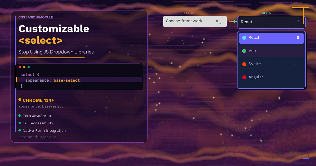
For about 25 years, the <select> element has been the most frustrating thing in web development. You know the drill -- you need a dropdown that matches your design system. You try to style the native <select>. You hit a wall. So you reach for a JavaScript library, add 30KB to your bundle, rebuild all the accessibility from scratch, and hope nothing breaks on mobile.
Sound familiar?
React Select, Headless UI Listbox, Radix Select, Select2 -- these libraries exist for one reason: the native <select> was impossible to style. But here's the thing -- that era is finally ending.
With appearance: base-select, you can now fully customise the native <select> element using just CSS. No JavaScript libraries. No custom ARIA roles. No reinventing keyboard navigation. The browser handles all of it.
What is appearance: base-select?
appearance: base-select is a CSS value that opts a native <select> element into a fully customisable mode. It's part of the CSS Basic User Interface Module and the Open UI initiative -- a cross-browser effort to make form controls styleable without losing their built-in behaviour.
When you add this one line of CSS, several things change:
- The browser's default select styling is completely removed
- The dropdown panel renders as a popover in the top layer -- meaning it escapes
overflow: hidden,z-indexstacking, and clipping containers - New elements and pseudo-elements become available for styling
- You can put arbitrary HTML inside
<option>elements -- images, icons, descriptions, whatever you need
Here's the basic opt-in:
select {
  appearance: base-select;
}
That's it. One line and you've unlocked a completely new set of styling capabilities.
New Elements and Pseudo-Elements
Once you opt in with appearance: base-select, you get access to a handful of new building blocks. Let's walk through them.
The selectedcontent Element
The <selectedcontent> element is a new HTML element that sits inside the <select> trigger (the button part). It automatically clones the content of the currently selected <option> and displays it in the trigger.
This is brilliant because it means if your options contain images or icons, the trigger will show them too -- without any JavaScript.
<select>
  <button type="popover">
    <selectedcontent></selectedcontent>
  </button>
  <option value="uk">
    <img src="/flags/uk.svg" alt="" /> United Kingdom
  </option>
  <option value="fr">
    <img src="/flags/fr.svg" alt="" /> France
  </option>
</select>
The ::picker(select) Pseudo-Element
The ::picker(select) pseudo-element targets the dropdown panel itself -- the bit that pops open when you click the select. You can style its background, border, border-radius, padding, shadow, and even animate it.
select::picker(select) {
  background: #1a1a2e;
  border: 1px solid #333;
  border-radius: 0.75rem;
  padding: 0.5rem;
  box-shadow: 0 8px 32px rgba(0, 0, 0, 0.3);
}
The ::picker-icon and ::checkmark Pseudo-Elements
::picker-icon targets the little arrow indicator on the select trigger. You can hide it, replace it, or style it however you like.
::checkmark targets the checkmark that appears next to the currently selected option in the dropdown. Again -- fully styleable or removable.
/* Custom arrow */
select::picker-icon {
  content: url('data:image/svg+xml,...');
  rotate: 0deg;
  transition: rotate 0.2s ease;
}

select:open::picker-icon {
  rotate: 180deg;
}

/* Hide the default checkmark */
option::checkmark {
  display: none;
}
Pseudo-Classes: :open and :closed
You also get :open and :closed pseudo-classes on the select element itself. These let you style the trigger differently depending on whether the dropdown is visible.
select:open {
  border-color: #6200ee;
  box-shadow: 0 0 0 3px rgba(98, 0, 238, 0.2);
}

select:closed {
  border-color: #ccc;
}
Real Examples
Let's look at some practical examples that show what you can actually build with this.
Options with Icons and Descriptions
This was impossible with the old <select>. Now you can put rich HTML content inside each <option>:
<select>
  <button type="popover">
    <selectedcontent></selectedcontent>
  </button>
  <option value="visa">
    <span class="option-row">
      <img src="/icons/visa.svg" alt="" width="32" />
      <span>
        <strong>Visa</strong>
        <small>**** 4242</small>
      </span>
    </span>
  </option>
  <option value="mastercard">
    <span class="option-row">
      <img src="/icons/mastercard.svg" alt="" width="32" />
      <span>
        <strong>Mastercard</strong>
        <small>**** 8888</small>
      </span>
    </span>
  </option>
</select>
select {
appearance: base-select;
font-family: system-ui, sans-serif;
padding: 0.75rem 1rem;
border: 1px solid #ccc;
border-radius: 0.5rem;
min-width: 280px;
}
.option-row {
display: flex;
align-items: center;
gap: 0.75rem;
}
.option-row small {
display: block;
color: #888;
font-size: 0.8rem;
}
option {
padding: 0.75rem 1rem;
border-radius: 0.5rem;
}
option:hover {
background: #f0f0f0;
}
option:checked {
background: #eef;
}Animated Dropdown with @starting-style
Because the dropdown is a popover, you can animate its entrance and exit using @starting-style and transition-behavior: allow-discrete. This gives you smooth, CSS-only open/close animations:
select::picker(select) {
  opacity: 1;
  transform: scaleY(1);
  transform-origin: top;
  transition: opacity 0.25s ease,
              transform 0.25s ease,
              display 0.25s allow-discrete;
}

@starting-style {
  select::picker(select) {
    opacity: 0;
    transform: scaleY(0.8);
  }
}

select::picker(select):not(:open) {
  opacity: 0;
  transform: scaleY(0.8);
}
No JavaScript animation libraries. No requestAnimationFrame hacks. Pure CSS.
Custom Arrow Icon
Replacing the default dropdown arrow was always a hack involving background images and padding tricks. Now it's straightforward:
select::picker-icon {
  content: '\25BC'; /* or use a custom SVG */
  font-size: 0.7rem;
  color: #666;
  rotate: 0deg;
  transition: rotate 0.2s ease;
}

select:open::picker-icon {
  rotate: 180deg;
  color: #6200ee;
}
Accessibility -- What the Browser Handles for Free
This is where appearance: base-select really shines. Let's be honest -- the main reason we reach for libraries like Headless UI or Radix isn't just styling. It's because rebuilding accessibility from scratch is hard and error-prone.
With the customisable select, all of this is handled by the browser automatically:
- Keyboard navigation -- Arrow keys, Home, End, Enter, Escape, and type-ahead all work out of the box
- Screen reader announcements -- The correct roles, states, and properties are built in. No manual ARIA attributes needed
- Focus management -- Focus moves into the dropdown when it opens and returns to the trigger when it closes
- Touch and pointer support -- Works correctly on mobile without extra event listeners
Compare this to a typical custom dropdown built with divs and JavaScript. You'd need to manually implement role="listbox", role="option", aria-selected, aria-expanded, aria-activedescendant, keyboard event handlers, focus trapping, and more. It's a lot of code to get right, and most implementations have subtle bugs.
The native customisable select gives you all of this with zero effort.
Progressive Enhancement -- The Fallback Strategy
The good news is that appearance: base-select is designed for progressive enhancement. If a browser doesn't support it, the property is simply ignored and you get a standard <select> element. It still works -- it just doesn't have your custom styling.
This is the beauty of using the native element instead of a JavaScript replacement. Your fallback is a perfectly functional dropdown -- not a broken UI.
If you want to apply different styles based on support, you can use @supports:
@supports (appearance: base-select) {
  select {
    appearance: base-select;
    /* all your custom styles here */
  }
}

/* Fallback styles for unsupported browsers */
select {
  padding: 0.5rem;
  border: 1px solid #ccc;
  border-radius: 0.25rem;
}
Before vs After -- The Bundle Size Argument
Let's talk numbers. Here's what a typical "styled select" looks like with a JavaScript library versus appearance: base-select.
Before: React Select
npm install react-select
# ~30KB gzipped
import Select from 'react-select';
const options = [
{ value: 'uk', label: 'United Kingdom' },
{ value: 'fr', label: 'France' },
{ value: 'de', label: 'Germany' },
];
function CountryPicker() {
return (
<Select
options={options}
styles={{
control: (base) => ({
...base,
borderRadius: '0.5rem',
borderColor: '#ccc',
}),
option: (base, state) => ({
...base,
backgroundColor: state.isSelected ? '#eef' : 'white',
}),
}}
/>
);
}That's a JavaScript dependency, a styles API to learn, and about 30KB added to your bundle -- for a dropdown.
After: appearance: base-select
<select>
  <button type="popover">
    <selectedcontent></selectedcontent>
  </button>
  <option value="uk">United Kingdom</option>
  <option value="fr">France</option>
  <option value="de">Germany</option>
</select>
select {
appearance: base-select;
padding: 0.75rem 1rem;
border: 1px solid #ccc;
border-radius: 0.5rem;
font-family: system-ui, sans-serif;
min-width: 240px;
}
select::picker(select) {
border-radius: 0.75rem;
padding: 0.5rem;
box-shadow: 0 4px 16px rgba(0, 0, 0, 0.15);
}
option {
padding: 0.5rem 0.75rem;
border-radius: 0.5rem;
}
option:checked {
background: #eef;
}
option:hover {
background: #f5f5f5;
}Zero JavaScript. About 20 lines of CSS. Full accessibility. And browsers that don't support it still get a working native select.
When You Still Need a JavaScript Library
I should be fair -- appearance: base-select doesn't cover every use case. There are situations where you'll still want a JavaScript solution:
- Search and filtering -- If you need a combobox where users can type to filter options, that's a different component. The native select doesn't have a built-in search
- Multi-select with tags -- Styling multi-select is not part of this spec. If you need a "tag picker" UI, you'll still need JavaScript
- Async option loading -- Loading options from an API as the user types is beyond what a native select can do
- Grouped options with complex layouts -- While you can use
<optgroup>, the styling options for groups are still limited
But for the majority of dropdowns -- a list of countries, a status picker, a category selector, a payment method chooser -- the native customisable select is more than enough.
Browser Support
As of March 2025, appearance: base-select is available in:
- Chrome 134+ -- stable
- Edge 134+ -- stable
- Safari -- in development (Technology Preview)
- Firefox -- in development (behind a flag)
This means it's Chromium-only in production for now. But given that Chrome and Edge account for roughly 80% of desktop browser usage, and that the fallback is a perfectly functional native select, this is absolutely something you can start using today with progressive enhancement.
Safari and Firefox are actively implementing it, so full cross-browser support is coming.
Conclusion
The <select> element has been the web's most annoying form control for a quarter of a century. We've worked around it with JavaScript libraries, custom divs, and all sorts of hacks -- each bringing bundle size, accessibility headaches, and maintenance cost.
appearance: base-select changes the game. One CSS property gives you full control over the trigger, the dropdown, the options, the arrow, and the checkmark. You get animations with @starting-style. You get rich content inside options. And you get all the accessibility for free.
Next time you reach for a dropdown library, stop and ask yourself: does this really need JavaScript? Chances are, it doesn't.
Happy coding!
If you want to go deeper and learn how to build real, production-ready CSS design systems step by step, check out my full course here: CSS Design Systems Course
If you found this helpful, I'd love to connect! Follow me on Twitter/X @alexandersstudi or LinkedIn for more CSS and design system tips.