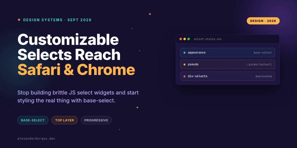
This changes everything. For years, we've lived in a world where the HTML <select> was the bane of every UX engineer's existence. You either lived with the clunky, unstylable platform widget, or you spent weeks building a fragile, ARIA-heavy JavaScript replacement that inevitably broke on mobile or screen readers.
But as of September 2026, the landscape has shifted. With Safari 27 joining Chrome's earlier support, we finally have a cross-browser path to styling native selects without losing their soul. It's called appearance: base-select, and it's the progressive enhancement win we've been waiting for.
The End of the Custom Select Tax
We've all been there: a designer hands over a beautiful mockup with custom arrows, specific padding, and themed dropdown lists. You look at the native select, sigh, and start reaching for a library or a <ul> hack. The cost? Accessibility bugs, broken form submission, and weird keyboard navigation.
The base-select model changes the game. It allows developers to take complete control of the rendering of the <select> while keeping the underlying semantic engine intact. Chrome shipped this back in March 2025, and now that Safari has followed suit, it's time to bake this into our design systems.
How it Works: The Two-Step Opt-in
It's important to note that this isn't just a single line of CSS. To fully unlock the customization, you have to opt-in both the trigger (the button) and the popup (the picker). If you only style the select, you're only halfway there.
/* The magic incantation */
.ds-select,
.ds-select::picker(select) {
  appearance: base-select;
}
The ::picker(select) pseudo-element is the real hero here. It targets the popup menu that appears when you click the select. By applying base-select, you're telling the browser: "I'll take it from here. Don't use the OS-native menu; use my CSS instead."
Styling the Top Layer
One of the coolest technical details is that the picker is rendered in the top layer, similar to a popover. This means no more z-index wars or overflow: hidden clipping issues. It's also fully compatible with CSS anchor positioning, letting you place the dropdown exactly where you want it.
.ds-select::picker(select) {
  border: 1px solid var(--border);
  border-radius: 0.5rem;
  background: var(--surface);
  box-shadow: 0 0.5rem 1.5rem rgb(0 0 0 / 0.18);
  padding: 0.5rem 0;
}
A Progressive Enhancement Strategy
I'm a firm believer in not breaking the web for users on older browsers. Since Firefox is still trailing on this specific implementation, we should use @supports to ensure a graceful fallback. If the browser doesn't support base-select, they get the standard native experience. No harm done.
@supports (appearance: base-select) {
  .ds-select,
  .ds-select::picker(select) {
    appearance: base-select;
  }

  /* Custom styles here */
}
This approach allows you to ship modern, themed components to the vast majority of your users while maintaining a functional, accessible baseline for everyone else. It's the ultimate 'have your cake and eat it too' scenario for design systems.
Important Gotchas to Remember
While I'm genuinely excited about this, there are a few things you need to watch out for when implementing this in your component library:
- Sizing changes: Unlike native selects,
base-selectdoesn't automatically size the trigger based on the widest option. You'll need to manage your widths manually. - Mobile behaviour: This feature bypasses the OS-native mobile picker (like the iOS 'slot machine'). You must ensure your custom picker has large enough touch targets and handles small viewports correctly.
- Focus states: You are now responsible for the focus ring. Don't forget to style
:focus-visibleto keep your component accessible. - Dual opt-in: If you forget to apply the property to
::picker(select), your popup will still use the old native rendering, which will look jarring against your styled trigger.
The full story including the testing layers and governance lives in Ship Your Design System on Amazon.
Wrapping Up
- Use
appearance: base-selectto unlock styling on both the select and its picker pseudo-element. - Always wrap your custom styles in
@supportsto maintain a functional fallback for Firefox and older browsers. - Leverage the top-layer rendering to avoid z-index issues, but remember to test your touch targets on mobile devices.
I'd highly encourage you to try this out in your next internal project. It feels almost illegal to style an option list this easily after years of struggle! Let me know what you build.
If you want to go deeper and learn how to build real, production-ready CSS design systems step by step, check out my full course here: CSS Design Systems Course
For more tips on CSS architecture and design systems, follow me on Twitter or connect with me on LinkedIn.