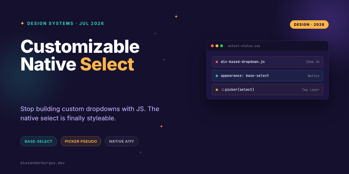
Ever wondered why we're still shipping 30kb of JavaScript just to make a dropdown menu look like our brand? It's one of those industry-wide frustrations we've just accepted as the 'cost of doing business' in UI engineering.
For years, the native <select> has been the bane of design systems. You could style the box, sure, but the moment the user clicked it, the OS took over with a picker that looked out of place and was impossible to theme. That's finally changing.
The New Primitives: base-select
Starting with Chromium 135, we have a new way to opt-in to a styleable state. As the Chrome team puts it: "From Chrome 135, web developers and designers can finally unite on an accessible, standardized and CSS styleable <select> element on the web."
The magic happens with appearance: base-select. Unlike appearance: none, which just strips styles, base-select tells the browser to keep the widget logic but let us control the rendering of the internal parts, including the dropdown itself.
/* The opt-in pattern */
select,
select::picker(select) {
  appearance: base-select;
}
Crucially, you must apply this to both the select element and the new ::picker(select) pseudo-element. If you forget the picker, you'll find yourself stuck with the old OS-level dropdown behavior.
Styling the Picker and Options
The ::picker(select) is the container for your options. It lives in the top layer, much like a popover or a modal. This is a massive win for design systems because it solves the 'z-index hell' we often face with dropdowns inside overflow-hidden containers.
We also get several new hooks to make the UI feel polished:
::picker-icon: Style that little arrow without using background-image hacks.::checkmark: The indicator for the currently selected item.:open: A pseudo-class to style the parent when the menu is active.<selectedcontent>: A new element that lets us define exactly how the selected value looks inside the button.
A Design System Implementation
In my experience, the best way to handle this in a production design system is via progressive enhancement. We want the shiny new features for modern browsers, but we can't break the experience for everyone else.
.ds-select {
  /* Fallback styles for all browsers */
  appearance: none;
  padding: 8px 32px 8px 12px;
  border: 1px solid var(--border-color);
}

@supports (appearance: base-select) {
  .ds-select,
  .ds-select::picker(select) {
    appearance: base-select;
  }

  .ds-select::picker(select) {
    background: var(--surface-overlay);
    border-radius: 8px;
    box-shadow: 0 4px 20px rgba(0,0,0,0.15);
    padding: 4px;
    /* We must set explicit sizing now */
    min-width: anchor-size(width);
  }

  .ds-select option:hover {
    background-color: var(--brand-primary);
    color: white;
  }
}
Common Gotchas to Watch Out For
Right, let's talk about the tricky bits. When you move to base-select, the browser stops making layout assumptions for you. You'll notice that the picker might not match the width of the select box by default.
You'll need to use CSS Anchor Positioning to ensure the picker stays glued to the trigger. You also need to define max-height and overflow-y: auto for the picker, otherwise, a long list of options will just trail off the screen.
Most importantly: remember that this is currently Chromium-only (Chrome/Edge 135+). Firefox and Safari will safely ignore these properties, so your baseline CSS still needs to be solid. Don't throw away your appearance: none hacks just yet!
Wrapping Up
- Use
appearance: base-selecton both the select and::picker(select)to opt-in to full styling. - Leverage the top-layer behavior to avoid z-index issues and layout shifts.
- Always wrap your custom styles in
@supportsto ensure a functional fallback for Firefox and Safari users.
I'm genuinely excited about this. Getting rid of heavy React-Select or Select2 clones in favour of native primitives is a huge win for performance and accessibility. Give it a go in your next internal tool!
If you want the long-form version of this with 23 chapters and runnable code, Ship Your Design System on Amazon is the handbook.
If you want to go deeper and learn how to build real, production-ready CSS design systems step by step, check out my full course here: CSS Design Systems Course
Let's keep the conversation going. I'd love to see what you're building—catch me on Twitter or connect with me on LinkedIn.