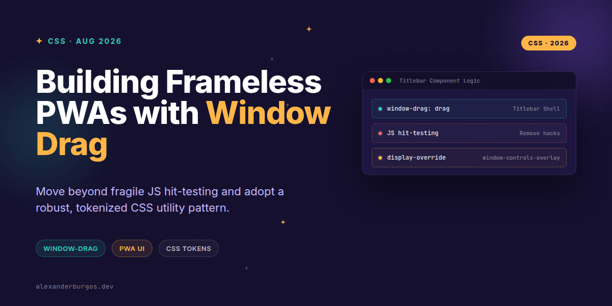
Right, let's talk about the 'uncanny valley' of Progressive Web Apps. You've spent weeks perfecting the typography, the micro-interactions are buttery smooth, and the performance is top-tier. But the moment a user installs it on their desktop, it still feels like a guest in a browser's house because of that clunky, standard OS titlebar.
In the past, making a truly 'frameless' or integrated titlebar experience meant wrestling with complex JavaScript hit-testing or proprietary Electron APIs. But there's a better way emerging in the standards track. I've been digging into the window-drag property, and it's a game-changer for how we architect PWA components within a design system.
The Shift from Hacks to Standards
For a while, Chromium-based browsers allowed us to use the non-standard -webkit-app-region: drag. It worked, but it was always a bit of a 'use at your own risk' situation. The good news? Chrome 152 and the latest WICG manifest incubations have formalised this as the window-drag property.
This property essentially tells the operating system: 'Hey, when the user clicks and holds this specific HTML element, don't select text—move the whole window instead.' It's incredibly powerful, but if you don't bake it into your design system correctly, you'll end up with a UI that's literally impossible to interact with.
Architecting the Token Pattern
I'm a big believer that these types of platform-specific affordances shouldn't be scattered randomly across your codebase. Instead, we should expose them as part of our design system's utility layer. This ensures consistency and makes it easier to handle fallback logic for browsers that don't support the property yet.
/* Design System Tokens */
:root {
  --ds-window-drag-enabled: drag;
  --ds-window-drag-disabled: no-drag;
}

/* The Utility Class */
.u-window-drag {
  /* Modern standard */
  window-drag: var(--ds-window-drag-enabled);
  /* Legacy support */
  app-region: drag;
  -webkit-app-region: drag;
}

.u-window-no-drag {
  window-drag: var(--ds-window-drag-disabled);
  app-region: no-drag;
  -webkit-app-region: no-drag;
}
By using these utilities, you're creating a safe abstraction. If the spec changes again (which, let's be honest, happens), you've got one place to update your logic.
The 'No-Drag' Trap: Don't Lock Your Users Out
Here's the most common mistake I see: someone applies window-drag: drag to their entire <header> component. Suddenly, their search input, profile button, and settings toggle become 'dead zones' because the OS intercepts every click to move the window.
You must explicitly opt-out interactive descendants. In your design system, you can automate this by ensuring your base button and input components have the 'no-drag' property applied by default if they are children of a drag region.
.c-titlebar {
  window-drag: drag;
  display: flex;
  align-items: center;
  height: 48px;
}

/* Ensure interactive elements remain interactive */
.c-titlebar button,
.c-titlebar input,
.c-titlebar a {
  window-drag: no-drag;
}
Manifest Requirements
It's important to remember that this CSS doesn't do anything in a standard browser tab. It only kicks in when the app is installed and running in a specific display mode. You'll need to update your manifest.json to tell the browser you want to take over the titlebar area.
- Set
display_overrideto include["window-controls-overlay"]. - This allows your content to flow into the area usually reserved for the OS titlebar.
- The OS will still provide the essential 'Close', 'Min', and 'Max' buttons in a small overlay.
Wrapping Up
- Use the
window-dragproperty to create native-feeling titlebars without JavaScript hacks. - Always explicitly apply
no-dragto interactive elements like buttons and inputs. - Abstract these properties into your design system tokens for better maintainability and browser compatibility.
I'd encourage you to experiment with this in your next PWA project. It's one of those small details that bridges the gap between 'a website in a window' and a truly professional desktop application.
If you want to go deeper and learn how to build real, production-ready CSS design systems step by step, check out my full course here: CSS Design Systems Course
The full story including the testing layers and governance lives in Ship Your Design System on Amazon.
Let's keep the conversation going! You can find me sharing more CSS tips on Twitter at @alexandersstudi or connect with me on LinkedIn.