Ever wondered why navigating between separate microfrontends always feels so... clunky? For years, we've enviously looked at Single Page Applications (SPAs) and their smooth, fluid transitions, while multi-page architectures were stuck with the jarring white flash of a full-page reload.
Well, that's officially a thing of the past. With Chrome 126+, Safari 18.2+, and Edge providing stable support for cross-document view transitions, we can finally treat the entire web like a seamless canvas. In my experience, this is the single biggest win for UX engineering in a long time.
The End of the SPA Animation Monopoly
Until recently, if you wanted a 'hero' image to fly from a product list to a product detail page, you had to build a massive, monolithic React or Vue app. In a microfrontend world, where different teams might own different subdomains or routes, this was nearly impossible to coordinate.
The View Transitions API Level 2 changes the game. It allows the browser to take a snapshot of the outgoing page, a snapshot of the incoming page, and animate between them—even if they are completely different HTML documents. According to MDN, this provides a mechanism for easily creating animated transitions between different website and element views without complex JavaScript orchestrators.
The Secret Sauce: @view-transition
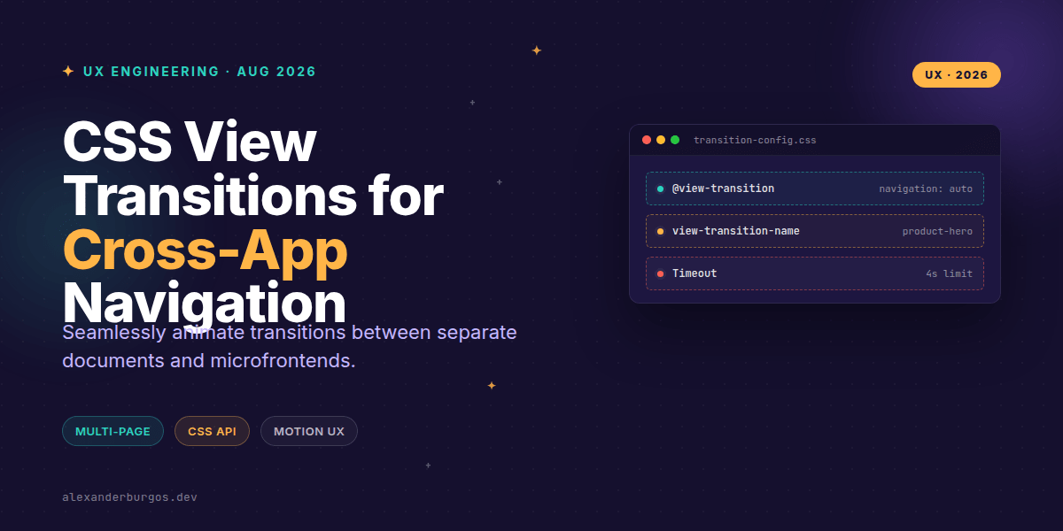
The beauty of this API lies in its simplicity. You don't need a JavaScript library or a complex state management tool. You just need a tiny bit of CSS. To opt in, both the source and the destination documents must include this at-rule:
@view-transition {
  navigation: auto;
}
I've found that the best way to implement this in a design system is to include it in your global 'reset' or 'base' stylesheet. Once this is in place, any same-origin navigation (like clicking a standard <a> tag) will trigger a default crossfade animation.
Coordinating Microfrontends
When you're working across different teams, naming conventions are your best friend. To move beyond a simple crossfade, you need to tell the browser which elements are 'the same' across pages. You do this with the view-transition-name property.
/* In Team A's Product List App */
.product-card-image {
  view-transition-name: product-hero;
}

/* In Team B's Product Detail App */
.product-detail-hero {
  view-transition-name: product-hero;
}
As long as the names match, the browser will handle the interpolation for you. It's like magic, but it's just standard CSS. However, there's a catch: these names must be unique on the page. If you have ten products on a list, you'll need to dynamically assign names (e.g., product-hero-42) via inline styles or JS.
Critical Gotchas and Performance
It's not all sunshine and rainbows. There are a few constraints you need to keep in mind to avoid breaking the user experience:
- Same-Origin Only: This won't work if you're navigating from
app.mysite.comtocheckout.mysite.comunless they share the exact same origin. Cross-origin redirects will also kill the transition. - The 4-Second Rule: The browser has a hard 4-second timeout. If the new page takes too long to render its first frame, the transition is aborted and it falls back to a standard jumpy load.
- User Intent: Navigations triggered by the browser's address bar or bookmarks usually won't trigger the transition; it's designed for interactions within the page content.
Accessibility First
We shouldn't just animate because we can. Motion can be physically nauseating for some users. Always wrap your custom animations in a prefers-reduced-motion media query. The browser's default crossfade is generally safe, but big sliding or scaling effects should be opted-out for users who request it.
@media (prefers-reduced-motion: reduce) {
  ::view-transition-group(*),
  ::view-transition-old(*),
  ::view-transition-new(*) {
    animation: none !important;
  }
}Wrapping Up
- Opt in both source and destination pages using
@view-transition { navigation: auto; }. - Use consistent
view-transition-namevalues across your design system to link elements between apps. - Keep your pages fast—if you miss the 4-second render deadline, the transition disappears.
I really encourage you to experiment with this in your next project. It's a low-risk, high-reward progressive enhancement that makes the web feel significantly more modern.
If you want to go deeper and learn how to build real, production-ready CSS design systems step by step, check out my full course here: CSS Design Systems Course
The long version with support labels and runnable demos is in Modern CSS 2026 on Amazon Kindle.
Let's keep the conversation going! You can find me sharing daily CSS tips on Twitter or connect with me for professional insights on LinkedIn.