Ever wondered why we still need a 50KB JavaScript runtime just to flip a boolean for a mobile menu? It's the classic frontend dilemma: we want declarative UI, but CSS has historically lacked a first-class way to handle state without reaching for the "checkbox hack" or a React useState hook.
That's exactly what the CSS Toggles specification aims to fix. It's an emerging proposal that gives us a native state machine primitive directly in the stylesheet. I've been digging into the draft, and honestly, it's the most exciting development for design system engineers since Container Queries.
What are CSS Toggles?
At its core, CSS Toggles allow you to associate a "toggleable value" with a DOM element. Think of it like a checkbox's checked state, but decoupled from form elements and capable of holding more than just two values. You define the state on a root element, trigger it from a child, and style based on the result.
The spec introduces three main pillars:
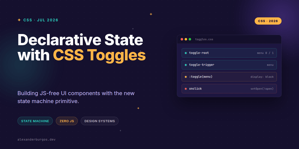
- toggle-root: Defines the name and possible states (e.g., 0, 1, or custom names like 'open').
- toggle-trigger: Tells an element to change a specific toggle's state when clicked.
- :toggle(): A pseudo-class to select elements based on their current state.
The Basic Pattern: A Simple Disclosure
Let's look at how we'd build a standard accordion or disclosure. In the past, you might have used <details> or a JS toggle. With CSS Toggles, it looks like this:
.accordion {
  toggle-root: expanded / closed;
}

.accordion__trigger {
  toggle-trigger: expanded;
}

.accordion__content {
  display: none;
}

.accordion:toggle(expanded) .accordion__content {
  display: block;
}
It's clean, it's declarative, and most importantly, it's scoped. The state lives within the .accordion root, preventing the global scope pollution we often see with legacy CSS hacks.
Modeling Complex Component State
For those of us building design systems, the real power isn't in binary toggles—it's in multi-state logic. Imagine a Tabs component. Traditionally, this requires JS to manage the active index. With toggle-root, we can define a range of states.
.tabs {
  /* Define a toggle named 'active-tab' with states 0, 1, and 2 */
  toggle-root: active-tab 0 / 0 1 2;
}

.tabs__btn:nth-child(1) { toggle-trigger: active-tab 0; }
.tabs__btn:nth-child(2) { toggle-trigger: active-tab 1; }
.tabs__btn:nth-child(3) { toggle-trigger: active-tab 2; }

/* Show only the panel matching the state */
.tabs__panel {
  display: none;
}

.tabs:toggle(active-tab 0) .tabs__panel:nth-child(1),
.tabs:toggle(active-tab 1) .tabs__panel:nth-child(2),
.tabs:toggle(active-tab 2) .tabs__panel:nth-child(3) {
  display: block;
}
This pattern is incredibly robust because the source of truth is the DOM element itself, styled via the CSS engine. No more worrying about React state getting out of sync with the actual rendered nodes.
Common Pitfalls for Senior Engineers
While this looks like a silver bullet, there are architectural considerations we need to keep in mind, especially when working at scale.
1. Accessibility isn't automatic. Just because CSS is handling the visual state doesn't mean the browser is handling the A11y tree. You still need to ensure your triggers have the right roles and that aria-expanded or aria-selected attributes are updated. Hopefully, future specs will bridge this gap, but for now, JS is still required for robust ARIA management.
2. Root Scoping. Toggles are scoped to their root. If you try to trigger a toggle from outside its root's subtree, it won't work. In a complex React or Vue app with portals, this can lead to unexpected bugs where a modal trigger can't find its toggle-root.
3. Unknown States. The spec allows toggles to exist in states not explicitly defined in the list. If you're not careful with your selectors, your UI might end up in a 'limbo' state where no CSS rules match. I always recommend having a solid default style that doesn't rely on the toggle being active.
The Design System Perspective
In a design system, I'd suggest treating CSS Toggles as a progressive enhancement. Since browser support is currently experimental (mostly limited to Chromium prototypes), we can't ship this as the primary logic for a production site yet.
However, you can start architecting your components to be "toggle-ready." By using data attributes that mirror toggle states, you can create a bridge that works with JS today but can be swapped for native CSS Toggles with a single line of code tomorrow.
If you want the long-form version of this with 23 chapters and runnable code, Ship Your Design System on Amazon is the handbook.
Wrapping Up
- CSS Toggles provide a native, declarative state machine for UI components like tabs and accordions.
- They use
toggle-rootto define state andtoggle-triggerto change it, keeping logic in the stylesheet. - While powerful, they still require manual ARIA management to stay accessible for all users.
I'd encourage you to fire up a Canary build of Chrome, enable the experimental web platform features, and try building a JS-free menu. It's a glimpse into a future where our bundles are smaller and our CSS is smarter.
If you want to go deeper and learn how to build real, production-ready CSS design systems step by step, check out my full course here: CSS Design Systems Course
Let me know what you think about this spec over on Twitter or LinkedIn. I'm curious to see how you'd use this in your own systems!