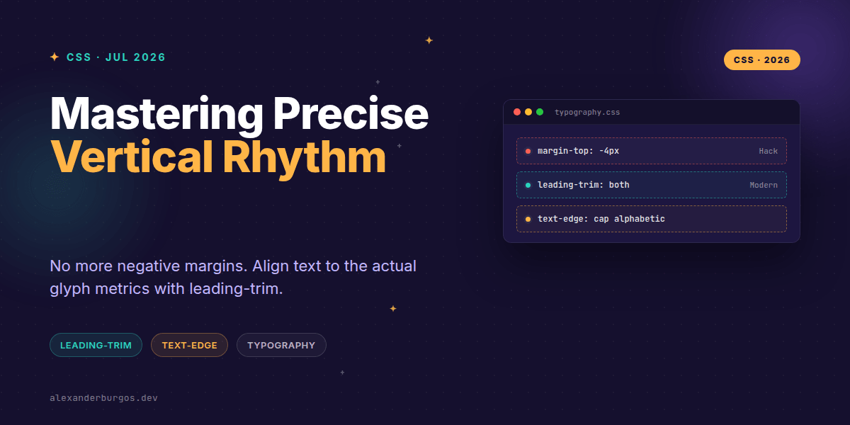
Ever wondered why your perfectly measured 24px gap between a heading and a paragraph always looks slightly 'off' in the browser? It's because CSS has traditionally treated text as a box with invisible 'leading' space baked into the top and bottom of every line.
I've lost count of the number of times I've seen developers (myself included!) resort to negative margins or transform: translateY(-2px) just to make a label look vertically centred. It's a fragile way to build a design system. But things are finally changing.
The Ghost in the Box: Why Vertical Rhythm is Hard
In the world of print, designers talk about the baseline. In the world of the web, we've historically been stuck with the 'line box'. When you set a line-height, the browser distributes the extra space (the leading) equally above and below the text.
The problem? Different fonts have different internal metrics. One typeface might sit higher in its box than another. This makes 'pixel-perfect' spacing nearly impossible to achieve across a whole design system without custom hacks for every single font weight and size.
Enter Leading-trim and Text-edge
The CSS Inline Layout Module Level 3 introduces two properties that are absolute game-changers for UX engineers: leading-trim and text-edge. Despite what some older blog posts might suggest, there isn't actually a property called line-gap in the CSS spec—that's usually a confusion with font metrics.
- leading-trim: This property tells the browser to strip away that extra leading space from the top and bottom of the text box.
- text-edge: This is the companion property. It defines which part of the font metrics we should align to (like the cap height or the alphabetic baseline).
By using these together, we can finally make a text element's bounding box match the actual visual height of the characters. This means a 16px margin actually looks like 16px of white space.
Practical Implementation
Since these are emerging specs, we shouldn't just throw them into production without a fallback strategy. We want to treat this as a progressive enhancement. Here is how I've been structuring my typography tokens lately:
.heading-l {
  font-size: 2rem;
  line-height: 1.2;
  margin-block-end: 1.5rem;
}

@supports (leading-trim: both) {
  .heading-l {
    leading-trim: both;
    text-edge: cap alphabetic;
    /* We can now use precise spacing tokens */
    margin-block-end: 1rem;
  }
}
Common Pitfalls to Watch Out For
It's tempting to think this solves everything, but there are a few 'gotchas' you should keep in mind as you experiment with these new properties.
- It's not line-height: 0: Trimming the leading is about the box geometry, not the spacing between lines of wrapped text. Setting line-height to zero will still break your accessibility and readability.
- Font Fallbacks: If your primary font fails to load and the browser swaps to a system font, the metrics will change. Trimming is precise, but it's only as good as the font data provided.
- Mixed Scripts: If you are working with multi-language sites (e.g., combining English and Arabic), the baseline and cap-height metrics might behave differently. Always test your components with real content.
Wrapping Up
- Stop using negative margins for text alignment;
leading-trimis the future-proof way to handle vertical rhythm. - Use
text-edgeto define whether you're aligning to the cap height, ex-height, or baseline. - Always wrap these new properties in
@supportsblocks to ensure your layout remains functional in older browsers.
I'm genuinely excited to see these properties gain more browser support. They represent a shift from 'making it work' to 'making it right' in web typography. Go ahead and try it out in your latest prototype—seeing the blue selection box actually hug the letters for the first time is incredibly satisfying!
If you want to go deeper and learn how to build real, production-ready CSS design systems step by step, check out my full course here: CSS Design Systems Course
I cover the full pipeline in Ship Your Design System, 200 pages on Amazon Kindle.
If you found this useful, let's keep the conversation going on Twitter or connect with me on LinkedIn. I'd love to hear how you're handling vertical rhythm in your own projects!