Right, let's talk about underlines. For years, we've been hacking them. Whether it's using border-bottom, box-shadow, or complex linear-gradient backgrounds, we've jumped through hoops just to get an underline that doesn't feel clunky or touch the edges of the text.
That's why I'm genuinely excited about Chrome 154. It introduces a native way to handle this: text-decoration-inset. It’s a game-changer for design systems because it finally gives us granular control over the geometry of our decorations without adding extra DOM nodes or background hacks.
What is text-decoration-inset?
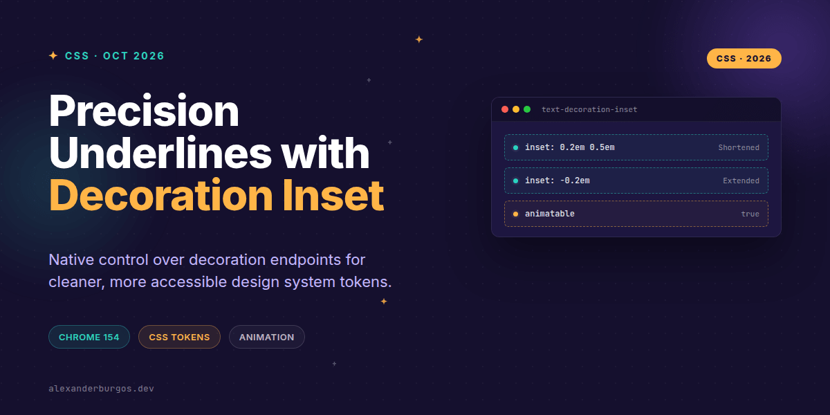
As defined in the CSS Text Decoration Module Level 4, this property allows us to adjust the start and end points of an element’s text decoration. This applies to underlines, overlines, and even line-throughs.
The syntax is straightforward. You can use one value (for both ends) or two values (for start and end):
/* Shorten decoration by 0.25em on both sides */
text-decoration-inset: 0.25em;

/* Custom start and end points */
text-decoration-inset: 0.1em 0.5em;

/* Extend the line beyond the text edges */
text-decoration-inset: -0.2em;
Positive values move the endpoints inward, effectively trimming the decoration. Negative values move them outward, lengthening the line. It’s simple, predictable, and long overdue.
1. Tokenized Underline Geometry
In a design system, consistency is everything. Before now, if you wanted a 'pill-style' underline that was slightly shorter than the word itself, you'd likely reach for a background gradient. But gradients are a pain to manage with font-size changes and dark mode.
With text-decoration-inset, we can include geometry directly in our link tokens:
:root {
  --link-inset: 0.15em 0.35em;
  --link-thickness: 0.12em;
  --link-offset: 0.2em;
}

a {
  text-decoration-line: underline;
  text-decoration-thickness: var(--link-thickness);
  text-underline-offset: var(--link-offset);
  text-decoration-inset: var(--link-inset);
}
This setup ensures that every link in your organisation has the exact same visual weight and geometry, scaling perfectly with the em unit regardless of the font size.
2. Better Focus Indicators
Accessibility (WCAG) requires clear focus indicators. Sometimes, a standard outline can feel disconnected from the text. I've found that using a negative inset can create a really nice, text-attached focus treatment.
:where(a, button):focus-visible {
  text-decoration-line: underline;
  text-decoration-thickness: 0.15em;
  text-decoration-color: var(--focus-color);
  text-decoration-inset: -0.25em;
  text-underline-offset: 0.3em;
}
By using a negative value, the underline extends beyond the word, making it much more prominent. Just remember: this should supplement, not necessarily replace, a standard focus ring if your design requires high contrast.
3. The Animation 'Reveal' Effect
This is where it gets fun. Because text-decoration-inset is animatable by computed value, we can create reveal effects that previously required ::after pseudo-elements or background-size transitions.
.reveal-link {
  text-decoration-line: underline;
  text-decoration-thickness: 0.1em;
  /* Hide the line by moving endpoints to the centre */
  text-decoration-inset: 50% 50%;
  transition: text-decoration-inset 300ms ease-out;
}

.reveal-link:hover,
.reveal-link:focus-visible {
  text-decoration-inset: 0;
}
It's clean, performant, and keeps your HTML semantic. No extra wrappers, no messy CSS. It just works.
Important Gotchas
- Endpoints, not height: Use
text-underline-offsetfor vertical position. Inset only handles the horizontal start and end. - Inheritance: It does not inherit from ancestors. It only affects decorations drawn by the element itself.
- Browser Support: As of October 2026, Chrome 154 is the leader here. Always use
@supportsfor progressive enhancement. - Inline Wrapping: If your text wraps to a new line, the percentage values may behave differently depending on your
box-decoration-breaksetting.
The full story including the testing layers and governance lives in Ship Your Design System on Amazon.
Wrapping Up
- Use
text-decoration-insetto move decoration endpoints inward (positive) or outward (negative). - Tokenize these values to ensure consistent underline geometry across your entire design system.
- Leverage transitions on this property for lightweight, performant hover animations.
I'd encourage you to experiment with this in your next project—it's a small property that solves a surprisingly large number of visual headaches.
If you want to go deeper and learn how to build real, production-ready CSS design systems step by step, check out my full course here: CSS Design Systems Course
Let's keep the conversation going! You can find me sharing more CSS tips on Twitter or connect with me for a deeper dive on LinkedIn.