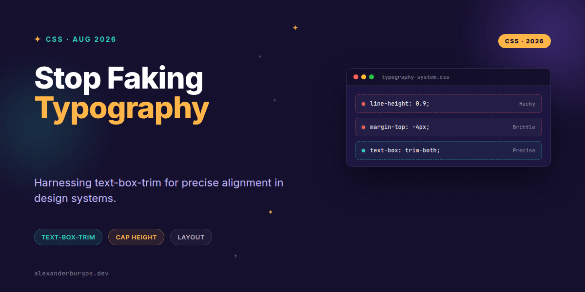
This changes everything. For years, we've been fighting a losing battle against the 'invisible' space that surrounds text in the browser. You know the one—that annoying gap between the top of your capital letters and the edge of the blue selection box.
We've all been there: you're trying to align a heading with an icon, or you're trying to vertically centre text inside a button, and it just looks... off. So, what do we do? We reach for negative margins, magic line-height numbers, or 'nudge' the padding by a couple of pixels until it looks right in Chrome. It's brittle, it's frustrating, and it's finally becoming a thing of the past.
With Chrome 133 shipping support for the text-box shorthand, we finally have a standards-track way to trim that extra leading. Let's look at how we can use text-box-trim and text-box-edge to build more robust design systems.
The Problem: The 'Leading' Tax
The fundamental issue is that browsers treat text as a block that includes 'leading'—extra space above and below the glyphs. This space is defined by the font file itself, meaning an h1 in Helvetica might have totally different vertical spacing than the same h1 in Inter, even with the same line-height.
In a design system, this is a nightmare. It makes 'vertical rhythm' feel like a suggestion rather than a rule. We want our boxes to hug the actual content, not some arbitrary space defined by a font designer thirty years ago.
Meet the Solution: text-box-trim
The new CSS specification gives us two main properties (which can be combined into the text-box shorthand):
- text-box-trim: Tells the browser which sides to trim (
trim-start,trim-end, ortrim-both). - text-box-edge: Defines what metrics to use for the trim (like
capfor the top of capital letters andalphabeticfor the baseline).
I've found that for 90% of use cases in a design system, you'll want the shorthand. It's clean, expressive, and does exactly what you expect.
Perfect Headings without the Nudge
When you have a large heading, that top-leading gap is massive. By using text-box: trim-both cap alphabetic;, we can force the bounding box to snap exactly to the cap height and the baseline.
h1, h2, h3 {
  /* Snap the box to the actual letters */
  text-box: trim-both cap alphabetic;
  line-height: 1.2;
  margin-block-start: 2rem;
}
Buttons and UI Controls
This is where I'm genuinely excited. Centring text in buttons has always been a game of 'optical adjustment'. If you trim the text box first, your padding actually becomes meaningful. 12px of padding means 12px from the actual letter, not 12px from an invisible box.
button {
  text-box: trim-both cap alphabetic;
  padding-inline: 1.5rem;
  padding-block: 0.75rem;
  display: inline-flex;
  align-items: center;
}
What about Inputs?
Sometimes you don't want to trim both sides. For text inputs or textareas, you might want to trim the top to align with a label, but keep the bottom leading to allow for descenders (like the 'tail' on a 'g' or 'y') to breathe.
input, textarea {
  /* Only trim the top edge */
  text-box: trim-start cap alphabetic;
}A Few Gotchas to Keep in Mind
Before you go and refactor your entire CSS codebase, there are a few things I've noticed during my testing. First, remember that text-box-trim doesn't change the font; it just changes how the container box treats the font's metrics. If you have a font with very unusual metrics, you might still need a tiny bit of adjustment.
Secondly, while Chrome 133 has made this practical, support across all browsers is still catching up. I recommend using it as a progressive enhancement. Your layout shouldn't break if the trim isn't applied, but it will look significantly 'tighter' and more professional in browsers that support it.
Wrapping Up
- Use
text-box: trim-both cap alphabetic;for the most consistent results in headings and buttons. - Stop using negative margins to fix vertical alignment—trim the box instead.
- Combine trimming with standard padding for a predictable, metric-based spacing system.
I'd encourage you to open up your current project, find a button, and try adding these properties. The difference in visual balance is immediate and satisfying.
If you want to go deeper and learn how to build real, production-ready CSS design systems step by step, check out my full course here: CSS Design Systems Course
The long version with support labels and runnable demos is in Modern CSS 2026 on Amazon Kindle.
If you enjoyed this, let's connect! I'm always sharing CSS tips on Twitter and LinkedIn.