CSS text-box-trim -- Fix the 30-Year-Old Text Spacing Bug
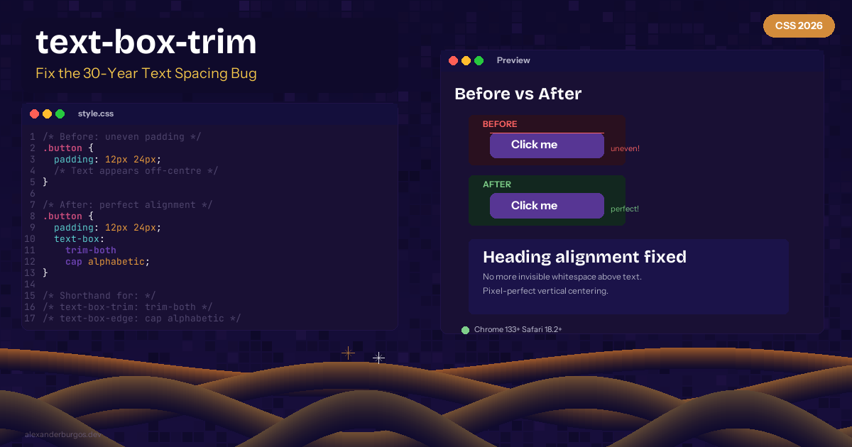
Ever noticed that a button with equal padding on all sides doesn't look visually centred? Or that a heading next to an image always seems slightly lower? That's because browsers add invisible whitespace above and below text called half-leading. It's been this way for 30 years.
text-box-trim and text-box-edge finally fix this. Chrome 133+ and Safari 18.2+ stable.
The Problem
/* This looks uneven despite equal padding */
.button {
  padding: 12px 24px;
  /* The text appears lower than centre because of
     invisible space above it */
}
The Fix
.button {
  padding: 12px 24px;
  text-box: trim-both cap alphabetic;
  /* Now the text is truly centred */
}
Understanding the Values
text-box-trim: trim-both-- trim space above and belowtext-box-trim: trim-start-- trim only abovetext-box-trim: trim-end-- trim only belowtext-box-edge: cap alphabetic-- trim to cap height and alphabetic baselinetext-box-edge: ex alphabetic-- trim to x-height and baseline
Shorthand
The text-box shorthand combines both properties:
/* Shorthand */
.heading {
  text-box: trim-both cap alphabetic;
}

/* Longhand equivalent */
.heading {
  text-box-trim: trim-both;
  text-box-edge: cap alphabetic;
}
Browser Support
Chrome 133+ and Safari 18.2+ (stable). No Firefox yet.
Here's the thing -- this is one of those CSS features that makes you wonder why it took so long. Once you start using it, you'll never go back to guessing padding values to compensate for invisible whitespace.
Happy coding!
If you want to go deeper and learn how to build real, production-ready CSS design systems step by step, check out my full course here: CSS Design Systems Course If you found this helpful, I'd love to connect! Follow me on Twitter/X @alexandersstudi or LinkedIn for more CSS and design system tips.