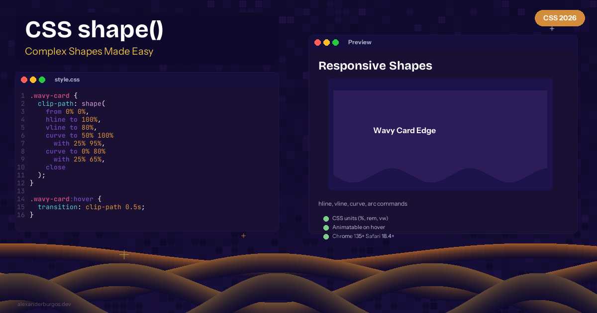
CSS shape() -- Complex Responsive Shapes in Human-Readable CSS
Creating complex shapes in CSS has always been painful. clip-path: polygon() uses raw coordinates, path() uses SVG syntax that's nearly unreadable. Let's be honest -- nobody enjoys writing SVG path data by hand.
Enter shape() -- a new function for clip-path that uses human-readable CSS commands. Chrome 135+ and Safari 18.4+ stable.
The Syntax
.wavy-card {
  clip-path: shape(
    from 0% 0%,
    hline to 100%,
    vline to 80%,
    curve to 0% 80% with 50% 100%,
    close
  );
}
Available Commands
hline to X-- horizontal linevline to Y-- vertical linecurve to X Y with CX CY-- quadratic bezier curvearc to X Y of Rx Ry-- elliptical arcclose-- close the path
Responsive and Animatable
The good news is that shape() uses CSS units -- percentages, rem, viewport units all work. And it's animatable:
.blob {
  clip-path: shape(
    from 50% 0%,
    curve to 100% 50% with 90% 10%,
    curve to 50% 100% with 110% 90%,
    curve to 0% 50% with -10% 90%,
    curve to 50% 0% with 10% 10%
  );
  transition: clip-path 0.5s ease;
}

.blob:hover {
  clip-path: shape(
    from 50% 0%,
    curve to 100% 50% with 80% 20%,
    curve to 50% 100% with 80% 80%,
    curve to 0% 50% with 20% 80%,
    curve to 50% 0% with 20% 20%
  );
}
Browser Support
Chrome 135+ and Safari 18.4+ (stable). Firefox in progress.
Happy coding!
If you want to go deeper and learn how to build real, production-ready CSS design systems step by step, check out my full course here: CSS Design Systems Course If you found this helpful, I'd love to connect! Follow me on Twitter/X @alexandersstudi or LinkedIn for more CSS and design system tips.