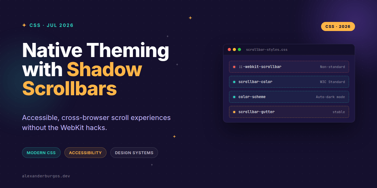
Ever wondered why your beautifully crafted dark mode design system still looks "off" when a chunky, bright grey scrollbar appears on the side of a modal? We've all been there, and for years, we've patched it over with a messy pile of vendor-prefixed hacks.
For the longest time, styling scrollbars felt like the Wild West. You either used ::-webkit-scrollbar and ignored Firefox users, or you just accepted that the OS would dictate the aesthetic. But things have changed. With CSS Scrollbars Level 1, we finally have a standardized way to handle native theming that actually works across modern browsers.
The Death of WebKit Hacks
Let's be honest: ::-webkit-scrollbar was never great. It lives in a shadow tree, doesn't inherit normal CSS properties, and completely ignores event bubbling. Worst of all, it's non-standard. Firefox has never supported it, and likely never will. If your design system relies solely on it, you're delivering a degraded experience to a significant chunk of your users.
The modern approach involves two key properties: scrollbar-width and scrollbar-color. These are now supported in Chrome 121+, Firefox 64+, and Safari 17+. It's the standard we've been waiting for.
.scroll-container {
  overflow: auto;
  /* Standard properties */
  scrollbar-width: thin;
  scrollbar-color: var(--brand-primary) var(--bg-surface-2);
}
Leveraging color-scheme for Instant Wins
Before you even touch specific scrollbar colors, you should be using color-scheme. This is a massive UX win for design systems. By telling the browser that your page supports both light and dark modes, the OS will automatically adjust the native scrollbars, form controls, and even the default background to match.
/* In your global CSS or root */
html {
  color-scheme: light dark;
}

/* When the user toggles dark mode */
html[data-theme='dark'] {
  color-scheme: dark;
}
This ensures that even if you don't explicitly style every scrollbar, they won't clash with your dark UI. It's the foundation of a resilient theme.
Improving UX with Shadow Scrollbars
One common issue with scrollable areas is the "hidden content" problem. If a list ends perfectly at the edge of a container, the user might not realize there's more to see. This is where shadow scrollbars (or scroll shadows) come in.
Instead of just relying on the visual scrollbar, we can use CSS gradients to create an affordance. These shadows only appear when there is content to be scrolled, providing a subtle but powerful hint to the user.
.scroll-shadows {
  overflow: auto;
  background:
    /* Shadow Covers */
    linear-gradient(var(--bg) 30%, transparent) center top,
    linear-gradient(transparent, var(--bg) 70%) center bottom,
    /* Actual Shadows */
    radial-gradient(farthest-side at 50% 0, var(--shadow), transparent) center top,
    radial-gradient(farthest-side at 50% 100%, var(--shadow), transparent) center bottom;
  background-repeat: no-repeat;
  background-size: 100% 40px, 100% 40px, 100% 14px, 100% 14px;
  background-attachment: local, local, scroll, scroll;
}
The magic here is the background-attachment property. By using local for the covers and scroll for the shadows, the covers move with the content, revealing the shadows only when the content is actually scrollable. It's pure CSS brilliance.
Avoiding Layout Shift
We've all seen that annoying jump when a scrollbar appears and pushes the layout a few pixels to the left. In a design system, consistency is key. You can solve this using scrollbar-gutter: stable.
This property reserves space for the scrollbar regardless of whether the content overflows or not. No more layout shifts, no more jumping buttons. It's a small change that makes a huge difference in perceived performance.
Wrapping Up
- Ditch the
::-webkit-scrollbarhacks in favour of standardscrollbar-widthandscrollbar-colorproperties. - Use
color-schemeat the root level to ensure native UI elements respect your light and dark themes. - Implement scroll shadows to provide better visual affordance and prevent layout shift with
scrollbar-gutter.
I'd encourage you to go into your current project and replace those old vendor prefixes. You'll likely find that you can delete half your CSS and get a more consistent result across browsers.
If you want to go deeper and learn how to build real, production-ready CSS design systems step by step, check out my full course here: CSS Design Systems Course
The full story including the testing layers and governance lives in Ship Your Design System on Amazon.
For more tips on CSS architecture and UX engineering, you can find me on Twitter or LinkedIn. Let's keep building better webs together.