Let's be honest -- if you have ever shipped a sticky header that needs a shadow when it sticks, a carousel slide that highlights when it snaps into place, or a hide-on-scroll navbar, you have written far more JavaScript than you wanted to. IntersectionObserver with a 1px sentinel. A scroll listener that fires sixty times a second. A debounced callback that compares the previous scrollY. A scrollsnapchanging handler that only works in Chromium. And every single one of those handlers eats main-thread time, leaks if you forget to remove it, and breaks the moment you put it inside a Shadow DOM.
Sound familiar?
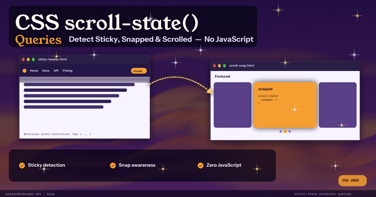
The good news is that CSS finally has a proper, declarative answer. It is called scroll-state() container queries, and it lets you style descendants of a container based on whether that container is stuck, snapped, scrollable, or freshly scrolled in a given direction -- without a single line of JavaScript. As a UX engineer who has spent way too many evenings debugging scroll listeners, this one genuinely makes me happy.
What Is scroll-state()?
scroll-state() is a new family of container queries defined in the CSS Conditional Rules Module Level 5 spec. It lets you style descendants of a container based on the scroll-related state of that container. The browser already tracks all of this internally -- whether something is stuck via position: sticky, whether it is snapped to a scroll-snap ancestor, whether there is overflow remaining, which direction the user just scrolled in. scroll-state() simply exposes those facts as queryable conditions.
You opt an element in by setting container-type: scroll-state on it, then query that container with @container scroll-state(<descriptor>: <value>). The styles inside the at-rule apply to descendants of the container while the condition is true.
Because this runs in the browser's own style and layout pipeline -- not in a JavaScript callback on the main thread -- it is fast, it does not jank, and it works the same way every other CSS query works. No observers to clean up. No debouncing. No fighting the compositor.
The Four Descriptors
There are four descriptors you can query inside scroll-state(): stuck, snapped, scrollable, and the newest one, scrolled. Each one answers a different question about the container's relationship with the scroller around it.
stuck
stuck tests whether a position: sticky container is currently pinned against an edge of its scroll container. Possible values are none, the four physical edges (top, right, bottom, left), and the four logical edges (block-start, block-end, inline-start, inline-end).
@container scroll-state(stuck: top) {
  /* applies to descendants while the container is stuck to the top */
}
snapped
snapped tests whether the container is currently snapped to its scroll-snap ancestor along a given axis. Values include none, x, y, the logical inline and block, and both. The query re-evaluates whenever the equivalent of scrollsnapchanging would fire.
@container scroll-state(snapped: x) {
  /* applies when this slide is the snapped one along the x-axis */
}
scrollable
scrollable tests whether there is still scroll room left in a particular direction. It accepts physical edges, logical edges, and the axis shorthands x, y, block, inline. Perfect for those edge fade gradients that should disappear when you reach the start or end of a scroller.
@container scroll-state(scrollable: right) {
  /* user can still scroll further to the right */
}
scrolled
scrolled is the newest member of the family -- it landed unflagged in Chrome 144. It tests the last direction the user scrolled in, and it is sticky in time. Once you scroll down, scrolled: bottom stays true until you scroll up again. That single sentence is what makes hide-on-scroll headers a one-liner instead of a fifty-line script.
@container scroll-state(scrolled: bottom) {
  /* user most recently scrolled downwards */
}
Browser Support Today
Here is the honest picture as of April 2026. scroll-state() is shipped and unflagged in all Chromium browsers, but it is not yet a Baseline feature -- Firefox and Safari are still catching up.
- Chrome 133+ -- stuck, snapped, and scrollable shipped unflagged
- Chrome 144+ -- scrolled shipped unflagged
- Edge 133+ and Opera 118+ -- Chromium parity
- Samsung Internet 29+ and Chrome Android 147+
- Firefox -- not supported, expected to land in 2026
- Safari -- not supported through 26.5, no public WebKit position yet
Global support hovers around 68-71% on caniuse, which puts it firmly in progressive enhancement territory. Use it now, but feature-detect and ship a fallback for the browsers that have not caught up yet.
Show Me the Code
Enough theory. Here are the four patterns you will reach for the most often, each one replacing a chunk of JavaScript that you can now delete with confidence.
1. Sticky Header That Gets a Shadow When Stuck
The classic. You have a sticky header, and you want a subtle shadow to appear the moment it pins to the top of the viewport. Previously this was an IntersectionObserver with a 1px sentinel above the header. Now it is just CSS:
header {
  position: sticky;
  top: 0;
  background: white;
  container-type: scroll-state;
  container-name: site-header;
  transition: box-shadow 0.2s ease;
}

/* scroll-state styles apply to DESCENDANTS, so target a child */
header > .inner {
  transition: box-shadow 0.2s;
}

@container site-header scroll-state(stuck: top) {
  header > .inner {
    box-shadow: 0 4px 15px rgba(0, 0, 0, 0.2);
  }
}
Here's the thing that trips everyone up the first time: scroll-state() styles apply to descendants of the container, never to the container itself. So either query a wrapper one level up, or style a child element inside the sticky header. Once you internalise that rule, the rest is plain sailing.
2. Carousel Slide That Highlights When Snapped
A horizontal scroll-snap carousel where the centred card brightens up. No IntersectionObserver, no scrollsnapchanging listener, no threshold: 1 dance:
.carousel {
  display: flex;
  overflow-x: auto;
  scroll-snap-type: x mandatory;
  gap: 1rem;
}

.carousel > li {
  flex: 0 0 80%;
  scroll-snap-align: center;
  container-type: scroll-state;
  transition: transform 0.3s, filter 0.3s;
  filter: grayscale(0.6);
}

@container scroll-state(snapped: x) {
  .card {
    transform: scale(1.05);
    filter: grayscale(0);
  }
}
The browser re-evaluates the query every time a different slide snaps into place. The centred card brightens and scales up. Every other card sits dim and small. Zero JavaScript, zero jank.
3. Edge Fade Gradients on a Scroller
Those subtle fade gradients on horizontally scrollable lists -- the ones that hint there is more content off-screen, and disappear when you reach the end. Previously: a scroll listener computing scrollLeft, scrollWidth, and clientWidth on every frame. Now:
.scroller {
  container-type: scroll-state;
  overflow-x: auto;
  position: relative;
}

.scroller::before,
.scroller::after {
  content: "";
  position: sticky;
  top: 0;
  width: 2rem;
  height: 100%;
  pointer-events: none;
  opacity: 0;
  transition: opacity 0.2s;
}

@container scroll-state(scrollable: left) {
  .scroller::before {
    opacity: 1;
    background: linear-gradient(to right, white, transparent);
  }
}

@container scroll-state(scrollable: right) {
  .scroller::after {
    opacity: 1;
    background: linear-gradient(to left, white, transparent);
  }
}
The gradients only show on the side that still has content to reveal. Reach the end, the gradient on that side fades away. It is the kind of micro-interaction that used to cost you a bunch of debounced JavaScript and now costs you nothing at all.
4. Hide-on-Scroll Header (the Bramus Pattern)
This is the example that turned the most heads when Bramus van Damme published it. A header that slides up when the user scrolls down, and slides back into view when they scroll up. With the scrolled descriptor, the whole thing is about ten lines of CSS:
html {
  container-type: scroll-state;
}

header {
  position: sticky;
  top: 0;
  translate: 0 0;
  transition: translate 0.25s ease;
}

/* slide header up once the user has been scrolling down */
@container scroll-state(scrolled: bottom) {
  header:not(:focus-within) {
    translate: 0 -100%;
  }
}
The :not(:focus-within) bit is a thoughtful touch -- if the user has tabbed into something inside the header, we keep it visible. Try doing that as cleanly with a scroll listener.
You can also combine multiple scroll-state checks with and / or, exactly the same way size queries combine. For example, "play this animation only when the user is somewhere in the middle of the page, with room to scroll both up and down":
@container scroll-state((scrollable: top) and (scrollable: bottom)) {
  .player-wrapper .sprite {
    animation: climbAnim 1s steps(8);
    animation-timeline: scroll(root y);
  }
}
Gotchas to Watch Out For
It is genuinely lovely to use, but there are a handful of sharp edges I have hit while building real things with it. Here is what to keep in mind:
- You must set container-type: scroll-state. Without it, the query never matches. You can combine it with size containment via container-type: size scroll-state if you need both kinds of queries on the same element.
- Styles apply to descendants only, never to the container itself. To style the sticky element, wrap it or target a child element inside it.
- stuck only works on position: sticky elements, and only against an edge you have actually pinned with top, bottom, left, or right.
- snapped only works inside a scroll-snap container. The ancestor must have scroll-snap-type set to something other than none.
- Containment side-effects. container-type establishes a containment context, which can have subtle layout/paint implications -- especially if you mix it with size containment.
- Logical vs physical values. Prefer block-start, inline-end, etc. for internationalisation. Be aware some early Chromium builds shipped only the physical values first.
- Nested scroll-state queries each need their own container. A single container-type: scroll-state on <html> does not magically cascade into nested snap carousels.
- It looks like a function but is not one. scroll-state(stuck: top) uses ident keywords -- you cannot pass CSS variables into it.
When to Ship It (Progressive Enhancement)
My honest take? Start using it now, behind a feature query. Chromium users get the smooth, JS-free experience straight away. Firefox and Safari users get whatever fallback you ship -- which can absolutely still be your old IntersectionObserver code, you just gate it behind a @supports not rule and it stops running everywhere it is no longer needed.
@supports (container-type: scroll-state) {
  /* the nice declarative version */
  header {
    container-type: scroll-state;
  }
  @container scroll-state(stuck: top) {
    header > .inner {
      box-shadow: 0 4px 15px rgba(0, 0, 0, 0.2);
    }
  }
}

@supports not (container-type: scroll-state) {
  /* JS fallback: toggle .is-stuck via IntersectionObserver */
  header.is-stuck > .inner {
    box-shadow: 0 4px 15px rgba(0, 0, 0, 0.2);
  }
}
The beauty of this approach is that the moment Firefox and Safari ship support, your fallback simply stops running. No code changes, no migrations, no flag flips. The page just gets faster.
Final Thoughts
scroll-state() is one of those rare features where the spec authors clearly looked at the most common JavaScript hacks on the web and asked "why is the browser making developers do this?". Sticky-stuck detection, snapped-slide highlighting, edge gradients, hide-on-scroll headers -- all of these are now declarative, all of them run on the compositor, and all of them survive being moved into Shadow DOM.
It is not Baseline yet, and the descendants-only rule will catch you out the first time. But the moment you wire up your first sticky shadow with a single @container scroll-state(stuck: top) rule and delete the IntersectionObserver next to it, you will understand why this is worth shipping today.
Open your project, find the noisiest scroll listener you have, and see if scroll-state() can replace it. I would bet your future self is going to thank you.
Happy coding!
If you want to go deeper and learn how to build real, production-ready CSS design systems step by step, check out my full course here: CSS Design Systems Course
If you found this helpful, I'd love to connect! Follow me on Twitter/X @alexandersstudi or LinkedIn for more CSS and design system tips.