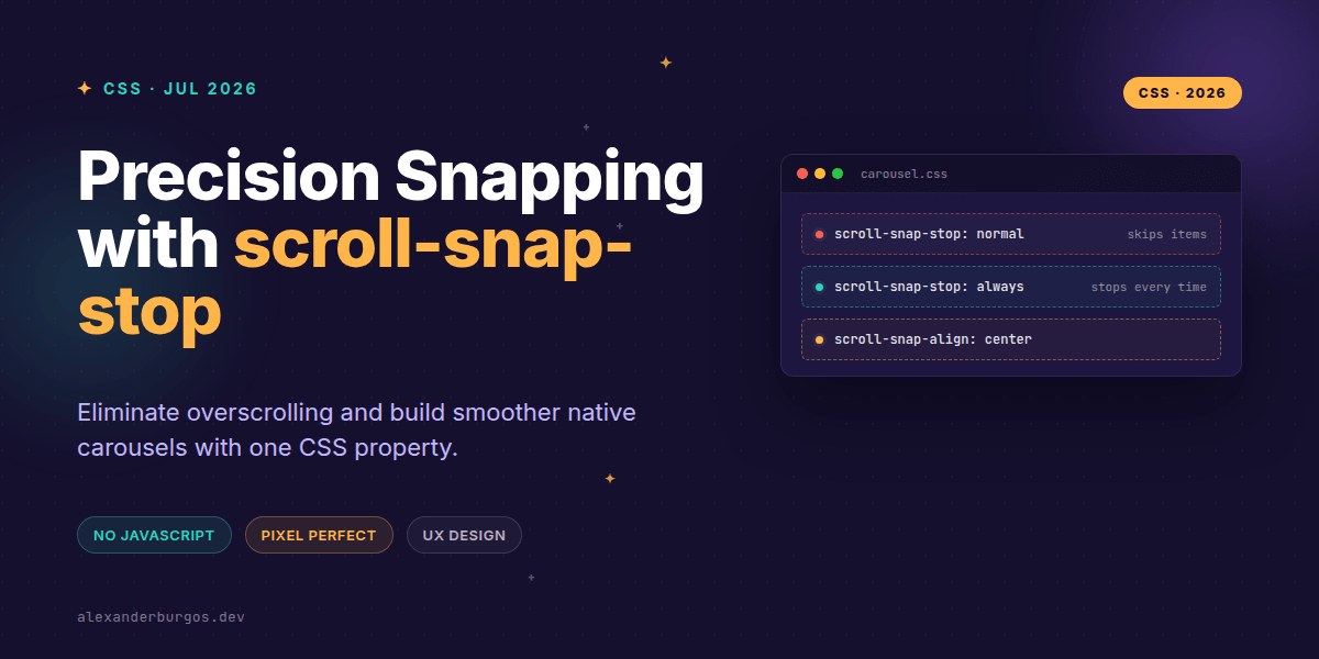
Right, let's talk about carousels. We've all been there: you build a beautiful, native CSS scroll-snap carousel, it feels lightweight and fast, but then you give it a vigorous flick on a trackpad or mobile screen and—whoosh—the browser skips five slides at once. It's frustrating, right?
For a long time, if you wanted to ensure a user landed on every single slide during a fast scroll, you had to reach for a heavy JavaScript library. But that's changed. The scroll-snap-stop property is the missing piece of the puzzle that gives us total control over native scroll physics.
The Problem with Native Snapping
By default, when you use scroll-snap-type, the browser treats snap points like helpful suggestions rather than hard rules. If I scroll quickly, the browser calculates the momentum and says, "I'll just land on the fourth item because that's where the physics lead me."
In many UX scenarios, like a gallery of high-value products or a paginated onboarding flow, that's exactly what we don't want. We want the user to see every piece of content. This is where scroll-snap-stop steps in to save our layouts.
Understanding the Property
Defined in the CSS Scroll Snap Module Level 1, this property tells the browser whether it's allowed to skip over snap positions. It's remarkably simple, offering only two main values:
- normal: The default. The container may pass over snap points during fast scrolls.
- always: The container must not pass over a snap point. It will snap to the very first snap position it encounters.
Building a 'One Card Per Flick' Carousel
I've found that the most common use case is a horizontal carousel where each item takes up the full width. Here is how you implement it without a single line of JS for the snapping logic:
.carousel {
  display: flex;
  overflow-x: auto;
  scroll-snap-type: x mandatory;
  scroll-behavior: smooth;
}

.slide {
  flex: 0 0 100%;
  scroll-snap-align: center;
  scroll-snap-stop: always; /* This is the magic line */
}
By adding scroll-snap-stop: always to the slide, you're telling the browser: "I don't care how hard the user flicks; you stop at the next slide." It creates a much more intentional, premium feel.
Common Pitfalls to Avoid
I've seen a few developers struggle with this property, usually because of where it's placed. Remember: scroll-snap-type goes on the parent, but scroll-snap-stop goes on the children (the snap points).
Also, be careful with accessibility. If you use always on every single section of a very long page, it can feel "sticky" and frustrating for users who just want to get to the footer. Use it when the content demands focus, but don't hijack the user's intent without a good reason.
Browser Support is Ready
The good news? It's widely available. It's been supported in Chrome since version 75 and Safari since version 15. As of mid-2022, it's effectively baseline for modern web development. You can use this today with high confidence.
Wrapping Up
- Use
scroll-snap-stop: alwaysto prevent users from accidentally skipping content. - Apply the property to the child elements, not the scroll container.
- Combine with
scroll-paddingto ensure content isn't hidden behind fixed headers.
I'd encourage you to experiment with this in your next UI project. It's a tiny addition to your CSS that makes a massive difference in how polished your site feels.
If this is the kind of thing you keep finding out late about, my book Modern CSS 2026 on Amazon is one chapter per shift, with honest support labels.
If you want to go deeper and learn how to build real, production-ready CSS design systems step by step, check out my full course here: CSS Design Systems Course
Let's keep the conversation going! You can find me sharing more CSS tips on Twitter or connect with me for professional insights on LinkedIn.