We've all been there: you need to build a carousel, and suddenly you're trapped in a nightmare of custom JavaScript just to handle basic keyboard accessibility. It's a fragile dance of roving tabindexes, manual ARIA state syncing, and hacky focus management. It always feels like a lot of heavy lifting for something that should be native.
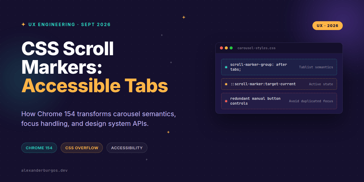
Thankfully, the web platform is catching up with our layout demands in a massive way. Chrome 154 has introduced explicit links and tabs modes for CSS scroll markers, turning native scroll containers into fully accessible interactive widgets. This feature completely changes how we approach carousels and tabbed interfaces in modern design systems.
Released on September 22, 2026, this specification update allows us to declare the semantic behaviour of generated controls directly in our stylesheets. Let's dive into how this works, why it matters for your component libraries, and how to implement it safely.
The Shift: Links Mode vs Tabs Mode
Before this update, generated scroll markers typically behaved like basic anchor links. Now, we have two distinct semantic paradigms controlled by the scroll-marker-group property. This choice fundamentally alters how assistive technologies perceive your content.
/* Default: navigation/link semantics */
.carousel-links {
  scroll-marker-group: after links;
}

/* Tab semantics */
.carousel-tabs {
  scroll-marker-group: before tabs;
}
In links mode, the generated ::scroll-marker-group operates as a standard navigation landmark, and every single marker behaves as a link. Every marker remains in the sequential keyboard tab order, and activating one shifts focus directly to the target item. It's perfect for a sequence of independent articles or landing page sections.
Switching to tabs mode completely rewires the user experience. The marker group becomes a tablist, the individual markers become tab elements, and the originating content items are exposed as tabpanel elements. The keyboard interaction model switches to a roving tab stop, matching the WAI-ARIA tabs pattern seamlessly.
A Minimal Carousel Implementation
Let's look at how lean our markup becomes when we let browser engines do the heavy lifting. We no longer need to author separate indicator buttons or container wrappers for pagination dots. The structure is clean, semantic, and highly readable.
<section class="carousel" aria-label="Featured Products">
  <article>Product one</article>
  <article>Product two</article>
  <article>Product three</article>
</section>
Now, we layer on the CSS to instantiate the scroll container and instruct the browser to generate the tabbed controls automatically. Notice how we target the pseudo-elements directly for layout and decoration.
.carousel {
  display: flex;
  overflow-x: auto;
  scroll-snap-type: x mandatory;
  scroll-marker-group: after tabs;
}

.carousel > article {
  flex: 0 0 100%;
  scroll-snap-align: start;
}

.carousel::scroll-marker-group {
  display: flex;
  gap: 0.5rem;
  padding: 1rem 0;
}

.carousel::scroll-marker {
  content: "";
  inline-size: 0.75rem;
  block-size: 0.75rem;
  border: 1px solid currentColor;
  border-radius: 50%;
  cursor: pointer;
}
According to the CSS Overflow Module Level 5 draft, the browser handles all the bindings behind the scenes. The generated ::scroll-marker acts as a control that explicitly moves the viewport to the related item's snap position without custom event listeners.
Mastering Focus Styling and Keyboard Dynamics
When building design systems, we must design for keyboard states, not just the active visual state. Under the hood in tabs mode, the inactive markers behave as if they have a tabindex="-1". This means a user tabs into the active marker, then uses the arrow keys to cycle through the remaining tabs.
Crucially, after activating a tab marker, focus remains on that marker rather than jumping into the content panel. This allows keyboard users to rapidly browse through options without losing their place. Because of this, styling the focus state accurately is vital.
.carousel::scroll-marker:focus-visible {
  outline: 3px solid Highlight;
  outline-offset: 3px;
}

.carousel::scroll-marker:target-current {
  background: currentColor;
}
Never rely solely on :target-current for your styling. The active panel marker and the currently focused marker are not always the same thing, especially when a user is arrowing through controls quickly before the scroll animation finishes. Always provide a distinct, high-contrast focus indicator.
Designing Component APIs for Design Systems
If you're packaging this inside a React, Vue, or Web Component library, you need to expose this interaction choice deliberately. Do not hide this configuration behind a vague visual prop like variant="dots" or variant="pills".
The choice between links and tabs dictates accessibility tree behaviour, focus loops, and screen reader announcements. Your component API should reflect this architectural impact directly.
// Conceptual design system component API
<Carousel markerMode="links">
  {/* Great for independent articles */}
</Carousel>

<Carousel markerMode="tabs">
  {/* Great for closely related product specifications */}
</Carousel>
I recommend using links when each sub-item represents independently meaningful navigation target where users should naturally tab through every option. Opt for tabs when the carousel functions as a unified composite widget where only one panel's data is relevant at a single moment.
Critical Gotchas to Keep in Mind
The most significant trap in tabs mode is that inactive panel content can be completely removed from the accessibility tree by the browser engine. Do not use this mode if all carousel items must remain concurrently discoverable or searchable for assistive technology users.
Additionally, make sure you don't accidentally author duplicate manual HTML button controls underneath your container. Mixing manual button rows with native pseudo-element markers will create chaotic, broken keyboard focus paths that will frustrate your users.
Finally, remember that placement matters immensely. Using before or after in your scroll-marker-group property determines whether the interactive controls appear before or after the content in both the visual rendering layout and the default DOM tab sequence.
Wrapping Up
- Understand the semantics: Use links mode for sequential, independent content navigation, and tabs mode for unified composite widgets.
- Design for focus: Always separate your
:focus-visibleindicators from your:target-currentactive layout styles. - Guard the tree: Remember that tabs mode can hide inactive content from screen readers, so choose your mode based on content discoverability needs.
This feature is an incredible step forward for browser-native UX patterns. I highly encourage you to open up Chrome 154, spin up a prototype, and experiment with these modes yourself to see how much code you can delete from your current component implementations.
If you want to go deeper and learn how to build real, production-ready CSS design systems step by step, check out my full course here: CSS Design Systems Course
If this is the kind of thing you keep finding out late about, my book Modern CSS 2026 on Amazon is one chapter per shift, with honest support labels.
For more CSS tips, design system architecture discussions, and UX engineering insights, catch up with me on Twitter or follow my updates over on LinkedIn.