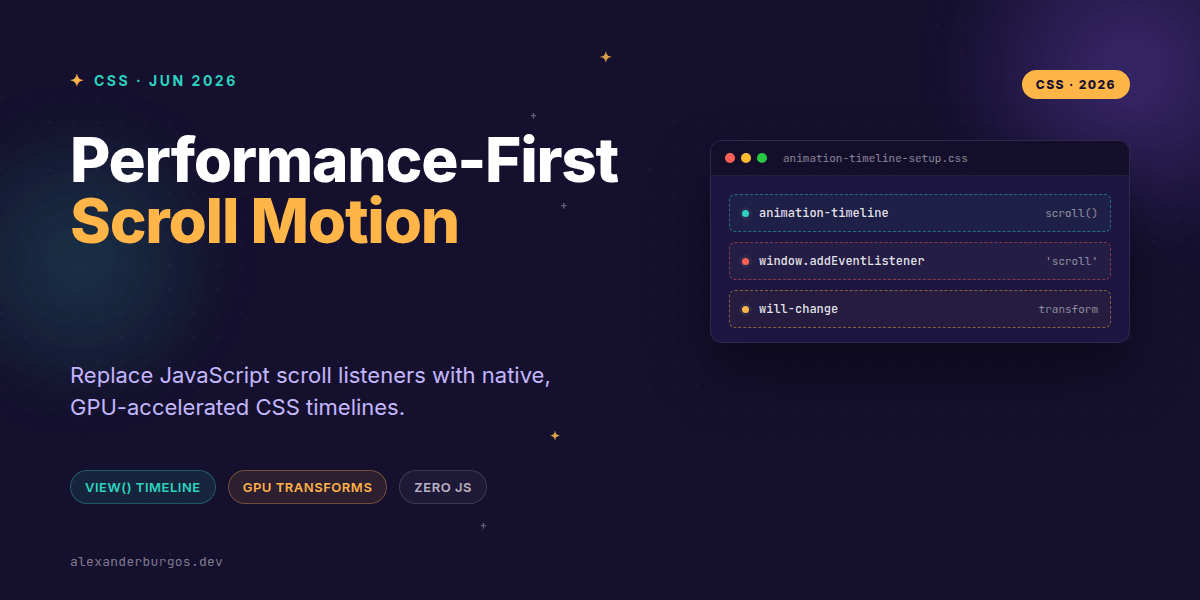
Ever wondered why some scroll animations feel like butter while others make your browser scream for mercy? We've all been there: installing heavy libraries or writing complex requestAnimationFrame loops just to move a header or fade in an image.
The good news is that those days are largely behind us. Modern CSS has introduced Scroll-Driven Animations, a declarative way to link motion directly to the scroll progress of a container. It's faster, cleaner, and strictly follows the performance-first mindset we need in design systems today.
The End of the Main-Thread Struggle
When we used JavaScript to handle scroll motion, we were fighting a constant battle with the main thread. Every pixel scrolled triggered a script, which calculated a value, which then forced a style update. If the main thread was busy with React re-renders or data fetching, your animation would stutter.
By using animation-timeline, we shift that responsibility to the compositor. Chrome's documentation is quite clear on this: scroll-driven animations let you create motion using just CSS, keeping the work on the GPU and avoiding the jank often caused by JavaScript scroll handlers.
The Two Pillars: scroll() and view()
The specification gives us two primary tools to define our timelines. Choosing the right one depends entirely on what you're trying to achieve.
- scroll(): This tracks the scroll position of a container. Think of a reading progress bar at the top of an article. At 0% scroll, the bar is empty; at 100%, it's full.
- view(): This is the real game-changer for UI. It tracks an element as it enters and exits the viewport. It's perfect for those 'reveal on scroll' effects we used to need Intersection Observer for.
/* A simple reveal effect using view() */
@keyframes reveal {
  from { opacity: 0; transform: translateY(50px); }
  to { opacity: 1; transform: translateY(0); }
}

.card {
  animation: reveal linear both;
  animation-timeline: view();
  animation-range: entry 10% cover 40%;
}
The Design System Perspective
In a design system, we want motion to be predictable and reusable. I've found that the best way to implement this is by treating scroll timelines as an enhancement. Your layout should look perfect even if the animation fails to load or the browser doesn't support the spec.
One common pitfall I see is animating non-compositor properties. If you try to animate height or top via a scroll timeline, you're still going to hit performance issues. Stick to transform and opacity to ensure the GPU handles the heavy lifting.
Accessibility and User Preference
We cannot talk about motion without talking about accessibility. For some users, parallax or heavy scroll-linked motion can cause genuine physical discomfort or vestibular issues. It's our job to respect their settings.
I always wrap my scroll animations in a media query check. If a user has requested reduced motion, the safest path is to disable the timeline entirely or switch to a subtle opacity-only fade.
@media (prefers-reduced-motion: no-preference) {
  .hero-image {
    animation-timeline: scroll();
    transform-origin: top;
  }
}
Practical Gotchas to Avoid
While this tech is exciting, there are a few things that might trip you up. First, property order matters. WebKit warns that animation-timeline must be declared after the shorthand animation property, or the browser might overwrite your timeline with the default 'time' value.
Secondly, be careful with nested scrollers. If you use scroll() without arguments, it looks for the nearest scroll container. In complex layouts, this might accidentally target a side-nav or a modal instead of the main page body. Explicitly naming your timelines or targeting the root can save you hours of debugging.
Wrapping Up
- Native CSS timelines move motion logic to the compositor for 60fps performance.
- Use
view()for intersection-based reveals andscroll()for container-wide progress. - Always respect
prefers-reduced-motionto keep your UX inclusive.
I'd encourage you to start small. Try replacing a single scroll-reveal script with a CSS view() timeline today. The performance gains are immediate, and the code is much easier to maintain.
If you want to go deeper and learn how to build real, production-ready CSS design systems step by step, check out my full course here: CSS Design Systems Course
I cover the full pipeline in Ship Your Design System, 200 pages on Amazon Kindle.
Let's keep the conversation going! You can find me sharing more CSS tips on Twitter or connect with me on LinkedIn for a deeper dive into UX engineering.