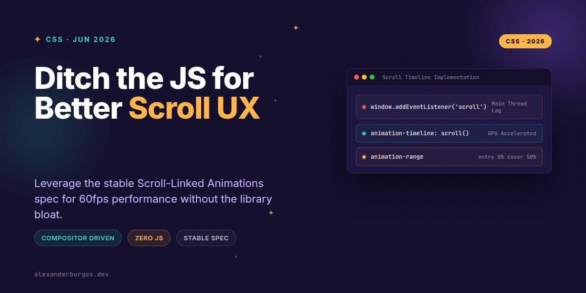
Ever wondered why scroll-based animations always feel just a tiny bit janky, even on powerful machines? We've all been there: importing a 30kb JavaScript library just to make a header shrink or a card fade in as it enters the viewport. It's the classic trade-off between delightful UX and main-thread performance.
But here is the good news: that trade-off is officially dead. As of mid-2026, the CSS Scroll-Linked Animations specification is stable and production-ready across all major modern browsers. We can finally tie animation progress directly to scroll position or element visibility without a single line of JavaScript.
Why this changes the game for UX Engineers
In the past, scroll effects relied on scroll listeners or IntersectionObserver. While effective, these run on the browser's main thread. If that thread is busy parsing a heavy React bundle or handling API data, your animation frames drop. It results in that 'stutter' that makes a premium site feel unpolished.
CSS Scroll-Driven Animations run on the compositor thread. This means the browser can update the animation even if the main thread is completely pegged. It's the difference between a 'hacky' scroll effect and a native-feeling experience that stays glued to the user's thumb or scroll wheel.
The Core Primitives
To master this, you only need to understand three main concepts. I've found that once these click, you'll never want to go back to GSAP or Framer Motion for simple scroll triggers.
- Scroll Timelines: These track the scroll progress of a container (like the body or a div). Progress goes from 0% at the top to 100% at the bottom.
- View Timelines: These track an element's visibility within its scrollport. It's exactly like an Intersection Observer, but in pure CSS.
- Animation Range: This defines when the animation should start and end relative to the visibility (e.g., 'start when the top of the element hits the bottom of the screen').
Example: The 'Fade-In' Card
Let's look at how we'd replace a typical JS-driven scroll entrance. Instead of checking offsets in a loop, we define a view-timeline on the element itself.
.card {
  /* Define the timeline */
  view-timeline-name: --revealing-card;
  view-timeline-axis: block;

  /* Bind the animation */
  animation-name: fade-in-up;
  animation-timeline: --revealing-card;

  /* Control the timing */
  animation-range: entry 0% cover 30%;
  animation-fill-mode: both;
  animation-timing-function: linear;
}

@keyframes fade-in-up {
  from { opacity: 0; transform: translateY(50px); }
  to { opacity: 1; transform: translateY(0); }
}
In this snippet, the card starts animating the moment its 'entry' hits the viewport and finishes by the time it has covered 30% of the view. It's declarative, readable, and incredibly performant.
Common Pitfalls to Avoid
I've been experimenting with this spec for a while, and there are a few things that usually trip people up during the first implementation.
First, forget about duration. In a scroll-driven animation, animation-duration is essentially ignored because time is replaced by distance. I usually set it to 1ms or auto just to satisfy the syntax, but the scroll position is the real clock here.
Second, stick to Composite-only properties. If you try to animate height or margin-top on scroll, you'll force the browser to recalculate layout on every pixel scrolled. Stick to transform and opacity to keep it on the compositor thread.
Browser Support & Progressive Enhancement
While Chrome and Safari 18+ have excellent support, you still need to think about fallbacks. The best way is to use the @supports rule. This ensures that users on older browsers just see the static content without a broken animation state.
@supports (animation-timeline: scroll()) {
  .hero-parallax {
    animation: parallax-effect linear forwards;
    animation-timeline: scroll();
  }
}If this is the kind of thing you keep finding out late about, my book Modern CSS 2026 on Amazon is one chapter per shift, with honest support labels.
Wrapping Up
- Swap JS scroll listeners for
animation-timelineto move work to the compositor thread. - Use
view-timelinefor entrance animations andscroll()for global progress bars or parallax. - Always wrap your scroll-driven styles in
@supportsfor a safe production rollout.
Go ahead and try replacing one small JS scroll effect today. You'll be surprised at how much cleaner your codebase feels without those bulky dependencies.
If you want to go deeper and learn how to build real, production-ready CSS design systems step by step, check out my full course here: CSS Design Systems Course
I'd love to see what you build! Tag me in your demos on Twitter or let's connect on LinkedIn to chat CSS architecture.