Ever wondered why scrolling through a complex web spreadsheet or a large map feels 'sticky' or frustratingly linear? You try to move diagonally to reach a specific cell, but the browser stubbornly locks you into a strictly horizontal or vertical track.
It's a classic UX friction point. Historically, browsers have used 'axis locking' to help users stay on track. If your initial gesture is slightly more vertical than horizontal, the browser assumes you want to scroll up or down and ignores the horizontal input. While this is great for reading a long article, it's a nightmare for interactive canvases.
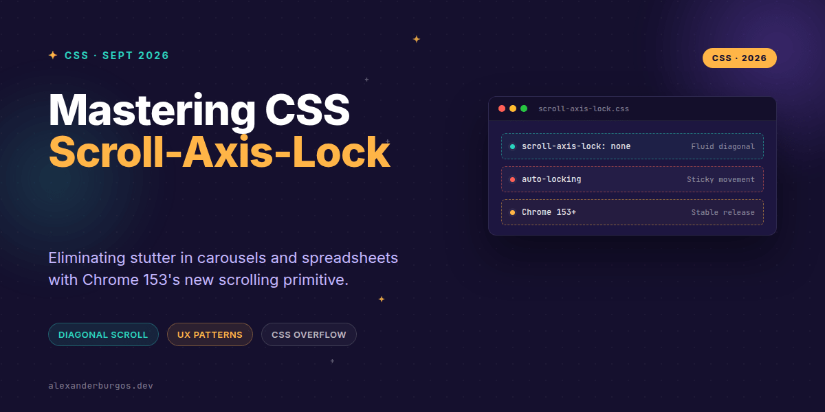
With the release of Chrome 153, we finally have a native CSS solution: scroll-axis-lock. Let's dive into how this changes the game for design systems and complex UI components.
What is scroll-axis-lock?
Defined in the CSS Overflow Module Level 5, scroll-axis-lock is a property that gives us control over the browser's heuristic for locking scroll gestures. It applies directly to scroll containers and accepts two primary values:
auto(Initial): The browser decides whether to lock the gesture to a single axis based on the user's initial movement.none: The browser is instructed not to lock the gesture, allowing for fluid, 360-degree diagonal movement.
It's important to note that this doesn't disable scrolling; it simply changes how the input is interpreted. It’s the difference between a train on tracks and a puck on an air-hockey table.
Solving the Spreadsheet Stutter
In a large data grid or spreadsheet, users often need to scan diagonally to find a specific data point. If the browser locks the axis, the user has to stop their gesture, recalibrate, and move again. It feels like the interface is fighting them.
By applying scroll-axis-lock: none, we remove that friction. I've found that pairing this with overscroll-behavior: contain creates a much more 'app-like' experience, preventing the entire page from bouncing when you reach the edge of the grid.
.data-grid-container {
  overflow: auto;
  scroll-axis-lock: none;
  overscroll-behavior: contain;
}
Carousels and the 'Accidental Scroll' Trap
Carousels present a different challenge. Often, a horizontal carousel lives inside a vertically scrolling page. When a user swipes diagonally, the browser has to guess: do they want to see the next slide, or do they want to keep reading the page?
In most carousel patterns, we actually want the default auto behavior. If the user is trying to scroll down the page, we don't want the carousel to start sliding sideways just because their thumb slipped a few pixels to the left. Keeping the axis lock here prevents 'micro-stutter' where the UI jitters between two different scroll intentions.
Design System Implementation
Since Chrome 153 is the first to ship this, we should treat it as a progressive enhancement. Don't bake it into your global reset. Instead, I recommend using it as a utility or a component-level token for specific 'free-scroll' containers.
- Maps & Canvases: Always use
noneto allow natural exploration. - Standard Lists: Stick with
autoto keep the scroll experience stable. - Infinite Grids: Experiment with
nonebut monitor for accidental horizontal shifts on mobile.
Wrapping Up
- Use
scroll-axis-lock: noneto enable fluid diagonal panning in spreadsheets and maps. - Stick to the default
autofor carousels to prevent accidental horizontal shifts while vertical scrolling. - Treat this property as a progressive enhancement for Chrome 153+ users.
I'd encourage you to try this out on your most complex scroll containers. You'll be surprised how much 'smoother' the UI feels just by removing that invisible axis constraint.
If you want the long-form version of this with 23 chapters and runnable code, Ship Your Design System on Amazon is the handbook.
If you want to go deeper and learn how to build real, production-ready CSS design systems step by step, check out my full course here: CSS Design Systems Course
Let's chat about CSS and UX over on Twitter or connect with me on LinkedIn for more design system insights.