We've all been there: you click a deep link to a heading, or a user scrolls through a beautifully snapped carousel, only for the content to be partially obscured by a sticky header or cut off at the edge of the viewport. It's one of those tiny UX frictions that makes a polished design feel slightly broken.
For years, we've reached for JavaScript to fix this. We'd calculate the header height, subtract some pixels, and manually trigger a window.scrollTo(). But honestly? It's fragile. In a modern design system, we should be able to define our "scrolling intent" directly in the CSS. Thankfully, the current CSS Scroll Snap spec (and the emerging Level 2 drafts) gives us exactly the tools we need to handle anchoring with precision.
The Invisible Buffer: Scroll-Padding
If you're building a design system with a persistent navigation bar, scroll-padding is your best friend. I like to think of it as a "safe zone" for the scroll container. When you apply scroll-padding to a container, you're telling the browser: "When you snap or scroll to an element inside here, leave this much space at the edges."
.scroller {
  scroll-snap-type: y mandatory;
  /* Reserve space for a 72px sticky header */
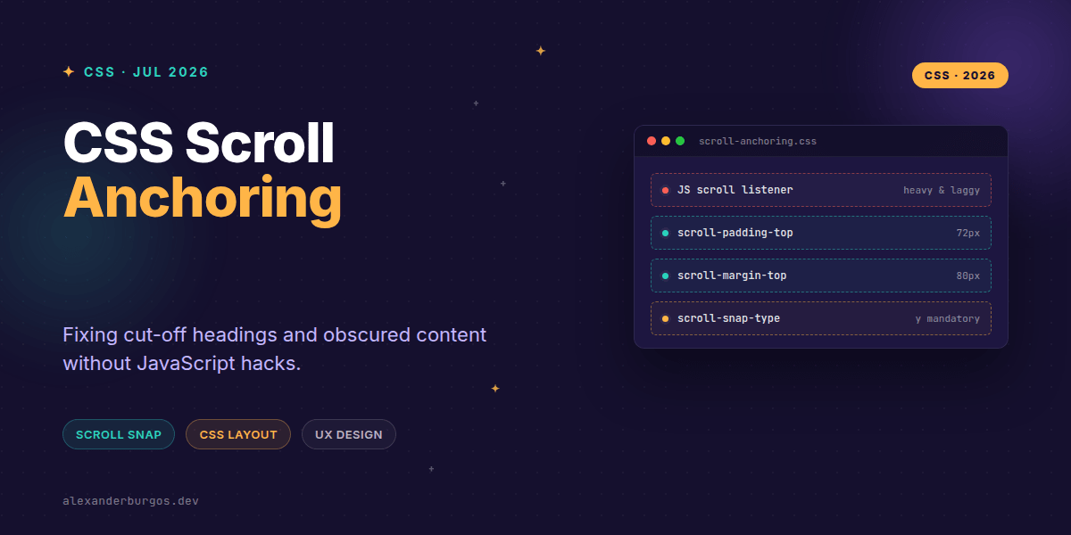
  scroll-padding-top: 72px;
}
The beauty of this is that it's global to the container. Every single snap point or anchor link target will respect that 72px offset automatically. No more headings hiding behind your navigation.
Targeted Precision with Scroll-Margin
Sometimes you don't want to pad the whole container; you want specific elements to have their own breathing room when they become the scroll target. This is where scroll-margin shines. I use this constantly for section headings in documentation sites.
h2[id] {
  /* Ensure the heading doesn't hug the very top of the screen */
  scroll-margin-top: 80px;
}
Unlike regular margin-top, scroll-margin-top doesn't affect the actual layout or visual spacing of the element in the document flow. It only affects where the browser lands when that element is scrolled into view. It's a pure UX affordance.
The Future: Intent-Aware Initial Targets
Okay, I'm genuinely excited about where the spec is heading with CSS Scroll Snap Level 2. There's been a lot of discussion around scroll-initial-target. The goal here is to solve the problem of where a scroller should start when the page loads.
Currently, we often rely on the browser to just... start at the beginning. But what if your design system has a carousel that should start on the second item, or a dashboard that should focus on a specific data point? The draft proposal for scroll-initial-target aims to let us define that starting anchor point natively.
- It defines the initial scroll position without requiring JS
window.onloadscripts. - It integrates with the existing snap alignment logic (start, center, end).
- It respects the container's
scroll-paddingout of the box.
Inconsistent Alignment? Check Your Snapport
One common gotcha I see is mixing up scroll-snap-align and scroll-behavior. Remember: scroll-behavior: smooth is just the aesthetic of the movement. The logic of where you land lives entirely within the snap properties.
If your sections aren't aligning correctly, it's often because the 'snapport' (the visible area of the scroll container) hasn't been properly defined. Using scroll-padding-inline for horizontal carousels is a game-changer for ensuring your cards are perfectly centered while still showing a hint of the next item.
.carousel {
  display: flex;
  overflow-x: auto;
  scroll-snap-type: x proximity;
  /* Keeps the active card from hitting the edges */
  scroll-padding-inline: 24px;
}

.card {
  scroll-snap-align: center;
}Wrapping Up
- Use
scroll-paddingon containers to account for global UI like sticky headers. - Use
scroll-marginon specific elements to give them unique landing offsets without breaking layout. - Keep an eye on
scroll-initial-targetas it moves through the CSSWG draft process for native initial anchoring.
I've found that moving these concerns from JavaScript to CSS not only improves performance but also makes our design systems significantly more robust across different screen sizes. Give them a try on your next project!
If you want to go deeper and learn how to build real, production-ready CSS design systems step by step, check out my full course here: CSS Design Systems Course
I cover the full pipeline in Ship Your Design System, 200 pages on Amazon Kindle.
Let's keep the conversation going! You can find me sharing more CSS tips on Twitter at https://x.com/alexandersstudi or connect with me on LinkedIn at https://www.linkedin.com/in/alexandersstudio/.