Ever wondered why our design systems end up with thousands of global CSS variables that nobody dares to touch? We've all been there: a giant :root file filled with --btn-primary-bg-hover-active-dark-mode, praying that changing one value won't break a random tooltip three pages away.
The problem isn't custom properties themselves; it's that we've been forced to treat them as global constants. But with the arrival of @scope, that's all changing. We can finally define variables that only exist where they're needed, making our architecture cleaner, safer, and much easier to reason about.
The Trouble with Global Everything
In traditional design system architecture, we tend to hoist everything to the top. This leads to "variable bloat." When every state and every component variation needs a unique name to avoid collisions, your autocomplete becomes a nightmare. More importantly, it makes contextual theming—like putting a dark card inside a light section—a mess of specific utility classes or high-specificity overrides.
Enter @scope: Encapsulation Done Right
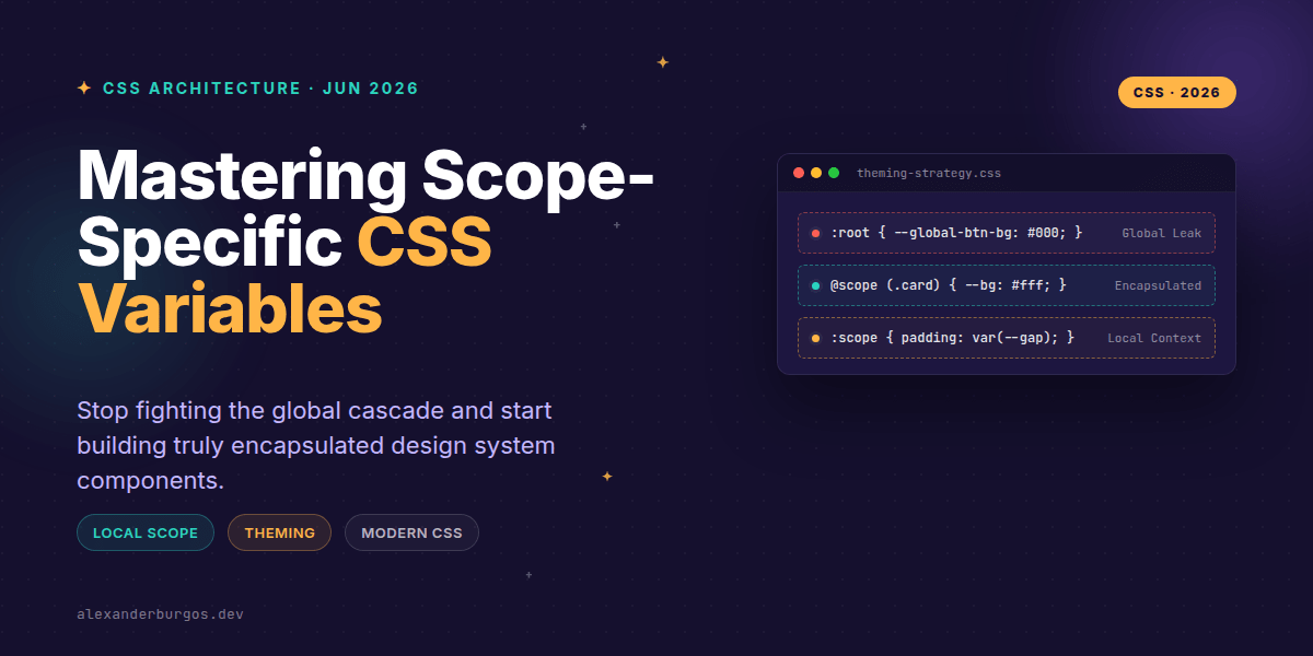
The @scope at-rule is a game-changer. It allows us to define a boundary in our CSS. Anything declared inside that block is effectively tethered to a specific DOM subtree. According to the Chrome Developers documentation, it lets us limit the reach of our selectors by setting a scoping root.
Here’s how it looks in practice when we want to define a specific theme for a card component without polluting the rest of our app:
/* Global baseline */
:root {
  --color-text: #222;
  --color-bg: #fff;
}

/* Card-specific scope */
@scope (.card) {
  :scope {
    --color-text: #f5f5f5;
    --color-bg: #1a1a1a;
  }

  .content {
    color: var(--color-text);
    background: var(--color-bg);
  }
}
In this example, the --color-text override only exists for elements inside .card. You don't need a .card--dark class on every single child element. The variables simply behave differently because of where they live.
Simplifying State Styling
I've found that one of the best uses for scoped variables is managing component states like hover, focus, or disabled. Instead of writing complex selectors for every variation, we can just update the local variable value.
@scope (.button) {
  :scope {
    --btn-bg: #0055ff;
    --btn-scale: 1;
  }

  .btn-element {
    background: var(--btn-bg);
    transform: scale(var(--btn-scale));
    transition: all 0.2s ease;
  }

  &:hover {
    --btn-bg: #0040cc;
    --btn-scale: 1.05;
  }
}
This is much cleaner than juggling ten different utility classes. The logic is co-located with the component scope, and the intent is crystal clear.
Browser Support and Progressive Enhancement
Right, let's talk about the elephant in the room: support. As of mid-2026, @scope is well-supported in Chromium and WebKit (Safari). Firefox has been catching up, but we still need a strategy for older environments. I recommend using global baseline variables as a fallback and using @scope to layer on specific refinements.
Common Pitfalls to Avoid
- Confusing @scope with :scope: Remember that
@scopeis the container/rule, while:scopeis the selector matching the root of that rule. - Forgetting the Cascade: Scoped variables still cascade downwards. If you nest another scope inside, the inner one will take precedence.
- Over-scoping: Don't feel the need to scope every single line of CSS. Use it where encapsulation provides real value, like complex components or theme islands.
Wrapping Up
- Use
@scopeto keep theme-specific variables local and avoid global namespace pollution. - Leverage
:scopeto define component-wide defaults that are easily overridden by state changes. - Adopt a progressive enhancement mindset: keep your core layout variables global, but move component logic into scopes.
I'd really encourage you to experiment with this in your next project. Even if you're using a framework like React or Vue, native CSS scoping reduces the reliance on heavy CSS-in-JS libraries and keeps your styles closer to the platform.
If you want to go deeper and learn how to build real, production-ready CSS design systems step by step, check out my full course here: CSS Design Systems Course
The long version with support labels and runnable demos is in Modern CSS 2026 on Amazon Kindle.
Feel free to reach out on Twitter or LinkedIn if you have questions about implementing @scope in your current stack!