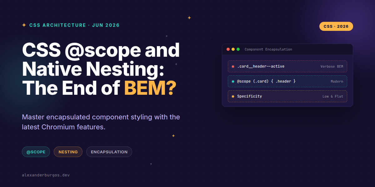
Forget everything you know about naming conventions for a second. For over a decade, we've relied on BEM (Block Element Modifier) or the heavy lifting of CSS-in-JS libraries just to keep our styles from leaking across the DOM. We've written class names like .nav-item__link--active because we didn't trust the global cascade.
But everything just changed. With @scope landing in Chromium and native nesting already broadly available, we finally have the tools to build truly encapsulated components using standard CSS. It's a massive shift for anyone working on large-scale design systems.
Why @scope is the missing piece
In my experience, the biggest headache in CSS architecture isn't writing the styles—it's preventing them from breaking something else. As Chrome Developers put it, "With @scope you can limit the reach of your selectors." This isn't just another way to write CSS; it's a way to define boundaries.
While native nesting helps us organise our code and express relationships, @scope actually changes how the browser matches selectors. It sets an upper boundary (the scoping root) and optionally a lower boundary (the limit), ensuring your styles only apply exactly where you want them.
@scope (.card) {
  & {
    padding: 1.5rem;
    border: 1px solid var(--border);
  }

  .title {
    font-size: 1.25rem;
    font-weight: 700;
  }

  .image {
    border-radius: 0.5rem;
  }
}
In this example, .title will only match if it's inside a .card. We don't need to call it .card-title. The scope root handles the encapsulation for us.
Nesting vs Scoping: The Mental Model
It's easy to get these two confused, but they solve different problems. I like to think of it this way: Nesting is for authoring ergonomics and internal relationships. Scoping is for DOM boundaries and preventing leakage.
- Nesting: Use the
&selector to handle states like:hover, data attributes, or media queries that affect the component itself. - Scoping: Use
@scopeto define the area of the page where these rules are allowed to live.
When you combine them, you get the best of both worlds. You can write clean, flat selectors that are perfectly safe because they're wrapped in a scope. MDN explains that @scope allows you to target elements precisely "without writing overly-specific selectors" or coupling too tightly to the DOM structure.
Patterns for Design Systems
If you're managing a component library, this is a game-changer. One of the most powerful features of @scope is the 'donut scope'—the ability to set a lower boundary. This is perfect for complex components like a navigation bar that might contain user-provided content that you don't want to style accidentally.
@scope (.navbar) to (.navbar-content-slot) {
  .link {
    color: var(--nav-link-color);
    text-decoration: none;
  }

  .link:hover {
    text-decoration: underline;
  }
}
By using the to keyword, we've told the browser: "Apply these styles inside the navbar, but stop once you reach the content slot." This prevents our navbar link styles from bleeding into whatever components the consumer drops into that slot. It's the kind of encapsulation we used to only get with Shadow DOM, but without the complexity.
Gotchas and Reality Checks
Before you delete your Sass files, let's look at the constraints. Firstly, @scope doesn't replace specificity. A scoped selector doesn't automatically win against a global one if the global one has higher specificity. It's a narrowing tool, not a 'win-all' button.
Browser support is also something to watch. While Chromium (Chrome/Edge 118+) and Safari (17.4+) are on board, Firefox support is still lagging behind at the time of writing. For production apps in 2026, I recommend using @supports to provide a graceful fallback or continuing to use a lightweight naming prefix alongside scoping for maximum safety.
Wrapping Up
- Use
@scopeto define component boundaries and stop selector leakage. - Leverage native nesting for internal states (
:hover,[data-state]) to keep your CSS readable. - Remember that scoping isn't Shadow DOM—it's a CSS authoring tool that respects the cascade.
I've started rolling this out in my latest projects, and the relief of not having to come up with unique 20-character class names is real. Give it a try in a small utility or a brand-new component and see how it feels to let the browser do the heavy lifting for once.
If you want to go deeper and learn how to build real, production-ready CSS design systems step by step, check out my full course here: CSS Design Systems Course
I cover this and the other twenty-seven CSS shifts of 2026 in Modern CSS 2026 on Amazon, my catch-up book for people who learned CSS five years ago.
Let's chat about your experience with native nesting over on Twitter at https://x.com/alexandersstudi or connect with me on LinkedIn at https://www.linkedin.com/in/alexandersstudio/.