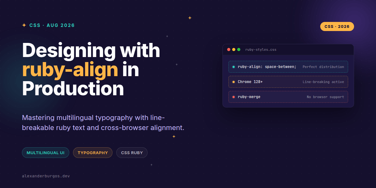
Right, let's talk about ruby-align. If you've ever had to build a design system that supports East Asian languages like Japanese or Chinese, you've likely wrestled with the <ruby> element. For years, it was a bit of a layout nightmare—annotations didn't align predictably, and long ruby strings would stubbornly refuse to wrap, breaking your carefully crafted grid.
But things have changed. With Chrome 128+ shipping support for ruby-align and, crucially, making ruby annotations line-breakable, we finally have the tools to treat multilingual typography as a first-class citizen in our design systems. It's no longer a 'nice-to-have' hack; it's a production-ready feature.
Why ruby-align Matters for Design Systems
The core problem we've always faced is the mismatch between the length of the base text (the Kanji or Hanzi) and the annotation (the Furigana or Pinyin). Without proper alignment controls, the UI looks unbalanced. In a design system, we want consistency. We want to know that if a user switches their interface language, the spacing remains intentional.
The ruby-align property gives us four main ways to handle this distribution:
- start: Aligns the ruby text to the start of the base.
- center: Centres the annotation over the base (great for short labels).
- space-between: Stretches the shorter text to match the width of the longer text.
- space-around: Distributes extra space around the characters (the default initial value).
The Game Changer: Line-Breakable Ruby
I've found that the biggest frustration for UX engineers wasn't just the alignment—it was the overflow. Previously, a <ruby> element was treated as a monolithic, unbreakable block. If you had a long ruby sequence in a narrow sidebar, it would simply blow out the container.
Chrome 128 changed the game by allowing ruby annotations to break across lines. This means our typography can finally be responsive. If you're building a card component or a mobile-first navigation, the ruby text will now wrap naturally with the rest of the paragraph.
.design-system-ruby {
  ruby-align: space-between;
  /* Ensure the text can wrap in narrow containers */
  white-space: normal;
}
Implementing ruby-align in Your Components
When I'm architecting a design system, I like to create a utility class or a specific sub-component for ruby text. This ensures that every developer on the team isn't reinventing the wheel when they need to display a phonetic guide.
Here is how you might structure a basic ruby component in a React-based system:
const RubyText = ({ base, annotation, align = 'space-around' }) => (
  <ruby style={{ rubyAlign: align }}>
    {base}
    <rt>{annotation}</rt>
  </ruby>
);
One thing to watch out for: ruby-align only applies to elements with display: ruby or the native <ruby> elements. Don't try to slap it on a <div> and wonder why nothing is happening!
Common Gotchas and Browser Support
Let's be real—browser support isn't 100% uniform yet. While Firefox has supported this for a while and Chrome/Edge are now on board, Safari has historically lagged behind. In your production CSS, you should treat ruby-align as a progressive enhancement.
Also, don't get distracted by ruby-merge or ruby-overhang. While they appear in the specs, MDN notes they aren't supported in modern browsers yet. Stick to ruby-align and ruby-position for now to keep your system stable.
Wrapping Up
- Use
ruby-align: space-betweenfor a clean, justified look where annotations match the base width. - Leverage Chrome 128's line-breaking to prevent layout breaks in responsive containers.
- Always test your mixed-script UIs in both horizontal and vertical writing modes.
I'd encourage you to experiment with these properties in your next internationalisation sprint. Even if you don't speak the language, seeing how the layout responds to different alignment values will make you a better UX engineer.
If you want to go deeper and learn how to build real, production-ready CSS design systems step by step, check out my full course here: CSS Design Systems Course
I cover the full pipeline in Ship Your Design System, 200 pages on Amazon Kindle.
For more tips on CSS architecture and UX engineering, catch me on Twitter at @alexandersstudi or connect with me on LinkedIn. Let's build a more accessible web together.